If what you're looking for isn't here, type keywords in SEARCH box (right side of this page)

OR look through list of topics in this blog OR look a bit lower for posts in order by date.


December 21, 2011

Vivian Maier - Street Photographer

"Vivian Maier (February 1, 1926 – April 21, 2009) was an American amateur street photographer who was born in New York but grew up in France, and after returning to the U.S., worked for about forty years as a nanny in Chicago. During those years she took about 100,000 photographs, primarily of people and cityscapes most often in Chicago, although she traveled and photographed worldwide." (Quote from Wikipedia article on Vivian Maier)

Below
VIVIAN MAIER
9 minutes, 33 seconds


_____________

VIVIAN MAIER SLIDESHOWS ON VIDEO

VIVIAN MAIER - STREET PHOTOGRAPHY - Part 1
9 minutes, 56 seconds
VIVIAN MAIER - STREET PHOTOGRAPHY - Part 2
10 minutes, 17 seconds
Below
VIVIAN MAIER - STREET PHOTOGRAPHY - Part 3
6 minutes, 5 seconds
The woman shown below, before the video starts, is not Vivian Maier. She is one of Maier's subjects.

 
Many of Maier's Chicago pictures remind me of some of Bruegel's paintings where there are many, many people packed into the overall scene and much going on -- one to a few people in clusters acting out their own tiny dramas and paying no attention to the others all around, yet all of them fitting equally well into the larger setting.


Netherlandish Provers, 1559, by Pieter Bruegel, the Elder

I feel intrusive when I'm looking at Maier's photographs. I feel that I was right with her as she butted in on other people's private moments. Many street photographs look artful but not intrusive ... They look too carefully composed and they just don't seem to relate to human life in any meaningful way; they may be a "slice of life" but it's not a slice that matters. Many street photographs are neither artful nor intrusive. Many look as if they were not taken by a human being...Somehow they seem to have taken with an invisible camera. Vivian Meiers' photographs look both artful and intrusive -- artful not meaning that her photos look carefully thought out ahead by an "artist," but that she knew exactly when and where to point that camera to best capture the essence of what she was observing; plus the subjects do look in many cases as if they were intruded upon (and sometimes they knew it, and she apparently didn't care that they knew it).

Most of her photographs that I have seen were taken in downtown Chicago, the streets of which seem to have been filled with an unending supply of human interest vignettes that Maier, with camera in hand, must have been constantly on the lookout for. Obviously she was fascinated by human life. She had a sense of humor and a sense of the absurd. She was sympathetic to some, and simply fascinated by others -- by what they were doing, how they presented themselves (wittingly and/or unwittingly) in public and how they related to others (including to her) and to their surroundings.

She knew instinctively what looks odd together, such as the woman holding a doll, the man in a suit, sleeping in his car, his hat hanging on the gearshift, the old gentleman sleeping on his back on the steps of a doorway, his hat to the side (an especially odd sight since we cannot see the man's head). In another picture a well-dressed man's head is missing due to a balloon being held in front of it by a baby he's tending, and in another picture a man, smoking a cigarette, is looking in a window (we see this from inside the room) at second- or third-story level (must be a window washer), and then there's the man with a long beard and dressed as if on safari waiting to cross a street. And lots more.

One reason her photographs, at least the ones I've seen, are so powerful (I think) is that she caught people "living their lives," not posing. Even when someone stops what they're doing to look at the camera because she called their attention for that purpose, as Maier apparently did now and then, it's only for a brief second of their lives and they do not get "out of character" while watching her watching them. So although they're looking right at the photographer the result is not a "posed" picture, but rather a revealing look at the subject's immediate and natural reaction to the situation they suddenly encounter (i.e., they are being photographed), their facial expressions reflecting their own personalities and concerns.

I think we're very lucky that the man who bought Maier's pictures at that auction realized how extraordinary her photos were and has devoted himself to scanning and preserving and sharing them.

November 22, 2011

A Painting of Frans Post by Frans Hals

In my last post, about painting "civilized" people (i.e., people in good control of their body language), one of the pictures I commented on was a portrait of Frans Post painted by Frans Hals in about 1655. As I wrote in that post, the comments I made on each of several pictures, including this one, were my first impressions of the personality and character of the people portrayed. Some pictures tell me a lot more than others about the people in them, and this was the one that told me the most.

Here is the picture I am referring to:

Frans Post
Artist: Frans Hals (c. 1580-1666), Dutch painter

And these were my comments (my own "first impressions") on this subject, having not yet taken any time to try to analyze the picture: "A modest yet friendly man who would be nice to be stuck sitting next to while waiting for something. He looks like a good listener, and sympathetic and probably encouraging. It would probably be nice to have supper with him...and keep him for a friend."

I did not know anything about Frans Post when I saw this picture for the first time.  And I still have not looked to find out anything about him or about other people's opinions and observations about the way the painting was composed and why it was composed that way. So, what follows are my own ideas based on my understanding of how these things work.

The main thing to get across here, as it helps so much in the interpretation of the personality of Mr. Post, is that where the subject is placed in relation to the center of the picture tells us a lot about it. (Of course there are also other factors that help us understand the subject, and I will point out a few of those shortly.)
It seems at first surprising to realize that so much of the subject's "personality" is evident when only a part of his face and one side of his collar are seen with any clarity. Everything else is in the dark.

How do we get such a strong idea of what he's like, then? It's not only the expression in his face, though that is part of it. What tells us even more is where his face is in the picture, and how it's tilted. And not just his face, but also his body.

Someone who was in dead center and straight upright, especially with head and body both facing directly toward the viewer, would seem (all other things being equal) perfectly composed, steady, like a rock, unchanging, hardly affected by outer events. You don't often see a portrait like that, as most people are not like that, though some are. Here is a good example of such a subject:

Senju Kannon - 12th Century - Japan -Scroll
Senju Kannon ("Thousand-armed Bodhisattva of Compassion"), 12th Century - Hanging scroll, color on silk, Tokyo National Museum
Source: Wikimedia (picture is in the public domain)

This is not an individual with a unique personality but the personification of compassion and mercy. We would expect someone like this to be serene, "like a rock, unchanging."

And here is another example:

Mary Turner Austin - 1880, by John Singer Sargent
Mary Turner Austin, 1880
Artist: John Singer Sargent
Source: The Athenaeum

The subject (or her head and neckscarf, anyway, which are all we can see) in the above picture is not in the center between top and bottom, but she is in the center between left and right, and her head and body are both facing directly toward the viewer. However, rather than giving the appearance of calmness and stability, as does the Senju Kannon, above, to me at least this woman looks like she's barely able to control strong emotion. She does not have "a thousand arms" reaching out in compassion, but instead seems to have all of her energy concentrated in her seemingly disembodied head. She projects that highly concentrated energy through her eyes, out of the darkness below her brows, causing her to look as if she's not at peace but, rather, stubborn, willful, and about to explode. She is quite literally "self-centered." She looks as if she would have only one position on things - her own, unchangeable, position. I would not want to be left alone with this person.

Frans Post, in Hals' painting, far from being in the center with face and body aimed directly toward the viewer, leans far to our left of the center of the picture. Recall:

Frans Post c.1655 - Artist: Frans Hals

He is also sitting behind the back of a chair, making him seem more "caged in," whereas the staring woman has nothing in front of her that protects us from her, should we need protection.

Mr. Post is a person, we understand, who is not afraid to look into our eyes (he has nothing to hide and seems open and honest). He, leaning comfortably against the back of the chair, has no fear of us, either, but, unlike the fearless Ms. Austin, he is not ready to pounce on us (physically or verbally). He doesn't seem to be leaning away from us, but, rather, is leaning a bit toward us. That, along with the focus (because of the light) on his facial expression, with its unforced friendly smile, is very endearing. He looks comfortable and content, and his body language seems to say "It's so good to see you. Please come and talk to me. Let's spend a while together."

I admit that it's true that in some portraits where the head is tilted back amost in the same way the subject does not look so friendly and welcoming as does Frans Post. For example, here is another portrait by Frans Hals in which the subject is placed in a similar pose:

Portrait of a Man - 1635, by Frans Hals
Portrait of a Man - 1635
Artist: Frans Hals

What are the differences between these pictures that account for how we interpret the two subjects so differently? For one thing, the man (no name is given) in this last picture does not look as relaxed as Mr. Post. He has a pleasant face with a sweet little smile (though it's almost sarcastic looking - try on that smile yourself and find out how it feels), but he looks very stiff, which in my opinion has a lot to do with the diagonal row of buttons or decoration down the front of his jacket, which makes his head look like a piece of candy on the end of a lollipop stick. He does not look "relaxed," but simply leaning away from us as if he didn't want us to get too close. Also, he is not looking at us. He is looking at someone (or something) behind us and to our right, as if he couldn't care less about us but was only interested in whatever he's looking toward. His gaze also has the effect of straightening him up, which is one of the reasons he looks so tense. The overall effect is to make him look like a very alert, superficially accommodating person who, however, is impatient, fidgety, and not very thoughtful.

Furthermore, his clothing does not blend in so well with the background as does Mr. Post's. It is much more noticeable because it is well-lit and lit from the side so that the folds and creases are very noticeable, making his clothing appear to be aggressively confronting us. Also, we are able to see that the fabric looks as stiff as the row of buttons, and that his right arm is thrust forward toward us, almost into "our" space; this seems "unfriendly," as if he's trying to put up a threatening barrier between himself and the viewer.
In other words, he does not look comfortable and he does not look welcoming. The message I get is: "I'd like to get out of this chair and this situation ASAP, and, by the way, I do wish you'd stop pestering me. I have better things to do."

There are more portraits by Hals where he has his subject in this same basic position, and it would be fun to compare more of them, but those will have to wait for other posts.

October 30, 2011

The Difficulty of Portraying Civilized People

... or GET UNDER THE MASK - OR WORK AROUND IT

A CIVILIZED PERSON LOOKING QUITE BORING. (BELOW)

Mr. Morley - before 1802 - artist George Romney

ABOVE: Mr. Morley, before 1802 (Wikimedia)
artist: George Romney (1734-1802), English painter

ANOTHER CIVILIZED PERSON JUST A TAD LESS BORING LOOKING (BELOW)

Nikolay Karamzin, 1818 - artist Vasily Tropinin

ABOVE: Nikolay Karamzin,1818 (Wikimedia)
artist: Vasily Tropinin (1776-1857), Russian painter

RENOIR NOT "GESTURING" BUT SITTING IN AN ODD PLACE, WHICH IS ALSO EXPRESSIVE. HE LOOKS SELF-CONFIDENT, AND COMFORTABLE IN CASUAL CIRCUMSTANCES. HE ALSO LOOKS ALERT, AND "RECEPTIVE" (NOT OVER-ASSERTIVE, JUST PAYING ATTENTION) (BELOW)

Renoir, 1867 - artist Frederic Bazille

ABOVE: Renoir, 1867 (The Athenaeum)
artist: Frederic Bazille (1841-1870), French painter

A WOMAN WITH PLENTY OF SELF-ESTEEM YET WHO WISHES TO BE ALONE. BUT WILLING TO FACE WHAT SHE MUST FACE...SIGH (BELOW)

Eleanora Duse c. 1893 - artist John Singer Sargent

ABOVE: Eleanora Duse, c. 1893 (Wikimedia)
artist: John Singer Sargent (1856-1925), American

A CHEERY, INTELLIGENT AND KIND BUT HONEST WOMAN I'D LIKE TO BE BEST FRIENDS WITH. SHE'S NOT LOUD AND AGGRESSIVE, BUT SHE GETS ALONG FINE WITH PEOPLE - YET SHE'S COMFORTABLE BEING ALONE. (BELOW)

Lucie in 1915 - artist Robert Henri

ABOVE: Lucie (Wikimedia)
artist: Robert Henri (1865-1929), American

A MODEST YET FRIENDLY MAN WHO WOULD BE NICE TO BE SITTING NEXT TO WHILE WAITING FOR SOMETHING. HE LOOKS LIKE A GOOD LISTENER, AND SYMPATHETIC AND PROBABLY ENCOURAGING. IT WOULD PROBABLY BE NICE TO HAVE SUPPER WITH HIM...AND KEEP HIM FOR A FRIEND. (BELOW)


ABOVE: Frans Post
artist: Frans Hals (c. 1580-1666), Dutch painter

A WOMAN WHO EVIDENTLY DID NOT WANT HER PICTURE PAINTED - SHE WANTS TO BE LEFT WITH HER OWN PRIVATE THOUGHTS. SHE LOOKS NOT SHY SO MUCH AS EMBARRASSED AND UNCOMFORTABLE BEING IN THE SPOTLIGHT. AND SHE IS NOT IN FULL CONTROL OF HER EMOTIONS. SHE MAY BE QUITE AN INTERESTING PERSON, AND PROBABLY IS, BUT THE PICTURE DOESN'T SAY "WHY" SHE MIGHT BE INTERESTING, ONLY THAT SHE'S VERY UNCOMFORTABLE, LIKE A FISH OUT OF WATER.(BELOW)

Katharine Pratt in1890 - artist John Singer Sargent

ABOVE: Katherine Pratt
artist: John Singer Sargent

JUST A PERSON - A GENERIC WOMAN - NOT INTERESTING (BELOW)

Jane Needham- no date - artist Mary Beale

Jane Needham
artist: Mary Beale (1646-1692), English painter

(Comments above the pictures are my first reactions to the subjects, the point being that some pictures tell me a lot more than others about the people in them.)

THE MASKS "CIVILIZED PEOPLE" WEAR

Most everyone who has reached the self-conscious age (what is it now, about eight years old? It used to be about age thirteen) has a "mask" that they wear while around other people (often they wear slightly different masks for different occasions...in many cases even in their own homes, and occasionally when alone). This "mask" (or "persona") is "how they wish to appear to others." The mask often consists solely of self-control, but sometimes it includes dress, hairstyle, makeup, and other accessories, even the milieu in which they allow themselves to be seen.

Some people don't have a mask, because they are quite unself-conscious or they just don't care what others think of them or whether they're upsetting people. But most of us with self-awareness try to control to some degree our facial expressions, language, and gestures so that we don't appear like five-year-olds or savages and make everyone wish we would just go away.

We are born with no mask at all, of course, as is so easily seen in babies, who let loose with every possible expression and gesture without any restraint during every waking moment ... and sometimes while sleeping. Of course there are some adults who seldom even try to hold back their emotions and in any case are unable to...jumping with joy at the slightest delight, crying easily, hitting or slapping people they feel offended by, stomping their feet when angry, and so on, but these people, who embarrass most of the rest of us, are few and far between. Generally, when we paint a portrait, the subject is a person who is not so unrestrained at least most of the time - they are "civilized" people, after all - and showing them with contorted faces and unconstrained body language would not portray them as they usually are (physically, at least), and there would be no point in making the portrait in that case.

Yet we don't want to simply show the mask...the mask, after all, is what covers up important things that we don't want people to know about us -- our attitudes and feelings toward life that may be in conflict with how we attempt to appear. The mask is important, as it is something the person has chosen, but what's underneath the mask is also important. In other words, we want to show both the inside and the outside of a person. Otherwise the person will look very, very boring, as uncomplex people are.

THE CHALLENGE OF MAKING A TRUTHFUL PICTURE OF SOMEONE WHO IS WEARING A MASK

In "civilized" societies we are taught from childhood to control our gestures and the looks on our faces (and our language) in order to cover up actions and reactions that come naturally to us. We are especially made to control ourselves when we are in public. And so we begin to acquire our mask very early in life, though it isn't until we are really self-aware (as mentioned above) that the mask starts to set. Once set, we may still experience strong feelings inside, but perhaps not as strongly after we become accustomed to not displaying them outwardly. In any case, painting portraits of individuals is often a difficult challenge because we are not able to use dramatic gestures and facial expressions to make clear the personality of a person, but must rely on less obvious clues to show what a person is typically like as far as their relationship with the outside world ... or, in fact, with the inside world -- with themselves and their own private thoughts.

And so we must figure out how to portray people's attitudes, and how they meet life's challenges -- or, in other words, we have to show their true "character" -- without relying mainly - or only - on facial expression and bodily gestures. Unless, of course, we want to portray someone who is very physically expressive, and this kind of person is probably fun to paint, and easier to paint (or draw), because their bodies are so helpful in revealing what kind of people they are. These subjects include babies and young children, as well as some adults.

Those who want more of a challenge, however, will choose a subject who is at least somewhat reserved in demeanor when it comes to their public persona, but who has a strong personality nonetheless. The challenge is to show the personality and character of that person even though he or she is sitting or standing still and not contorting his or her face like an old-time stage actor. (Painting or drawing people with very lackluster personalities with the intention of trying to show their personality is impossible because there is no personality; if you want to use them as subjects that are meant to look like they have no "life force" within them, that's a different story.)

THERE ARE MANY, MANY PORTRAITS OF BORING-LOOKING PEOPLE

I look at pictures of paintings and drawings just about every single day, sometimes dozens and dozens of them at one sitting, and I have seen many, many portraits that are quite "boring" even though done by very well thought of artists ... sometimes even well thought of by myself. They are often very fine pictures in a way, but they are - again - boring. The pictures themselves may be very interesting and well-done but the subjects look like there was no reason to paint them because they look painfully dull. I'm sure they were painted for the sitter or his or her family and represent the way the sitter wished to appear to others or the family wanted them to appear to others, and this is only natural (I would be the same way, hoping the artist would show me as I think of myself as being). Perhaps the artists hardly know their sitters in many cases, and don't have much to go on besides the demands and/or expectations of the person who is paying for the portrait.

So many of these portraits look the same -- and the person portrayed is just not interesting. You hope and wonder if they have a life (or a "personality"), because it sure doesn't look like it in the picture. They look like they might as well be invisible.

SO WHAT CAN BE DONE, THEN?

Assuming the artist wants to show a person's unique "self," i.e., to make a picture of an individual person rather than a generic one, it seems obvious that they absolutely must get to know the subject as well as they possibly can, or at least find out what the sitter wishes to project. But how do they show what someone is "really like" if they're sitting or standing in a typical pose that shows nothing other than that the sitter has learned to look composed, pleasant, and "natural" according to the style of the day? Or else they are wearing the type of clothing the artist has chosen, posing against a background the artist has put them in, and assuming a pose the artist - or photographer - has coached them into -- the clothing type, background, and pose being chosen by him or her from a limited amount of "standard" choices. (And by the way, how many studio portrait photographs have you seen that look like this? Tell me, are they not truly boring, too?)

What has to be done is this: The entire picture must be composed in such a way that it will help us understand the personality and character of the subject. Copying the person's exterior appearance is not nearly enough and often the exterior appearance may tell you very little about that person; in fact it isn't important or even desirable that you get every detail of what you see in front of you - as it would be seen in a detailed photograph. Only what contributes to your idea of what this person is like should be there, or should be emphasized, not every single thing that your eyes see in front of them.

The human being (perhaps I should say "the body") in front of the artist is not the only thing he or she must be concerned with. The body should be in a context. The entire picture contributes to our idea of what the person is like, and this is where "composition" comes in. In fact, it occurs to me that a good (and interesting) exercise might be to use a painting of a person that someone else has done, getting the physical "likeness" as it is in that picture (same basic facial expression and pose, etc.), and try to change the person's perceived personality and character by how you re-compose the picture around these basic facts.

HOW DO YOU DO THIS?

How do you do this? Some examples: change colors and/or darkness and lightness and intensity of colors, change dark/light contrasts, change the size and/or placement of the subject and other objects in relation to the outside edges of the picture, change values, change the direction of the light, change what is emphasized, change the style of the chair, add appropriate (to your idea) objects and remove inappropriate ones. And, also, you can and even should use a certain amount of bodily gesture, just so it's subtle, and very natural to the person and helps us to understand what he or she is like. There is much more you can do - you will think of things as you go along. It would be important to always keep in mind exactly what you want to say about the subject so that you don't just do whatever might be "fun" or "interesting" to do and end up with a different personality than you intended. The result might be exciting to look at, but if it wasn't an exercise and were a real portrait of someone you were painting then you would not have done them justice. The idea isn't to have fun (though you might have fun anyway; I would hope so) but to do the person justice.
_____

NOTES:

1) If you try the above-suggested exercise, maybe you could leave a comment in which you add a URL that would lead us to the "before" and "after" pictures. I would love to see them and probably others would, too.
2) I will write more on portraits.

September 26, 2011

Making a Giant Look Immense and Powerful

What makes The Colossus look so gigantic?
_____

GIANT, noun: (in folklore) a being with human form but superhuman size, strength, etc.
Dictionary.com


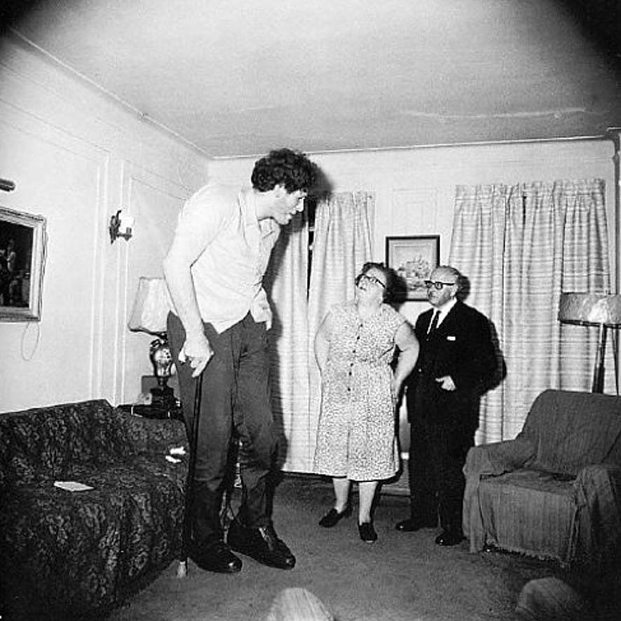
There are very tall people among us now, and no doubt there always have been. Here are photos of just a few of them:

Zhan Shi Chai (1840s-1893), Chinese, Eddie Carmel (1936-1972), Israeli-American, Ralph Madsen (1897-1948), American, and Sultan Kosen (1982-still living), Turkish.

These unfortunate people have often ended up being exhibited as freaks in circuses, and as there are few other job openings for them or anyplace where they "fit in," they usually grudgingly accept their fate and allow themselves to be exhibited. Their abnormal size is usually a result of a tumor on their pituitary gland (which regulates growth). Rather than being super-healthy, their condition often causes them to die young. These people are startlingly tall compared to the rest of us, but of course none of them have been "giants" of the kind that we know about from legends and fairy tales. They are not the type to cause an earthquake when they walk or eat a pile of whole roast oxen for dinner.

The giants of mythology and stories and movies and so on are always huge beyond a size that humans have ever grown to, and are extremely strong and powerful and often looking for a fight with gods, or with other giants, or else they're looking for a meal. No matter if they might be supposedly "friendly," such a giant would be frightening, as even the most careful and courteous giant might inadvertently step or sit down on people or animals or houses, etc., or knock over a building. He (sometimes she) would also use up the resources of the local "little people" in a hurry.

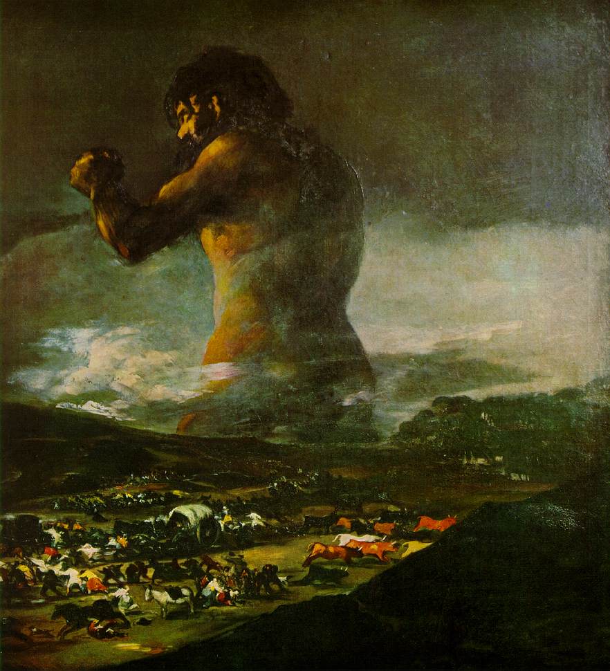
Though it's obvious that giants of this type have never actually existed in real life, they've been invented by writers, artists, and storytellers as metaphors to fill different needs. For instance, it is likely that the giant ("Colossus") in the painting shown below is meant to represent the Spanish people resisting Napoleon's invasion.


The Colossus - Click to see in larger size

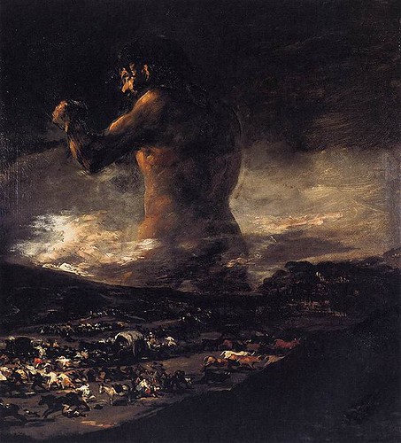
The Colossus - 1808-10
A clearer reproduction
Artist: This painting was formerly attributed to Francisco de Goya, but some experts now believe it is by Asensio Julia (1760-1832) (Here is a much better article on Julia, but in Spanish), a pupil and friend of Goya (Spanish - 1746-1828)
Picture, from Wikimedia, is in the public domain

To me this giant looks definitely of gargantuan size and strength, in addition to appearing somber, serious, and powerful. One would think mountains would crumble as he walked by.

What are some of the things the artist has done that make this giant seem so gargantuan and powerful? It's not just the size he has made the figures in the foreground, which are tiny in relation to the giant. If we are able to see this picture more clearly and in a larger size, we'll see there are people and animals in the foreground fleeing the area, but I didn't even notice them when I first looked at this dark reproduction of the picture, and wasn't aware of them until I read about them later; they just looked like specks of debris to me. When I saw another reproduction, I could see them, but even when I didn't know they were there the giant looked extremely gigantic. In fact, it seems to me that you could remove the bottom third or so of the picture, leaving out all the comparatively tiny humans and animals, and he would still look of monstrous size.

And what if we leave the bottom of the picture intact - Why is it that we don't see the Colossus as a man of normal size and the fleeing people and animals as being very tiny?

There are several things I can think of that the artist has done to make the Colossus look so gigantic and powerful. Here is what I've been able to come up with so far:

Borrowing the immensity of the sky

- There is the fact that he blends in with the black sky, making him "as big as the sky," since in many places you can't really see where he ends and the sky begins. I think that is one of the most effective methods the artist has used to imply monstrous size. What is bigger than the sky?

Making the giant appear to be rooted in the earth

- Although he seems to be part of the sky - or the sky seems to be part of him, at the same time he seems to be "rooted" in the earth (his body from the thighs down is either in a very deep valley or at the bottom of the ocean...neither one of which seems likely...or he is supposed to be buried from feet to thighs in the earth, not immobilized, but in order to appear figuratively deeply of this place and not about to be unsettled by mere interlopers), and this secure attachment to the ground gives him a look of great stability, adding to the impression of power and invulnerability.

Comparing his height with the height of the clouds

- He rises above the clouds...that alone makes him seem huge.

Contrasting his size with that of the clouds

- There is also, of course, the contrast in size between the clouds and the giant.

Contrasting his size with that of figures in the foreground.

- Mentioned above.

Having his eyes closed to show control of a huge reservoir of emotional energy

- The giant appears to have closed eyes. To me at least the closed eyes add to the feeling of power and strength contained within his massive and stable body. The closed eyes remind me of closed vents on a steaming pressure cooker. They show that he's holding back extremely strong emotions in order to keep them under control, presumably in order to make the best use of them, though he could explode with fury and action at any second.


The Colossus - Click to see in larger size

Making him appear reddish
- One thing that helps make him look powerful is the lighting, which presumably is caused by a setting sun, making him reddish, and therefore hot looking, which causes him to appear very "alive" and possibly angry or otherwise possessed by a powerful emotion about to erupt.

Illuminating the giant from a low angle

- The light shining on the giant is coming from a low angle, illuminating him as a just-setting sun would throw dramatic reddish light on a monstrous thundercloud to the east. Lighting him from "below" helps make him seem even taller.

Positioning his body so that he looks even bigger

- His raised arm and fist make him look bigger -- It gives him more bulk; and although his back is in blackness, much of its outline is clearly defined by the lighted clouds beyond it, so that we are aware of the thickness of the middle of his body -- If the background behind his back had also been black, he would not have looked so big and powerful. He would have look very tall, but "flimsy," not thick and strong.

Positioning him so that he appears to be rising

- Also, the raised arm, capped by a huge fist aimed upwards, along with the nearby head of the giant (which so strongly pulls our attention so near the top of the picture), makes it seem as if he's rising (and, as Arnheim [see Note 3, below] points out, what is rising is what we are alarmed by -- what is drooping or lying flat does not scream out "danger" to us; it calms us down as it is non-threatening). A rising giant (and/or the rising arm and fist of a giant) is definitely alarming.

Using a strong diagonal to show action

- The raised arm is the only really noticeable diagonal in the composition. We all know that a diagonal that is not supporting something signals "action," though that action could be "rising" or it could be "falling." The arm does look like it's rising, rather than falling, as the fist seems to "pull it up." Action, especially "rising" action, implies energy and power.

The Colossus - Click to see in larger size

Providing a viewpoint that makes the giant look huge

- Another thing that adds to the impression of hugeness is how the giant appears from our viewpoint. Even though he is a great distance away, we are looking "up" at the giant from approximately the level of his thighs, knowing that the rest of his lower body is far below our eye level. Just imagine how it would affect us if we saw such a thing from this viewpoint in real life.

Putting him in the upper part of the picture

- There is also the fact that objects that are higher up in a picture seem heavier than they would if they were lower in the picture. The giant is the only thing in the upper part of the picture, other than the clouds (which are "floating"). His raised arm and fist plus the thickness and three-quarter view of his body give him great width in this part of the picture. If his arm had been at his side and the hugeness of his back not defined by the light-colored clouds behind it, he would have looked tall but not massive. But he does have a raised arm and fist and etc. Not only that, but as mentioned, just because these things are so high up in the picture it makes him seem even heavier, and stronger. (If a person can easily hold up that much weight - the weight of his monstrous body - we can assume he is very strong).

Putting him in the distance

-- Oddly enough, something else that makes him look huge is putting him at such a distance from the foreground. How do we know that the giant is far in the distance? One way we can tell is that the mountains are in front of him (i.e., between the giant and the viewer) -- We may not assume that those dark shapes are mountains but even then we know that the entire foreground, whatever it is, is between him and us, cutting him off at the upper thighs, thereby, to our eyes, pushing him back behind something, which of course indicates that he is in the distance.

-- Another thing that implies distance is the dramatic difference in lighting between the foreground and background. Where the giant is, in the distance, the evening sunlight is still trickling through, but in the foreground you can hardly see what is going on; it is as if it's already nighttime there. Such a difference in lighting indicates a difference in depth. Knowing he's at a great distance, the fact that he still looks enormous is rather stunning.

The Colossus - Click to see in larger size

Putting him in the vertical center

- He is basically, as far as the legs and main trunk of his body is concerned, in the vertical center of the picture (though turned toward the left). Being in this position stabilizes him and makes him seem invulnerable.

Having him turn toward the left
- The fact that he is turning toward the left might show an attempt to push back at something that is coming at him from that direction. Action in a picture generally is imagined to begin at the left side and in this case the giant stops it and keeps it from going further. (Due to the fact that his base is firmly "planted" along the central vertical of the picture, the giant does not seem to have come from elsewhere, but to be defending himself from his home base, there in the center of the picture.) Having him turned toward the intrusion shows that he is quite aware of the danger and is able and prepared to do something about it ("the sleeping giant" has been awakened and he is furious).

Including fleeing people and animals

- Although these are hard to make out (at least in the copies of the painting I've seen), when you do notice them, they appear to be moving at top speed away from the giant, indicating, I would guess, one of three things:1) The giant is scaring them; 2) They know that something horrific is about to happen involving that giant and whatever he is facing; or 3) They are trying to escape whatever the giant is confronting, leaving him to take care of the problem. In any of these cases the giant, be he friend or foe, is having a terrific impact on these people and their animals.

Selecting a suitable format

- The picture is in the shape of a vertical rectangle, though not far from being a square. That is, it's "squat." This format reinforces the stocky, sturdy, powerful look of the giant.
_____

Although I have not seen the original painting, and I have probably not even seen a good reproduction (the picture shown here is the only one I've studied; I chose it because it was explicity said to be in the public domain), the ways in which it appears to me that this picture makes the giant look tremendously huge and powerful are still valid. My point is to reveal ways in which to make something look immense and fightfully strong and energetic. Certainly techniques such as these have been, and are, used not only in stories and drawings, paintings, photographs, etc., but also in other art "products"...from architecture to advertising...to make something - anything - appear to have similar qualities.
_____

NOTES:

1) The thoughts presented above on how the artist has made the giant appear to be so huge and powerful are my own, based on what I have read and understand; I am not pretending to be an expert, but I am very interested in composition and study the subject constantly.

2) I'm aware that The Colossus is now considered by some (most importantly, the Museo del Prado) to be the work of Goya's apprentice, Asensio Julia, yet it is very much in the spirit of what Goya himself would have done and some experts still believe it was painted by him. It doesn't matter here (in this post) who the artist was, as we're talking about how the composition makes the giant look gigantic, but it's interesting.

Here are some articles on this subject that you might want to read:
Wikipedia article on The Colossus (El Coloso), in English

Wikipedia article on El Coloso (The Colossus), in Spanish - This one is much longer and more interesting than the one in English.

"Does it matter who painted The Colossus - Goya or his apprentice?", Article in The Guardian (U.K.),

January 27, 2009, by Adrian Searle

Museo Nacional del Prado on the attribution of El Coloso
This is in Spanish, though Google will translate it. It's a long, very detailed, illustrated explanation of why they consider that El Coloso was not painted by Goya.


3) Rudolf Arnheim

Books by Arnheim consulted for this post:
--- The Power of the Center
--- Visual Thinking
--- Art and Visual Perception
To subscribe to the Thinking About Art Monthly Newsletter, see toward the bottom of the page.

August 18, 2011

Andre Kertesz

ANDRÉ KERTÉSZ, PHOTOGRAPHER
(Born in Hungary in 1894; died in New York City in 1985)

Photographers Robert Doisneau at left, André Kertész at right, during a talk in Arles, France, in 1975 - Photo provided through Creative Commons License 3.0 by Wolfgang H. Wogerer, Wien

AN INTERVIEW WITH ANDRÉ KERTÉSZA IN FOUR VIDEOS - Watch Them Below

There are many of Kertész's photographs shown in these videos. Don't be put off by the first video because of his difficult-to-understand English. It is definitely worth the trouble of trying to pick up what one can (and the interviewer, as well as the photos shown, do help). You will be glad you were patient when you get to the second and third videos, especially. The second and third time I went back through the interview, I understood what he was saying better and better, and of course I was able to see the photographs again and again.

After Kertész moved to the United States, to New York City, in 1936, his work, in the style he had always worked in, was rejected by magazines here (though his pictures had been published in European magazines) because it was too "human," too "sentimental" and "tells too many stories." Yes, he said, they were right, as that is what his photographs are about, those are the kinds of pictures he took. He said that they wanted photographs that were mechanically perfect, that were "documents," but his were, instead, sensitive and human, and "real."
___

"He left behind him a successful career and many close friends.  New York was a disaster.  His kind of photography was not understood, and magazines would not print his tender and sober images." (From second video, see below)
___

Nevertheless, he did some magazine work here in the U.S., though not able to fully exercise his unique creativity in the assignments he was given (for example he worked for House and Garden from 1945 to 1962), and he was very disappointed, but he stayed.  After he left House and Garden he was finally able to take the kinds of pictures he wanted to again.  Now he is recognized as the fine photographer that he was.

Note that you can watch these videos in a much larger size in the Thinking About Art Library.

André Kertész - Part 1
Master Photographers BBC series (1983)
9 minutes, 55 seconds

When first video finishes, scroll down to the next video


WHEN THIS VIDEO FINISHES, SCROLL DOWN BELOW TO THE NEXT ONE
__________

André Kertész - Part 2
Master Photographers BBC series
10 minutes, 20 seconds


WHEN THIS VIDEO FINISHES, SCROLL DOWN BELOW TO THE NEXT ONE
___________

André Kertész - Part 3
Master Photographers BBC series
7 minutes, 33 seconds


WHEN THIS VIDEO FINISHES, SCROLL DOWN BELOW TO THE NEXT ONE
__________

André Kertész - Part 4
Master Photographers BBC series
3 minutes, 53 seconds


__________

Here is another interview with Kertész, which you can read rather than listening to. It appears to be a transcription of a filmed interview. This is quite different than the interview in the videos, above. Almost every bit of this is regarding his experiences with photography from childhood until before he came to the U.S.


An excellent NY Times article on André Kertész (2005)


"Everything is a subject. Every subject has a rhythm. To feel it is the raison d'être. The photograph is a fixed moment of such a raison d'être, which lives on in itself." - André Kertész
To subscribe to the free Thinking About Art Monthly Newsletter, see below on this (or any) page.

July 18, 2011

Robert Hughes on Art Collectors

Robert Hughes: Commentary on Art Collectors (excerpt)
9 minutes, 58 seconds


Robert Hughes interviews an art collector who has paid millions of dollars for what hangs on his walls.  Hughes obviously didn't tell the person being interviewed ahead of time what he (Hughes) thought of the paintings, or of the artists who made them.


I would be interested in reading your comments on this.
___

Article on the same subject by Charles Saatchi: The hideousness of the art world
(This link added on December 5, 2011)
___

To subscribe to the free Thinking About Art Monthly Newsletter, see near bottom of the page.

June 14, 2011

Ronald Searle - Artist, Satirist, Cartoonist

Ronald Searle in video interview, 2010
Ronald Searle in video interview, March 2010

Ronald Searle, born March 3, 1920 in Cambridge, England, is mainly known in that country for his humorous (and wickedly satirical) cartoons about the beastly girls who attend the fictional St. Trinian's school for girls and for his Molesworth cartoons about a boy named Nigel Molesworth who attends a terrible boy's school. I had not heard of these much-beloved "school" cartoons or the books of cartoons or movies based on them...Well, in fact, I still have not seen them other than a few examples of each when I came across an interview with Searle recorded at the time of his 90th birthday; but I recognized his name right away and knew he was a famous cartoonist and that I have enjoyed his cartoons...probably I had seen them in magazines as I have always loved political and social commentary cartoons of a satirical nature and have never been able to get enough of them. Charmed by the interview and amazed that he was still alive (apparently many people are similarly amazed, since he left England to make his home in France and left behind St. Trinian's et all in 1961), I dove in and found out more about Searle so I could write this post on him.

Nigel Molesworth by Ronald Searle

Nigel Molesworth - Picture is from video interview with Ronald Searle

Although the "school" cartoons are quite famous, Searle has done much, much more and in fact was very glad to leave them behind so he could devote himself to other subjects. I've put together a page on Searle in the Thinking About Art Library. As the "Library" is actually an annex to this blog, I'll let you go there to watch a couple of videos in a much larger size than would fit in the format of this blog; one of the videos is of an interview with Searle at the time of his 90th birthday (in 2010) and the other shows illustrations he made for Dickens' "A Christmas Carol." There are also some links on the page to interesting articles on Searle, and a link to a site where you can find hundreds of his books (used) at low prices.

Cat from cartoon by Searle

From Searle cartoon shown in video interview with Ronald Searle

Searle's forte is satire, sometimes very strong satire. He has said that his experience as a prisoner of war made him take everything more seriously from that time on, inclining him to see the "dark side" of things.

Already an artist who had been obsessed with drawing since he was a child, his four years as a POW (held by the Japanese) when a very young man gave him "purpose," he says. He felt that he had to record what was happening, to illustrate what he and his fellow prisoners of war were going through which he felt people should know about, and so he drew prolifically while a prisoner, on whatever blank surface he could get his hands on, trading cigarettes for scraps of paper (he traded drawings for the cigarettes). He hasn't stopped drawing since. He is amazed himself at how much he has drawn during his lifetime. The interview video will give you a good idea of how much he has done. And he continues drawing even in his nineties, and why not, as it's what he loves. Currently he is drawing for the Paris daily "Le Monde." "It is the illustrations for Le Monde by which he now wishes to be judged, and he hopes they will appear next year in an English- language version of a book already in print in France. They are simple, stark and highly political condemnations of political chicanery and double-dealing, corporate greed and global inequality." (Quote is from a December 2006 profile on Ronald Searle in The Guardian.)

Ronald Searle - POW drawing

Drawing Searle made as a POW - from
video interview (see link below)

Searle is a man with a point of view, with strong feelings...with something he wants to say (though sometimes he's kidding, as in the "school" cartoons), and what he wants to say comes out very, very strongly in his drawings - though of course his feelings are exaggerated - that's what makes them "comic." His caricatures are all expression. He doesn't worry about making something look superficially "realistic," as that isn't necessary and in fact would get in the way of what he wants you to know about it/him/her/the situation - It's the exaggeration of some characteristics (and contraction or even absence of others), and gestures, proximity, etc. that tell us what the characters are really like or what they're thinking.

From Ronald Searle cartoon

From a cartoon by Searle - from video interview in 2010
 
Ronald Searle has illustrated dozens and dozens of books, has drawn for animated films, has made many, many cartoons for such magazines as Punch, The New Yorker, and Holiday, and also has created advertisements...among other things.

Ronald Searle Videos and links in the Thinking About Art Library.


Man with cigar from cartoon by Searle

From a cartoon by Searle, shown in a 2010 video interview.


Note: My posts always "fall apart" when they're first published, with too much space between some things and not enough between others.  I will correct these things as I can as I can.

To subscribe to the Thinking About Art Monthly Newsletter, see toward the bottom of the page.

May 10, 2011

Alfred Stieglitz

Alfred Stieglitz - 1902
Photographer: Gertrude Kasebier

Alfred Stieglitz (1864-1946) was "an American photographer and modern art promoter who was instrumental over his fifty-year career in making photography an accepted art form." (Quote is from Wikipedia article on Stieglitz.)

Although Stieglitz was born in Hoboken, New Jersey (January 1, 1864), his parents were from Germany. In fact, the family moved back to the home country in 1881, when Alfred was a teenager. There he attended the equivalent of high school in Karlsruhe, then studied mechanical engineering in Berlin. He fell in love with photography at that time and traveled through the countryside in Germany, Italy, and the Netherlands taking pictures (he received a large allowance from his father). All of the family except Alfred returned to the U.S. in 1884 - Stieglitz stayed on until he was called back by his family in 1890. By then he was thoroughly dedicated to photography, had read extensively on the subject, and had written regular articles on photography for magazines in England and Germany. Also, he was winning prizes for his photographs.

When he got back to the U.S. in 1890, he was in his twenties. He already considered himself an artist (with a camera) and did not look for employment and did not have to as his father continued to support him. Later, his first wife was also able to support him. And so, with his natural talent and sensitivity, constant hard work, unflagging enthusiasm, and unwavering love for his photographic art - and usually no need to work at anything else - he lived quite a fascinating life that ordinary people could only dream of.

Below I am including three of his photographs (one is of his second wife, artist Georgia O'Keeffe), and also one very good video. Please note that you can see this video in a much larger size and also see more videos on Stieglitz in the Thinking About Art Library.

Above: Fifth Avenue, Winter (New York City) - 1892
Photographer: Alfred Stieglitz

"My picture, 'Fifth Avenue, Winter' is the result of a three hours' stand during a fierce snow-storm on February 22nd 1893, awaiting the proper moment." - Alfred Stieglitz

Above: The Hand of Man - 1902
Photographer: Alfred Stieglitz


Above: Georgia O'Keeffe - Hands - 1918
Photographer: Alfred Stieglitz


"The ability to make a truly artistic photograph is not acquired off-hand, but is the result of an artistic instinct coupled with years of labor." - Alfred Stieglitz

ALFRED STIEGLITZ - EARLY WORK/PICTORIALISM
9 minutes, 15 seconds


VIEW THIS VIDEO - AND OTHER VIDEOS ON ALFRED STIEGLITZ - ALL IN A MUCH LARGER SIZE - in the Thinking About Art Library. There are other art-photography videos in the Library, also.
_____

Alfred Stieglitz - Biographical material

There are several articles on the web on Stieglitz. I liked these:

Article on Stieglitz on Wikipedia. This is a thorough one-page biography that includes many facts that are not necessary to know and yet do make him seem more like a person who is connected to the past, to what was going on in the world while he was alive, to his unique experiences in that world, to his family, to his friends, to people who didn't like him, to his lovers, and to his wives.  If one believes that a person's achievements all come entirely from within that person without outside influence of any kind, then it would not be necessary or of interest to read anything other than, for example in this case, how he composed and developed his pictures and what he did with them in the darkroom afterwards, what kinds of cameras he used, what his subjects were, etc.  There is nothing wrong with keeping an article to these sorts of facts, but neither is it a crime to place the photographer in his world, and that is what this writer has done, although certainly there are many more details than I personally think were necessary to do this effectively.  Still, if you feel like taking the time to read it, it's a good story.

New York Times article on Alfred Stieglitz - February 13, 1983  This article refers to an exhibition of Stieglitz' photographs at the National Gallery of Art. The author mentions that Stieglitz's earliest pictures (taken in Europe) were reminiscent of quiet rural genre scenes by painters such as Courbet and Millet (this kind of treatment is known as "Pictorialism"), but when he began taking his late-19th-early-20th century photographs in New York City the scene was so different that Stieglitz's style changed dramatically as he reacted to a city where much was happening and rapidly changing; and later his familiarity with and admiration for modern art seems to have made him look for more abstract compositions.
_____

NOTE: There is a new post on Alfred Stieglitz (Jan. 25, 2012)

To subscribe to the Thinking About Art Monthly Newsletter, see toward the bottom of the page.

April 26, 2011

HENRI EDMOND CROSS

Antibes, afternoon - 1908

Antibes - Afternoon - 1908
Artist: Henri Edmond Cross (1856-1910)

Henri Edmond Cross was a French "Divisionist" painter, though he did not paint in that style until after he had met Georges Seurat and Paul Signac who had invented the technique (they had each come across
this technique separately, then met and developed their ideas further together). Divisionist painters did not "mix" colors, but applied them as small dabs or strokes side by side so that they would "mix" when seen at a distance. This made the colors appear more vibrant.

Cross' original surname was Delacroix but he changed his name to an English version to avoid confusion with Eugene Delacroix. He was born in northern France and settled in Paris in 1881. His early paintings were in the Realist style, but he started painting in lighter colors after he met Claude Monet in 1883; in that year also he spent time in the South of France where he became interested in landscape painting. He met Georges Seurat and Paul Signac in 1884.

Although very interested in the Divisionist (also referred to as "Pointillist" and "Neo-Impressionist") technique, Cross didn't begin painting in the Divisionist style until the year Seurat died, in 1891, beginning with a painting of his wife. In the same year Cross moved to the Mediterranean coast for health reasons.

After 1895 Cross' colors became more intense and he changed from dots to larger brush strokes. He continued to modify his style (but kept to a form of Divisionism) and for a while he painted nudes and mythological figures into his landscapes. In 1897, his friend Paul Signac moved to Saint-Tropez, close to where Cross lived in Saint-Clair. In 1904 Cross met Matisse in Saint-Tropez and they became friends. Cross made two trips to Italy before the end of his life. He died in 1910.

Rocks at Trayas - 1902 - watercolor

Rocks at Trayas - 1902
Artist: Henri Edmond Cross

Note in the following painting by Henri Matisse how he had been influenced by the Divisionist technique of Seurat and his followers, as were many other artists. Divisionism (as well as other post-Impressionist styles, for instance that of Gauguin and of Van Gogh) had a particularly strong influence in the development of Fauvism, of which Matisse was a leader.

Les toits de Collioure - 1905

Les toits de Collioure - 1905
Artist: Henri Matisse (1869-1954)

VIDEO

Henri Edmond Cross
10 MINUTES, 14 SECONDS
(There is no sound with this video.)


To subscribe to the Thinking About Art Newsletter, which goes out on the first day of every month, see near the bottom of the page.

April 18, 2011

The Square Format - Example 3


Fiesta Gallega ("Galician Festivities") - no date
Artist: Joaquin Sorolla (1863-1923)

This is the third post with an example of the square format used in a painting.

The first example was a painting by Alfred Sisley titled The Rest by the Stream. The second example was a painting by George Bellows called Cliff Dwellers.

THE ROLE OF THE SQUARE FORMAT IN ACHIEVING THE MOOD THE ARTIST WISHED TO CONVEY

I don't know how it looks to you, but I would characterize the mood of Fiesta Gallega as intense, vibrant, and serious.

This painting has quite a different mood to it than that of either the peaceful, restful, and refreshing Rest by the Stream or the tense, stifling, claustrophobic Cliff Dwellers, and yet they were all painted in a square format which does strongly affect the mood and the "message" in all of these pictures, no matter that the mood and message are not the same.

In the Cliff Dwellers there seems to be no possible relief from the tension that is produced to a great extent by the four "walls" of the square painting's edge, which push inward toward the center, contributing strongly to the feeling that the people are not able to escape the scene.

In the Rest by the Stream the "pressure" applied to the scene by the four sides of the square is not able to achieve a depressing mood because of many other factors that have quite the opposite effect; instead it gives just enough of a gentle push inward to make the scene seem cozy and secluded.

In Fiesta Gallega, while the four sides of the picture do seem to press in and hold the people snugly together (it looks like they've been collected and set down inside a crowded little box in which they still stand, not sure what to do), the background seems to offer an area of escape and refreshment that would be available to all of these people should they wish to simply walk away from where they are all tightly gathered together; yet it also somehow reminds me of the bit of landscape you see in the background of such paintings as the Mona Lisa -- not on the same plane as the ground the subject stands on, but more like a picture on the wall behind the subject. In any case, although the pressing in from the edges of the square frame in Fiesta Gallega does make things look "intense," the mood is not oppressive; in fact other compositional factors (colors, value contrasts, overall texture, etc.) decide how much "compacting" influence a square format contributes, though virtually always it will have some influence.

WHY THIS IS SQUARE AND NOT HORIZONTAL

As this is not a horizontal picture, we of course do not see any space to either side of the tight group of people who are packed into a square box-like shape. It's not that we can't imagine space, and people, extending to either side beyond the frame, and in fact we can see "parts" of people at both the left and right edges, suggesting the crowd is larger than what we see within the square frame. However, most paintings are meant to give us their message without our having to imagine parts that aren't there - unless it has been strongly suggested by the artist that something outside of the picture is important to what's going on on the inside (e.g., by adding the tip of a lightning bolt striking the ground at one edge). The viewer will bring his or her imagination and knowledge to the picture, but the composition is that of the artist, who has certain aims in mind, and one thing the artist did to accomplish those aims in this case was to make the composition square rather than horizontal. To either see, or imagine, the people spread out to left and right would take away from the intensity and feeling of common purpose and predicament the painter presumably was trying to communicate by "painting them into a box."

WHAT IS IN THE CENTER OF THE PICTURE

A solid blue hat on the head of a young woman is found right in the middle of this picture. It is the only sizable area of solid blue in the whole crowd of people. It is natural - one does not even have to think about it - to look at the center of a square picture in order to orient yourself (the same as if you were trying to find your way around in a square plaza - it will probably have something in the middle that everything else in the plaza will relate to, for example a fountain or a bandstand, and by keeping track of where that central object is you can find your way around), and in some square pictures you'll find the main subject right there in the middle ... or if it isn't there it's often close by. Being a different color than all that surrounds it makes this blue hat even more eye-catching. Obviously this hat on the head of a young woman is not the main subject, though; instead it serves as the "balancing center" of the picture (like a fountain is to the plaza), to which everything else in the picture is related.

THE SUBJECT AND THE CENTER

So, what is the main subject? Actually, we should probably ask instead what is the "dominant center," as Arnheim calls it (or you might call it the "focal point") in the picture, as to me at least, the main area of interest in this picture is not its subject, but, rather, an anonymous example of what the festivities mean to these people. That is, the people (more about them below) who are at the "dominant center" or "focal point" of the picture are probably not any particular people and what they are doing is not making history, even in their local group, but the relationships that we observe between these three people show a certain seriousness in the mood and the importance, to them, of carefully and conscientiously following customs.

It seems to me that the subject is, as the title says, "Fiesta Gallega." All of the people, the sunshine and the shade, the green grass and the trees and the feeling of being outdoors and of sharing a common heritage and customs -- These are all, together, the subject.

MORE ABOUT WHAT'S IN THE DOMINANT CENTER

The dominant center (or "focal point") of the picture includes the man in the red jacket and the woman facing him, and also the man in black and white directly behind the red-jacketed man. There are several reasons these three people seem "central" to the picture in spite of their not being at its geometrical center. One of those reasons is that they are positioned directly beside the head of the girl in the blue hat and in fact the man in black and white is actually positioned on the central vertical and the back of the man in the red jacket it up against that central vertical (the woman in the dominant center, although further away from the balancing center than the men, is part of the little group). The reason this group is not actually at the very center is that this position in a square (as in a tondo) is usually reserved for a subject that is rooted deeply, that is "timeless," unchanging, unmovable. You must be away from the center if you are to be seen as active
-- as "living" rather than "existing" (or "being").

EVIDENCE OF THE CARTESIAN GRID

There is quite a lot on this blog, in other posts, about the Cartesian Grid, so I won't go into much detail in this post about why it's used and how it works. Ultimately - believe it or not - it has to do with the fact that we live on a planet with a strong gravitational pull and so an artist who wishes to represent life as it is lived here on Earth must be aware of the grid, whether consciously or unconsciously. Evidence of the grid is seen in verticals (sides of buildings, fence posts, tree trunks, standing people, etc., etc.) and horizontals. This probably is not new to you, but if it is, you can read some of my other posts, perhaps especially Art, Gravity, Life, and the Cartesian Grid.

The square format alone (with its two vertical and two horizontal edges) is strong evidence of the Cartesian Grid being taken into account, but also there is other evidence of the grid in this picture. It doesn't matter that there are no perfectly straight lines or shapes inside the picture. The trunk of the tree at upper left and the small (because it's "distant") but noticeable yellow trunk of a tree at the upper right of the picture both provide evidence of the artist's awareness of the grid - He is showing verticality in these shapes.

There are also full top-to-bottom views of the two (standing, thus vertical) people who are at the dominant center of this picture, plus there is the woman standing in the left foreground who provides a vertical shape all the way to the bottom of the picture.

Verticality is especially strong in the case of the man in the red jacket. He is wearing dark clothes from the hat on his head down to and including his shoes, so he blends right in with the dark ground at his feet, making a long vertical shape that goes from the top of his head to the very bottom of the picture, anchoring him (and the other two people he is with) solidly to the ground in the right foreground thus helping to offset the general tilting of the picture's contents toward the left (as the thick dark trunk and leafy branch of the tree are also helping to do - by "lifting" - at upper left); in this way the artist makes the entire picture look lively and energetic (due to the "balancing act" that's going on) even though we see no apparent movement among the people. (There are also other factors which contribute to making the scene look "lively" in spite of the fact that the people are as quiet and still as mourners at a funeral, but in this post I'm focusing on "squareness" and the "grid" and the roles they play.)

The one (but very strong) horizontal is the brightly-lit background scene at the top of the picture, and by the way it seems all the more slanted because of the proximity of the verticals which frame it to the left and to the right as well as the comparison with the horizontal edge of the picture just above it. (Yet slanted or not, it works as a horizontal.) Incidentally, you may have noticed that the people are not on level ground, either, but apparently are standing on the same slope that is shown in the background. This is not immediately obvious, though, because the tilting is balanced by counterforces, including those mentioned in the last paragraph.

There is much more that it's tempting to say about this picture, but I've tried not to stray too far from a discussion of the effects that "squareness" has contributed to it.
keywords: center, composition, gravity, horizontality, Sorolla (Joaquin), square, square format, verticality
To subscribe to the Thinking About Art Monthly Newsletter, see toward the bottom of the page.

March 18, 2011

Video on The Harvesters by Pieter Bruegel the Elder

THE HARVESTERS - 1565 - by Pieter Bruegel the Elder
(c. 1525-1569)

This painting is also called The Wheat Harvest. It's one of a series of paintings of the months that Bruegel made for a client (Niclaes Jonghelinck) in 1565. One of the paintings is missing, leaving five in different museums. This painting, The Harvesters, was made to represent the months of August and September.

The Metropolitan Museum of Art has an interesting five-and-a-half-minute video in which they talk about this painting. In it they call The Harvesters "the first modern landscape in western art." I would like to have shown the video here, but it is only available at the site, so click here to watch it. Look just below on this post to see the other paintings in this series that have survived.

The Hunters in the Snow - December-January

The Dark Day - February-March

April-May is the missing picture


The Hay Harvest - June-July

August-September is the picture at the top of this post:
The Harvesters, also known as The Wheat Harvest

The Return of the Herd - October-November

The best biography of Pieter Bruegel the Elder that I have been able to find online.

To subscribe to The Thinking About Art Monthly Newsletter, see near bottom of the page.