Fiesta Gallega ("Galician Festivities") - no date
Artist: Joaquin Sorolla (1863-1923)
This is the third post with an example of the square format used in a painting.
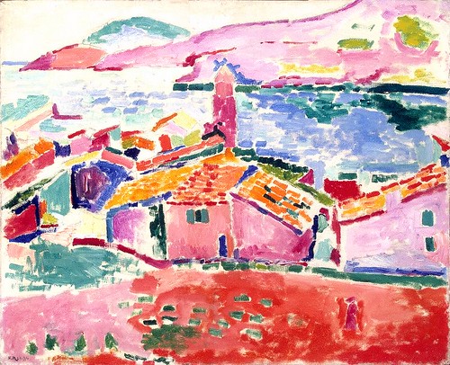
The first example was a painting by Alfred Sisley titled
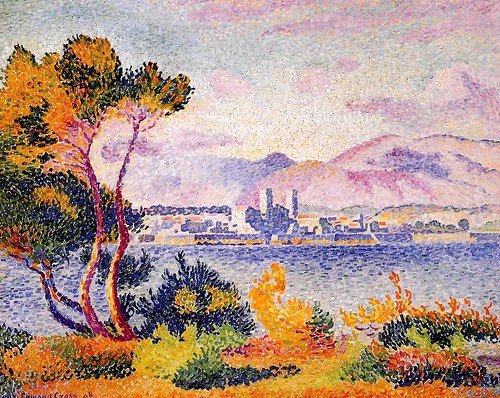
The Rest by the Stream. The second example was a painting by George Bellows called
Cliff Dwellers.
THE ROLE OF THE SQUARE FORMAT IN ACHIEVING THE MOOD THE ARTIST WISHED TO CONVEY
I don't know how it looks to you, but I would characterize the mood of Fiesta Gallega as intense, vibrant, and serious.
This painting has quite a different mood to it than that of either the peaceful, restful, and refreshing
Rest by the Stream or the tense, stifling, claustrophobic
Cliff Dwellers, and yet they were all painted in a square format which does strongly affect the mood and the "message" in all of these pictures, no matter that the mood and message are not the same.
In the
Cliff Dwellers there seems to be no possible relief from the tension that is produced to a great extent by the four "walls" of the square painting's edge, which push inward toward the center, contributing strongly to the feeling that the people are not able to escape the scene.
In the
Rest by the Stream the "pressure" applied to the scene by the four sides of the square is not able to achieve a depressing mood because of many other factors that have quite the opposite effect; instead it gives just enough of a gentle push inward to make the scene seem cozy and secluded.
In
Fiesta Gallega, while the four sides of the picture do seem to press in and hold the people snugly together (it looks like they've been collected and set down inside a crowded little box in which they still stand, not sure what to do), the background seems to offer an area of escape and refreshment that would be available to all of these people should they wish to simply walk away from where they are all tightly gathered together; yet it also somehow reminds me of the bit of landscape you see in the background of such paintings as the Mona Lisa -- not on the same plane as the ground the subject stands on, but more like a picture on the wall behind the subject. In any case, although the pressing in from the edges of the square frame in
Fiesta Gallega does make things look "intense," the mood is not oppressive; in fact other compositional factors (colors, value contrasts, overall texture, etc.) decide how much "compacting" influence a square format contributes, though virtually always it will have
some influence.
WHY THIS IS SQUARE AND NOT HORIZONTAL
As this is not a horizontal picture, we of course do not see any space to either side of the tight group of people who are packed into a square box-like shape. It's not that we can't
imagine space, and people, extending to either side beyond the frame, and in fact we can see "parts" of people at both the left and right edges, suggesting the crowd is larger than what we see within the square frame. However, most paintings are meant to give us their message without our having to imagine parts that aren't there - unless it has been strongly suggested by the artist that something outside of the picture is important to what's going on on the inside (e.g., by adding the tip of a lightning bolt striking the ground at one edge). The viewer will bring his or her imagination and knowledge to the picture, but the composition is that of the artist, who has certain aims in mind, and one thing the artist did to accomplish those aims in this case was to make the composition square rather than horizontal. To either see, or imagine, the people spread out to left and right would take away from the intensity and feeling of common purpose and predicament the painter presumably was trying to communicate by "painting them into a box."
WHAT IS IN THE CENTER OF THE PICTURE
A solid blue hat on the head of a young woman is found right in the middle of this picture. It is the only sizable area of solid blue in the whole crowd of people. It is natural - one does not even have to think about it - to look at the center of a square picture in order to orient yourself (the same as if you were trying to find your way around in a square plaza - it will probably have something in the middle that everything else in the plaza will relate to, for example a fountain or a bandstand, and by keeping track of where that central object is you can find your way around), and in some square pictures you'll find the main subject right there in the middle ... or if it isn't there it's often close by. Being a different color than all that surrounds it makes this blue hat even more eye-catching. Obviously this hat on the head of a young woman is not the main subject, though; instead it serves as the "balancing center" of the picture (like a fountain is to the plaza), to which everything else in the picture is related.
THE SUBJECT AND THE CENTER
So, what
is the main subject? Actually, we should probably ask instead what is the "dominant center," as Arnheim calls it (or you might call it the "focal point") in the picture, as to me at least, the main area of interest in this picture is not its
subject, but, rather, an anonymous example of what the festivities mean to these people. That is, the people (more about them below) who are at the "dominant center" or "focal point" of the picture are probably not any particular people and what they are doing is not making history, even in their local group, but the relationships that we observe between these three people show a certain seriousness in the mood and the importance, to them, of carefully and conscientiously following customs.
It seems to me that the subject is, as the title says, "Fiesta Gallega." All of the people, the sunshine and the shade, the green grass and the trees and the feeling of being outdoors and of sharing a common heritage and customs -- These are
all, together, the subject.
MORE ABOUT WHAT'S IN THE DOMINANT CENTER
The dominant center (or "focal point") of the picture includes the man in the red jacket and the woman facing him, and also the man in black and white directly behind the red-jacketed man. There are
several reasons these three people seem "central" to the picture in spite of their not being at its geometrical center. One of those reasons is that they are positioned directly beside the head of the girl in the blue hat and in fact the man in black and white is actually positioned on the central vertical and the back of the man in the red jacket it up against that central vertical (the woman in the dominant center, although further away from the balancing center than the men, is part of the little group). The reason this group is not actually at the
very center is that this position in a square (as in a tondo) is usually reserved for a subject that is rooted deeply, that is "timeless," unchanging, unmovable. You must be away from the center if you are to be seen as active
-- as "living" rather than "existing" (or "being").
EVIDENCE OF THE CARTESIAN GRID
There is quite a lot on this blog, in other posts, about the Cartesian Grid, so I won't go into much detail in this post about why it's used and how it works. Ultimately - believe it or not - it has to do with the fact that we live on a planet with a strong gravitational pull and so an artist who wishes to represent life as it is lived here on Earth must be aware of the grid, whether consciously or unconsciously. Evidence of the grid is seen in
verticals (sides of buildings, fence posts, tree trunks, standing people, etc., etc.) and
horizontals. This probably is not new to you, but if it is, you can read some of my other posts, perhaps especially
Art, Gravity, Life, and the Cartesian Grid.
The square format alone (with its two vertical and two horizontal edges) is strong evidence of the Cartesian Grid being taken into account, but also there is other evidence of the grid in this picture. It doesn't matter that there are no perfectly straight lines or shapes inside the picture. The trunk of the tree at upper left and the small (because it's "distant") but noticeable yellow trunk of a tree at the upper right of the picture both provide evidence of the artist's awareness of the grid - He is showing
verticality in these shapes.
There are also full top-to-bottom views of the two (standing, thus vertical) people who are at the dominant center of this picture, plus there is the woman standing in the left foreground who provides a vertical shape all the way to the bottom of the picture.
Verticality is especially strong in the case of the man in the red jacket. He is wearing dark clothes from the hat on his head down to and including his shoes, so he blends right in with the dark ground at his feet, making a long vertical shape that goes from the top of his head to the very bottom of the picture, anchoring him (and the other two people he is with) solidly to the ground in the right foreground thus helping to offset the general tilting of the picture's contents toward the left (as the thick dark trunk and leafy branch of the tree are also helping to do - by "lifting" - at upper left); in this way the artist makes the entire picture look lively and energetic (due to the "balancing act" that's going on) even though we see no apparent movement among the people. (There are also other factors which contribute to making the scene look "lively" in spite of the fact that the people are as quiet and still as mourners at a funeral, but in this post I'm focusing on "squareness" and the "grid" and the roles they play.)
The one (but very strong)
horizontal is the brightly-lit background scene at the top of the picture, and by the way it seems all the more slanted because of the proximity of the verticals which frame it to the left and to the right as well as the comparison with the horizontal edge of the picture just above it. (Yet slanted or not, it works as a horizontal.) Incidentally, you may have noticed that the people are not on level ground, either, but apparently are standing on the same slope that is shown in the background. This is not immediately obvious, though, because the tilting is balanced by counterforces, including those mentioned in the last paragraph.
There is much more that it's tempting to say about this picture, but I've tried not to stray too far from a discussion of the effects that "squareness" has contributed to it.
keywords: center, composition, gravity, horizontality, Sorolla (Joaquin), square, square format, verticality
To subscribe to the Thinking About Art Monthly Newsletter, see toward the bottom of the page.