THE SQUARE FORMAT

The Rest by the Stream - 1872
Artist: Alfred Sisley (1839-1899)
In this picture the square format helps achieve a peaceful, stable effect, much like a tondo (which is in the shape of a circle) does and for the same reasons (see Rudolf Arnheim's The Power of the Center, Chapter VI: Tondo and Square). The tondo shape, however, does not give a feeling of being grounded, which a square format is very capable of doing, and does here.
Although once you have seen this picture for the first time you may then look around the scene for details in other areas, your eyes are first and foremost drawn to the middle, where close and distant foliage mingle. For me, at least, that center area seems like a pinwheel that turns slowly and hypnotically, sometimes to the right, sometimes to the left, and it's hard to glance away from it.
The intense focus on the center (in spite of there being nothing there but indistinct leafy branches) has as much to do with the square format as with the large shapes in the composition that lead you there. A horizontal format or a vertical format would suggest something is happening or about to happen, or relationships are being revealed, or etc., causing you to look all around the picture to get some clues as to what's going on. But a square scene seems to just sit there quietly, its outer four edges implying a central point that they're all equally distant from and related to so that you simply can't help but look toward that calm and steady central point when you begin to search for the subject.
The square shape, with four straight edges of equal length and at right angles to each other, imply the balancing center of picture is in the actual "geometric" center of the square. This central focal point makes the picture (or at least whatever is at the very center of it) seem very balanced, solid and stable, as if it's not going anywhere nor is it concerned with anything that is outside of the edges of the picture. (Certainly an artist could make the subject look as if it's concerned with something beyond the edges, but in general the square format is used for a self-contained picture and it is very suitable for it.) The scene is made to look even more stable in this particular picture because of the depth the artist has given the scene, giving it the look of being inside a square "box" (cube) that is solidly resting on the earth's surface.
The role of the Cartesian Grid
The feeling of stability is further reinforced by the tree trunks that repeat the verticals of the sides of the picture, as well as the lower edge of the brightly lit grass behind the tall trunks and the bit of horizontality seen in the distant footbridge and suggested on the roof of the house at left which repeat the horizontals of the top and bottom of the square frame. These large and small bits of vertical and horizontal "lines" that can be seen imply a stable structure beneath the rolling ground and other curving shapes that fill the canvas. They suggest that the Cartesian grid is being utilized in this painting. The Cartesian grid considers the earth to be fundamentally flat (though of course, those who use the Cartesian grid know the earth is spherical; it is just that for many practical purposes it is flat enough within the areas we make use of that it is most practical for us to consider it flat and even to flatten it if it's not, e.g. in the case of floors, roads, sidewalks, and building foundations). The Cartesian grid (or Cartesian Coordinate System) is made up of verticals and horizontals that are perpendicular to each other. These horizontals and verticals are seen to be stable (inactive but solid and secure). When the structure of the Cartesian grid is evident in the composition, you are able to notice when things are not in line with it (i.e., not strictly vertical, or not strictly horizontal), thus enabling you to detect movement, direction, slopes, curves, etc. To find out more about what the Cartesian grid has to do with art, you might want to read an earlier post: Art, Gravity, Life, and the Cartesian Grid.
The Cartesian Grid combined with the Centric System
In this particular picture being discussed here (The Rest by the Stream by Alfred Sisley - see above) the Centric System and the Cartesian grid system are both effectively utilized to bring about the feeling of calm restfulness the painting's title promises.

Combined Centric and Grid Systems
The above diagram, which so perfectly applies to this square painting by Sisley, and more on this subject can be found in an earlier post, entitled Centric Systems. In that post it is noted that the Introduction to The Power of the Center, by Rudolf Arnheim, begins with this sentence: "This book derives from a single idea, namely that our view of the world is based on the interaction of two spatial systems." Those two spatial systems are the Centric System and the Cartesian grid system.
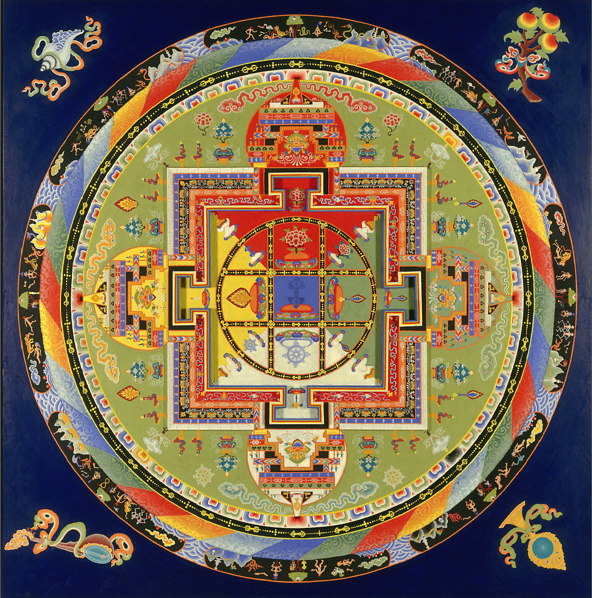
The similarity to a mandala
"Mandala is a Sanskrit word that means 'circle'. In the Hindu and buddhist religious traditions, their sacred art often takes a mandala form. The basic form of most Hindu and Buddhist mandalas is a square with four gates containing a circle with a center point." (This quote is from a Wikipedia Article on the mandala.) The article goes on to say that "mandalas may be employed for focusing attention of aspirants and adepts, as a spiritual teaching tool, for establishing a sacred space, and as an aid to meditation and trance induction."
Note how the mandala seen below combines the Centric System and the Cartesian grid system in the same way they are combined in the Sisley painting.
The cubical "enclosure"
The feeling of a snug cubic "enclosure" surrounding this scene also adds to the serenity and satisfaction we feel when viewing it. It is like viewing a scene in a glass sphere except that in the case of the cube we feel as if we could actually enter the scene, whereas the sphere rejects us -- we can only look at it from the outside. (You can read about the scene within a sphere under the last picture in an earlier post, titled Round Artworks).
There are other factors, also, which contribute to the
"restfulness" of this picture, but they do not have to do with its "squareness."
The Square Format - Example 2


4 comments:
Thanks for this very informative discussion on the square format...one of my favorites to work with.
Karen, Thank you so much for your comment! It is very much appreciated! - Jean
Thanks for the very interesting discussion, Jean. Like Karen, the square format is a favorite of mine as well. Since it doesn't automatically suggest landscape as does a horizontal format, and carries none of the potential hierarchical up-versus-down symbolism of a vertical format, it seems to free the contemporary artist to produce an unencumbered modern interpretation. I hadn't considered the restfulness it offers too in its inherent stability.
Brian, Thank you for your comment! I, also, am attracted to the square format. As you would already know, of course, there are some compositions in the square format that are not at all meant to be restful and calming - quite the opposite sometimes - but they can still be seen as "stable" and/or "under control" in the sense of being confined (though perhaps at the same time intensified locally) by their square boundaries. I'll be writing soon about other square compositions with quite different subject matter. - Jean
Post a Comment