THE LAST FLOWER
Text and illustrations by James Thurber, 1939
Four minutes, Twelve seconds
(There is sound)
To subscribe to The Thinking About Art Monthly Newsletter, see near bottom of the page.
December 29, 2010
The Last Flower
December 21, 2010
Visiting Spirits - Where Are They Coming From?
When it comes to the entrance of spirits onto a scene, the main rule is this (as we all know): The exceptionally good ("holy") and powerful spirits come from above and the exceptionally bad (as in "they are coming from Hell") and powerful ones come from below -- while ghosts of ordinary dead people enter at ground level (unless they're raised from their grave six feet below the surface - but then they end up at ground level or just barely above).
Another "rule" seems to be that these visitors usually enter the scene to the left (i.e., the viewer's left) of the person or persons they've come to interact with. Of course there are exceptions, but it does seem that most of them enter from the left, especially if it's their idea (or the idea of their superior, who has given them orders) to make this contact with one or more living humans (and sometimes animals); on the other hand, it seems that in most cases if someone summons a spirit then the summoner is shown to the left of the spirit.
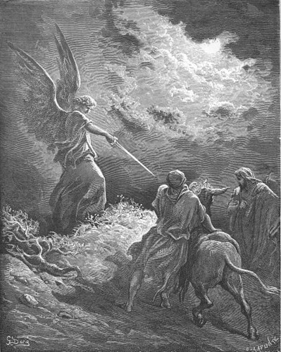
An Angel Appears to Balaam - 1866
Artist: Gustave Doré (1832–1883)
From Wikimedia, this picture is in the public domain
The angel, who at this point can only be seen by the donkey, has obviously entered the scene from the left (i.e., the viewer's left), and obviously from above, as we can see that she has wings of a size that would be awkward for regular use at ground level but very useful for flying purposes, plus of course it is common knowledge that angels live in Heaven (which is "above").
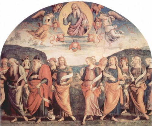
Gottvater mit Propheten und Sibyllen - 1497-1500
Artist: Pietro Perugino (1446-1524)
Artist: Pietro Perugino (1446-1524)
When God himself decides to communicate with people on earth, things are a little different. In pictures he very often seems to reveal himself from directly above - or very close to it - and doesn't come anywhere near ground level. He is often in something resembling a bubble, or large halo (aureola) when he is in this location. In addition to announcing his "holiness," these appear to seal him off from everything outside them. This appearance by God does not have to do with approaching humans at their level. This is not a "visit" so much as "vision," or some kind of a revelation, and is a one-way communication, apparently without any expectation of, nor desire for, immediate personal response from the human(s) below. The fact that he is near the top of the picture also makes it clear that this is a picture that is meant to imply a hierarchy wherein the person "on top" has power over those below even though they may not come into direct contact with them.*
* Please see other posts on this blog that have to do with gravity and how it influences our interpretation of what is going on in a picture. Not only does our understanding of gravity "tell us" that what is up higher has more weight (in a picture - not in real life) and thus (at least if it is not very close to or actually touching an edge of the picture) has power over what is below it, but also we are aware that something that is higher up can "observe" and perhaps understand better (and for that reason, too, have an advantage over) those who are below -- while those below, of course, for the same reasons are at a disadvantage.
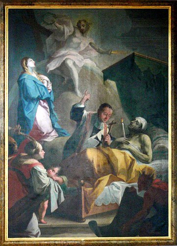
Picture from a German church
From Wikimedia - Photo of this painting taken by Andreas Praefcke
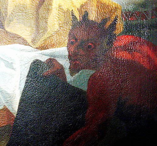
I don't know the story behind the deathbed scene above, but this picture seems to me to be extremely easy to read, with its zigzag composition that includes all the characters, who are arranged in a way that tells us much more quickly than words what is going on here -- Without knowing anything about this, not even the title, it appears obvious to me that: the man is dying and receiving the last sacraments from a priest who is no doubt at that very moment pleading with Mary to intervene and ask that this man's soul be accepted in Heaven. Mary is placed between God (who is above, and not personally participating in the deathbed event) and earthly life, and she is (looking at and) begging God to have mercy on this man and either to let him live...because, as it also very obvious, the man has a wife and baby who will be left behind if he dies...or to let him into Heaven. Meanwhile the devil, rising from blackness below, and unseen by all, is surveying the whole scene and apparently waiting to take the man's soul down with him to Hell. The scene is pertinent to this essay because of the visitations of Mary (from above left) and the Devil (from below right) as well as the appearance of God to Mary, who has summoned him in order to make a request.
As mentioned earlier, whether the living person is purposely approaching or summoning the spirit, or the spirit is approaching the living human of his or her own volition, sometimes seems to make a difference with regard to which side of the picture they seem to have entered from. I have noticed that it is usually the one who has the idea of communicating who is at the (our) left. In the above picture the summoner is the priest on behalf of the man. The devil has taken it upon himself to enter the scene -- he was not summoned by anyone.
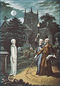
Magician raising a ghost
Illustration from Robert Cross Smith's The Astrologer of the Nineteenth Century (1825)
The image is based on an 1806 illustration by Ebenezer Sibly.
The image is based on an 1806 illustration by Ebenezer Sibly.
In the above picture, the idea of communicating was that of the magician, not the ghost, yet the ghost is shown to our left. But if you look at the illustration this picture was based on, below, you will see that the artist, Ebenezer Sibly, shows the magician and his friend on the left and the ghost on the right.
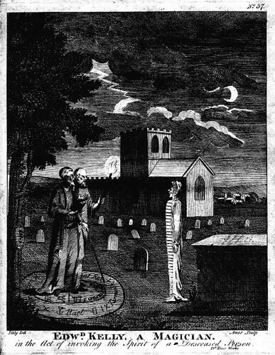
Edw[ar]d Kelly, a Magician. in the Act of invoking the Spirit of a Deceased Person
Engraved by Ames of Bristol (1806), original drawing by Ebenezer Sibly
Engraved by Ames of Bristol (1806), original drawing by Ebenezer Sibly
Ghost of humans who, upon death, did not graduate to Heaven nor plunge directly into the depths of Hell (they seem to still be entirely preoccupied with earthly affairs and want to be handy so they can interfere in them easily), may approach people from any direction (except from skies above or from below, with the exception of rising from their own grave or from a lower floor or basement), but generally they approach at ground level or at times floating, upright, just a tad above the ground (no doubt due to their weightlessness - It's hard to keep your feet on the ground when you're a ghost, apparently).
Cap'n Goldsack, Pirate Ghost
Artist: Howard Pyle (1853 - 1911)
Artist: Howard Pyle (1853 - 1911)
Although the pirate ghost in the above picture appears to be approaching the viewer "from above," that is because he has been placed near the top of the picture; he is not actually descending from above (from the sky), but, rather, seems to be approaching at ground level (with no sign of having flown or floated in) and appears to be stumbling down into an indentation in the ground. His position at the top of the picture, in fact, (helped by the darkness of the head) gives him the "weight" that makes him appear to be stumbling heavily downward.
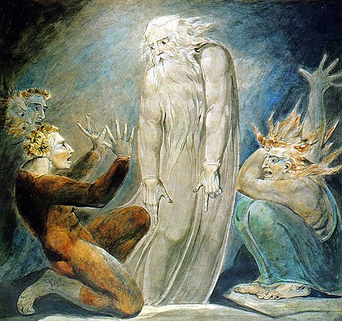
The Witch of Endor Raising The Spirit of Samuel.
c. 1800
Artist: Willliam Blake (1757 - 1827)
"The Witch of Endor, sometimes called the Medium of Endor, was a woman who called up the ghost of the recently deceased prophet Samuel, at the demand of King Saul of the Kingdom of Israel in the First Book of Samuel, chapter 28:3–25."
I am not sure which of these figures is the witch, but I'm assuming it's the person on the (our) right side of the picture, dressed in blue. "Her" arm is raised as if to "pull up" the spirit (yet the spirit seems to only have eyes for the fellow in orange, who must be King Saul, though I don't know). All I know about this story is what is quoted in the above paragraph, but the story the picture tells is what concerns me. We should be able to get the general idea of what's going on without knowing the story ahead of time.
The witch seems to have pulled up Samuel directly out of his grave. The relationship between the three, if we are to go by their positions in the picture seems to be that it is the man on the left who is the one who summoned the spirit, using the witch to do so, and that would fit the short description quoted in the last paragraph. In other words, the entity whose idea it was to make contact is to the left (i.e., our left) of the ghost (which tells us why the ghost is facing in that direction).
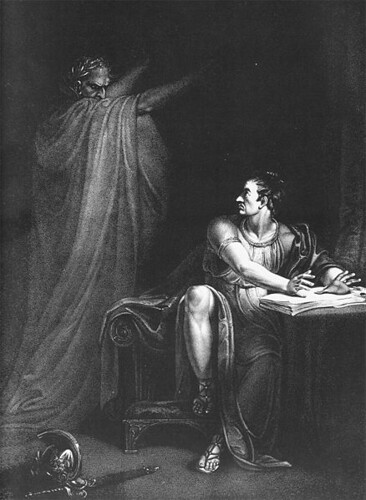
(1775-1841) from a painting by Richard Westall (1765 - 1836). London, 1802
Brutus, visited by the ghost of Julius Caesar, whom he has helped to kill, is obviously feeling very worried here. The ghost is probably no taller than Brutus would be if he were standing, but still he seems quite threatening not only because of his gesture and his evil look, but because he (particularly his head - the center of his thoughts, which lead to actions) occupies quite a large area near the top of the picture and "above" Brutus who has been sitting in a casual fashion, not ready to run anywhere. Also, Brutus has been surprised from behind by the ghost and being penned in by the table (and apparently a wall or a drape to his left) is not prepared for a quick exit whether he can get his feet under him or not.
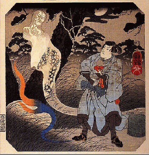
Above: The description under this picture says that this man's murdered wife (the ghost) has just handed her baby to her husband, and that the woman's spirit lives in the rock that her blood flows from.
I don't know whether the man went to the rock to implore his dead wife to give him the baby, or if he was just there to visit her spirit as one normally visits a grave of a departed loved one and it was her idea to hand over the baby, or if perhaps he has just killed her himself, though I doubt the latter as it does say her spirit "lives" in the rock as if has been living there for some time.
She is looking toward her husband but there is some reason she has turned her back on him after handing him the infant. Perhaps he killed her some time earlier, and giving him the baby was her revenge - though if he had killed her, certainly he wouldn't want to visit the place where she was murdered as he'd probably be very worried about what her ghost might do to him.
The fact that she is "above" him in the picture, in the same area that Ceasar inhabits in the picture above, may tell us that she is the one whose idea it was to appear to her husband...that it was not his idea. I really don't know. I am not (at this time) able to "read" this picture clearly. Possibly if I had been raised in the Japanese culture it would be obvious.
The Approach of Doom - 1788
Artist: William Blake
Artist: William Blake
When I first saw this picture I thought it was unfinished. Then I realized, or supposed, that it was not, that we finish it in our own minds, not with any "thing" that could be seen, but with a huge feeling of dread of the unknown.
Whatever it is, this "doom" that is approaching is coming from the left and it is filling the air over and under and around the people, nibbling away at them - dissolving them. They are backed up at the right as if they had gone in that direction to escape, but now have nowhere else to go as they have reached a dead end. Their legs are straight and their arms are entwined so they can be as close together and as far away from the dreadful thing as possible, and they are looking the only way there is to look, directly into whatever it is, which they can't see clearly but know means their certain death.
No monster could look as frightening as this cloud of "nothingness" that is enveloping them and that there is no escape from. The white tentacle-like shape at upper left that seems to be leaping toward the huddled group makes us realize that this is no innocent fog but something that contains a hellish element that seems to be throwing its light onto them, seeking them out in order to find and destroy them, very likely by dissolving them so that they become part of the cloud.
You may think I'm reading too much into this because I know the name of the picture ("The Approach of Doom"), but try to imagine this picture with a less morbid name, such as "A Lovely Summer Night's Walk in the Cooling Fog." You would probably then look at the picture and say to yourself: "I don't think so."
My hope is that this little essay will help the reader to realize that the placement of objects in pictures, in relation to each other and in relation to the perimeter of the picture, is very important to the viewer's understanding of what the picture is about.
To subscribe to the Thinking About Art Monthly Newsletter, see toward the bottom of the page.
November 20, 2010
How to Make a Fat Man Look Even Fatter
(And Like a Fool As Well)
A vertical format can make a subject look more slender and tall than it actually is.
Philip II of Spain - 1551
Artist: Tiziano Vecelli or Tiziano Vecellio (c. 1488/1490-1576), better known as Titian
From Wikimedia, this picture is in the public domain
Artist: Tiziano Vecelli or Tiziano Vecellio (c. 1488/1490-1576), better known as Titian
From Wikimedia, this picture is in the public domain
But a vertical format can also accentuate fatness.
Porträt eines dicken Herrn, des sogen - 17th century
("eines dicken Herrn" seems to translate to "a fat lord")("des sogen" seems to translate to "so-called")
Artist: Bernardo Strozzi (c. 1581-1644), Italian Baroque painter
From Wikimedia, this picture is in the public domain
This man, the artist seems to be saying, is not just fat - he's too fat (and not just fat but clueless - Strozzi did not like this guy).
A very large person can be made to look comfortable and quite acceptable and even admirable in his or her world -- the "world" of the painting. But Strozzi has made this large man look like he doesn't fit at all into the scene he has painted him into (even though the subject looks quite conceited, apparently completely unaware of how ridiculous he appears).
Other paintings by Strozzi show that those people he cared to flatter or whom he had something else to say about were not painted in the same way at all. For example:
Artist: Bernardo Strozzi
From Wikimedia, this picture is in the public domain
David (as well as Goliath's head) blends in with the background (and foreground - let us just say with the "ground"), whereas the "fat lord" stands out as a dark figure against a very light background so that we can very clearly see his entire bulging contour. As we can see from the painting of David and Goliath, Strozzi did not paint all subjects alike - How he painted them had to do with what he wanted to get across about the subject, so obviously the artist made the "fat lord" look as fat as possible quite intentionally.
How the artist made the fat lord look bigger:
- First of all, he chose the shape of the overall picture: a narrow vertical rectangle. A narrow vertical format can help to lengthen and slenderize a bulky vertical subject but other factors have to be manipulated as well or the same vertical rectangle can make the subject look even bulkier than it is - because of the contrast between tall/slim and bulky/wide. This is especially true if the sides come quite close to the subject, indicating that it barely fits or even that it's expanding toward the edges of the composition. This is the case here.
- And of course the rectangular shape (rather than an oval or round shape) of the perimeter of the picture -- along with the straight vertical columns -- strongly suggests the "Cartesian grid" understructure of the painting, making it impossible for us not to notice the bulging shape of the man as contrasted with the straight vertical and horizontal lines of the grid.
- As mentioned above, there is the contrast of the very dark subject against the very light "ground," making his large and bulging profile extremely obvious, and in fact more immediately noticeable than anything else in the picture.
- The dark shadow the man's stomach casts on the column blends in with the adjacent stomach to make it seem even larger than it is. "Where the overlapping units together form a particularly simple shape, they tend to be seen as one and the same thing." (Rudolf Arnheim in Art and Visual Perception, page 121)
- The man is, for some reason, pulling up his hem. Not only does this show us that he has huge legs, but it also plumps up the fabric and adds more bulk to the profile on the side of the picture opposite the stomach.
- The slenderness of the sword, which reaches down to his feet, contrasts with the bulk of the body, making the body look all the larger. The sword is so narrow that it looks like it might snap under the weight.
- The sword also accentuates the protrusion of the stomach since it is directly in line with the stomach's profile beginning at its outermost extension and acts as an arrow that points out the outer edge of the frontal bulk. (Another function of the sword is to "pin down" the lord's balloon-shaped stomach, as it seems to be rising.)
- The "heavily planted" feet seem to be pushed downward by a great weight.
- The artist takes advantage of the fact that we perceive objects that are higher in the picture as being heavier than they would look in a lower position "[I]n a painting the higher an object is in pictorial space, the heavier it looks." (Rudolf Arnheim in The Power of the Center, page 24) Thus the stomach looks particularly heavy.
- The vertical shape (a column) that is closest to the man's body and to the front plane of the picture not only contrasts with the rotund shape of the man's body, making it stand out all the more, it (the column) also helps to "lift" the stomach up, making it seem all the more prominent (and even "active!") - as if it were being shown off. ("Look at my magnificent stomach!")
The reason the column appears to lift up the stomach is that it (the column) is seen to be rising like a rocket just starting to lift off the ground - and in doing so "pulling" the nearby stomach upwards with it. The reason the column appears to be rising is that although there is a very definite base attached to its bottom, essentially "blocking" any perceived downward thrust, in contrast there is no change in shape (like a bulge) or anything else (such as a capital at the top) that appears to slow down the "ascent" of the column at the top the picture, and so the column appears to continue rising upward and out of the scene. -- When something immediately adjacent to something else looks like it is reaching upward, as this column is, there is a tendency to perceive that almost-attached "something else" as being lifted along with it. (See The Power of the Center, by Rudolf Arnheim, pp. 21-23)
- The fat lord's maximum girth is above the horizontal center of the picture, attracting our attention to it more strongly than would be the case if it were lower in the picture where heavier objects, pulled down as they are in real life by gravity, are usually found.
- The man's hands seem to cradle a large globular mass (his stomach), thereby emphasizing its size and shape. And speaking of the cradling hands, notice the difference in their apparent size, with hand in the foreground looking much larger than the one in the background - yes, there is probably more of the hand that we can't see from that position but what is important is what we can see; also the hand in the background is darker by far than the very prominent and brightly lit larger foreground hand...This difference in hand size and brightness emphasizes the distance between the one and the other.
- The large pear-shaped face (which we can see clearly as it is lit from the side and is of a light color modeled by dark shadows) is similar to the shape of the main bulk of the man's body. The light/dark modeling makes the face and neck area look 3-dimensionally bulgy, suggesting that the adjacent similar (though much larger) shape is also 3-dimensionally bulgy.
- The fat lord's feet (it looks like only one foot is shown, but we assume the other is there beside it!) are shown sideways and they seem very long - Whether or not it's just that he has very long shoes, or whether part of what we see is the "flag" or whatever it is lying on the floor doesn't make any difference. It is the dark shape we see and where the foot ends and the shoe ends or where the material behind his foot ends makes no difference as it is all one dark mass that we see as "the feet." Even if we saw only a bare foot and knew where it ended, this sideways view of it is the largest image we could have of it; obviously the artist gave us this profile view of the feet to make them seem very large and virtually planted to the floor in order to emphasize the man's great weight pushing downward ... Look at that heavy-looking, downward aimed wedge-shaped calf directing all the weight of the body above into the shoe; the leg seems not to end at the bottom of the shoe, but, rather, the shoe that we see looks like it opens up at the bottom so that the wedge extends into a deep pit.
- Another way he has been made to look large and heavy is by seemingly rubbing up against the column, as if there wasn't room for him to stand without bumping into something.
How the artist made this man look foolish:
It has been implied by the artist that the man, who looks very conceited, and proud of his figure, is delusional and foolish. Here are some of the ways the artist shows that the man is not what he thinks he is:
- His facial expression shows that haughty and satisfied look just mentioned, in spite of the ludicrous figure he presents.
- He is holding a very odd pose in a very odd place, just barely fitting on that pedestal and facing in the direction of the column. Obviously there's nowhere to go in that direction; he has run into a blockade.
- Note the viewpoint, from a little below. The artist has put this man quite truly on a pedestal and has us (ironically) looking "up" to him. Actually it appears as if the fat man had put himself on that pedestal, having had to step up there in order to take that pose.
- The man is (awkwardly) turned to show his profile, as if showing off his huge stomach quite proudly. (I don't think the subject knew anything about this picture, do you?)
- Perhaps what looks like a crumpled flag under his feet and just behind his lower legs might be there to show that he is capable of crushing things easily. Or it could be the remains of a flimsy chair he had been sitting on. With the other "clues" we've been given, we tend to think that the reason that "crumpled fabric" is there probably has to do with this man's weight and/or size.
- Why is the man pulling up his hem and showing his huge leg?
_____
The artist must have really enjoyed creating this picture (and probably his other pictures as well). He knew what he wanted to "say" about this man (i.e., that this delusional fat man is a pompous fool), and in order to get that across he had to do a lot of thinking (or "problem solving") to figure out how to accomplish this goal. Sounds like fun to me.
To subscribe to the Thinking About Art Monthly Newsletter, see toward the bottom of the page.
November 5, 2010
A Discussion About Creativity
THIS POST includes a half-hour (audio) discussion about "the creative mind in science and in art." The participants were Rudolf Arnheim, Margaret Mead, and Milton C. Nahm, and the moderator, Lyman Bryson.
This is a radio program produced in 1958 from a series titled The Creative Mind in the Twentieth Century, from the PBS-NPR Forum Network.
The "player" is embedded below on this page. There is no picture, as it is from a radio program, but you can listen to it. You can skip now down to the embedded program, or first read (just below) some information on the participants and on the subject they discuss, plus some excerpts I've extracted from the discussion, if you are interested.
PARTICIPANTS IN THE DISCUSSION
RUDOLF ARNHEIM
(1904-2007)
Professor of the Psychology of Art at Harvard University
American, born in Germany
Photo of Rudolf Arnheim
MARGARET MEAD (1901-1978)
American Cultural Anthropologist
Photo of Margaret Mead
MILTON C. NAHM (1903-1991)
Professor of Philosophy at Bryn Mawr College, and author of many books, at least one of which you can read online (The Artist as Creator)
Photo of Milton C. Nahm
MODERATOR
LYMAN BRYSON (1888-1959)
_____
FROM THE INTRODUCTION GIVEN BY LYMAN BRYSON, MODERATOR:
"We're going to look at the problem of how in a society like ours -- how in any society -- we can discover the conditions that make creative work more likely ... a little better harvesting of whatever genius we can produce in our population, and I suppose that problem...can be put this way: Since we know that in other times and in other places, there has been a high productivity of creativeness in art and science and other forms of expression, can we locate those conditions and describe them, and if we can describe them have we any real confidence in our capacity to reproduce them in our own society?" -- Lyman Bryson in the Introduction
SOME EXCERPTS FROM THIS DISCUSSION
(These are from my own notes that I took while listening to the conversation and any comments in brackets are mine - J.V.)
"I think that the greatest advantage you can give to your creative child...is to treat every child with the expectation of his creativity. You need an atmosphere of the expectation of creativity for all children, so that those few children [who are indeed capable of being creative] can flourish." - R. Arnheim
"One thing which I welcome very much is that we are beginning to think when we talk about creativity of something which is beyond the arts and even beyond the sciences. That is, that when you see nowawadays businessmen getting interested in creativity, and trying to train their executives in creativity. Now they are not after the arts, obviously. They may be using the arts or they may think they can get their cues from the arts, but what they are really after is a kind of alertness of mind, in a very general sense, which is not even served very well by technique. I don't think we ought to emphasize technique too much. What you need is that openness of response and that accessibility of your resources, which somehow doesn't seem to be there. You train these children about all sorts of techniques and they're technically very good about all sorts of things. What you don't have is that access to their spontaneity which make their work different from the work of other people." - R. Arnheim
"It seems to me that what we ought really to do is to subject them all to the same kind of technical discipline (or within the areas of their interest), and from this hope that the originality would come." -- M. Nahm
"[I]n the arts and in the sciences and so on, what we are not asking for is imitation. What we're asking for is in some sense for the creative mind to go past the mere copying, past the mere imitating, past the mere technique, although we all agree, I think, that this would be a condition for it." - M. Nahm
"There's a great danger in the misinterpretation of the word "spontaneity," to mean that somehow one should be "untrammeled" by tradition.....We tend to see tradition as something that's limiting, instead of being the thing that makes it possible to create." - M. Mead
"If we can make people see that the core of a society is genuine originality -- and this, it seems to me, is the primary function of fine art....That is, what the fine artist does is really very interesting because he does give us a picture of his society, but he does so much more -- and if we could take our audience and our critics and the people who have, to use a technical phrase, who have possibilities for aesthetic experiences...If we could make them see that originality is a value in itself, and then can be used to make other people creative, and use this technique in another way, then I think we could solve it....." - L. Bryson
"What is truly creative must come out of the experience of the creator -- his own experience, not something he got second-hand. That makes it valid. This is artistic honesty." - L. Bryson
_____
HERE IS THE PROGRAM
This is a radio program produced in 1958 from a series titled The Creative Mind in the Twentieth CenturyFrom the PBS-NPR Forum Network
Audio Only. 29 minutes,19 seconds
(Note: The woman, of course, is Margaret Mead, the man with the German accent is Rudolf Arnheim, and the other man is Milton C. Nahm)
_____
There are videos on Creativity in the Thinking About Art Library.
This is a radio program produced in 1958 from a series titled The Creative Mind in the Twentieth Century, from the PBS-NPR Forum Network.
The "player" is embedded below on this page. There is no picture, as it is from a radio program, but you can listen to it. You can skip now down to the embedded program, or first read (just below) some information on the participants and on the subject they discuss, plus some excerpts I've extracted from the discussion, if you are interested.
PARTICIPANTS IN THE DISCUSSION
RUDOLF ARNHEIM
(1904-2007)
Professor of the Psychology of Art at Harvard University
American, born in Germany
Photo of Rudolf Arnheim
MARGARET MEAD (1901-1978)
American Cultural Anthropologist
Photo of Margaret Mead
MILTON C. NAHM (1903-1991)
Professor of Philosophy at Bryn Mawr College, and author of many books, at least one of which you can read online (The Artist as Creator)
Photo of Milton C. Nahm
MODERATOR
LYMAN BRYSON (1888-1959)
_____
FROM THE INTRODUCTION GIVEN BY LYMAN BRYSON, MODERATOR:
"We're going to look at the problem of how in a society like ours -- how in any society -- we can discover the conditions that make creative work more likely ... a little better harvesting of whatever genius we can produce in our population, and I suppose that problem...can be put this way: Since we know that in other times and in other places, there has been a high productivity of creativeness in art and science and other forms of expression, can we locate those conditions and describe them, and if we can describe them have we any real confidence in our capacity to reproduce them in our own society?" -- Lyman Bryson in the Introduction
SOME EXCERPTS FROM THIS DISCUSSION
(These are from my own notes that I took while listening to the conversation and any comments in brackets are mine - J.V.)
"I think that the greatest advantage you can give to your creative child...is to treat every child with the expectation of his creativity. You need an atmosphere of the expectation of creativity for all children, so that those few children [who are indeed capable of being creative] can flourish." - R. Arnheim
"One thing which I welcome very much is that we are beginning to think when we talk about creativity of something which is beyond the arts and even beyond the sciences. That is, that when you see nowawadays businessmen getting interested in creativity, and trying to train their executives in creativity. Now they are not after the arts, obviously. They may be using the arts or they may think they can get their cues from the arts, but what they are really after is a kind of alertness of mind, in a very general sense, which is not even served very well by technique. I don't think we ought to emphasize technique too much. What you need is that openness of response and that accessibility of your resources, which somehow doesn't seem to be there. You train these children about all sorts of techniques and they're technically very good about all sorts of things. What you don't have is that access to their spontaneity which make their work different from the work of other people." - R. Arnheim
"It seems to me that what we ought really to do is to subject them all to the same kind of technical discipline (or within the areas of their interest), and from this hope that the originality would come." -- M. Nahm
"[I]n the arts and in the sciences and so on, what we are not asking for is imitation. What we're asking for is in some sense for the creative mind to go past the mere copying, past the mere imitating, past the mere technique, although we all agree, I think, that this would be a condition for it." - M. Nahm
"There's a great danger in the misinterpretation of the word "spontaneity," to mean that somehow one should be "untrammeled" by tradition.....We tend to see tradition as something that's limiting, instead of being the thing that makes it possible to create." - M. Mead
"If we can make people see that the core of a society is genuine originality -- and this, it seems to me, is the primary function of fine art....That is, what the fine artist does is really very interesting because he does give us a picture of his society, but he does so much more -- and if we could take our audience and our critics and the people who have, to use a technical phrase, who have possibilities for aesthetic experiences...If we could make them see that originality is a value in itself, and then can be used to make other people creative, and use this technique in another way, then I think we could solve it....." - L. Bryson
"What is truly creative must come out of the experience of the creator -- his own experience, not something he got second-hand. That makes it valid. This is artistic honesty." - L. Bryson
_____
HERE IS THE PROGRAM
This is a radio program produced in 1958 from a series titled The Creative Mind in the Twentieth CenturyFrom the PBS-NPR Forum Network
Audio Only. 29 minutes,19 seconds
(Note: The woman, of course, is Margaret Mead, the man with the German accent is Rudolf Arnheim, and the other man is Milton C. Nahm)
Hold your mouse pointer at bottom of the above black rectangle to see controls (if they should disappear)

_____
There are videos on Creativity in the Thinking About Art Library.
To subscribe to the Thinking About Art Monthly Newsletter, see toward the bottom of the page.
October 18, 2010
Verticality - Heaven is Up and Hell is Down
A vertical format strengthens the theme of the great desirability as well as difficulty of reaching Heaven and the ease of descending to Hell instead.
Why? Because Heaven is "up" and Hell is "down," and a vertical format, which so unmistakably shows who's on top and who's below (metaphorically speaking) is the best format in which to show a hierarchy, in this case the hierarchy that has Heaven at the top and Hell at the bottom.
But why is Heaven up and Hell down? It's gravity that gives us an up and a down, and it's the effects of gravity that make going "up" difficult and therefore admirable and "down" easy and therefore unworthy. Down is the direction in which gravity constantly pulls us toward the center of the earth. Up is the opposite direction ... toward the sky. Gravity holds us in place on the ground or...if we dare to try to defy gravity and move upward by some means...is ever capable of pulling us back to earth, in a most deadly fashion if we dare to attempt to go further than we safely can. For most of the time humans have noticed this they have not had airplanes nor were they able to go so far "up" that they escaped the pull of gravity, so when they imagined gods - beings superior to us - they imagined them like the clouds and stars and the sun and moon, apparently unaffected by this powerful force that we mere humans experience here on earth.

Lucifer - The Fallen Angel by James Donahue
For an angel who is no longer welcome in Heaven alas there is suddenly a very definite "down."
Source: Wikimedia
As for Hell, it is the opposite of Heaven and it is a place into which we "fall." Naturally it's "down." But it is not at ground level. It's even further down than that. We do not start out in Hell, after all, and so If we fall into it, it must be further down than the level at which we start out, even if we do not attempt to ascend to Heaven.
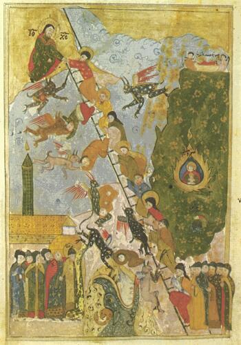
The Ladder of Divine Ascent - 1612
(The Heavenly Ladder of St. John Climacus)
Source: Wikimedia
According to an article in Wikipedia, St. John Climacus was "a 7th century Christian monk at the monastery on Mount Sinai." St. John's literary output included "The Heavy Ladder of Divine Ascent" in which he described the thirty "steps" one must take in order to reach Heaven.
One can see that it's a difficult climb to reach Heaven as there are many temptations by devilish types along the way which can lead one, no matter how high they have climbed to fall down further even than to the ground from which they began. It looks to me like a monster from below the ground has his mouth open ready to swallow up those who fall. In any case, obviously Heaven is Up (and a hard climb) and Hell is Down (and an easy fall), and a vertical format is very suitable to get this idea across.
To subscribe to the Thinking About Art Monthly Newsletter, see toward the bottom of the page.
October 8, 2010
Paul Gauguin - Letters of Discouragement and Hope
Self-portrait - 1889 - (Eugène Henri) Paul Gauguin, Born 1848 in Paris, died 1903 in the Marquesas Islands, French Polynesia
Picture source: The Athenaeum
Have you ever been discouraged by your inability to make the art you want to make because your art doesn't earn you enough money to buy the basic necessities of life much less the art supplies you need, and/or because you are distracted due to difficult living conditions? Then you'll understand what Gauguin was talking about in these letters.
Video - A reading of some of Gauguin's letters
Watch a 14-minute video called Gauguin in his Words at The Guardian, U.K. website in which several of Gauguin's letters to his wife and to friends are read aloud.
Book - At amazon.com
Book: Paul Gauguin: Letters To His Wife And Friends

Watering Place - 1885 - Paul Gauguin
Picture source: The Athenaeum
"The future is to the painters of the Tropics, which have not yet been painted. Novelty is essential to stimulate the stupid buying public." (In letter from Paul Gauguin)
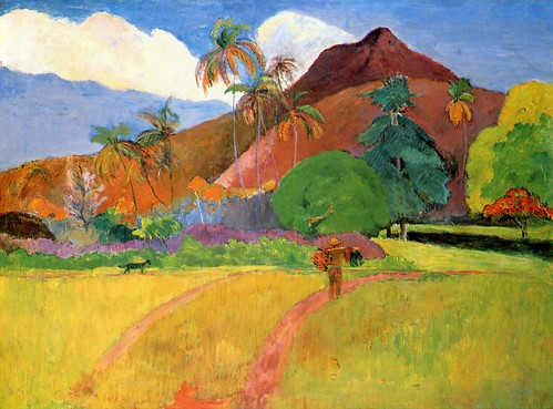
Tahitian Landscape - 1893 - Paul Gauguin
To subscribe to The Thinking About Art Monthly Newsletter, see near bottom of the page.
September 24, 2010
Edward de Bono on Creative Thinking
Edward de Bono
_____
There are more videos about Creativity in the Thinking About Art Library.
To subscribe to the Thinking About Art Montly Newsletter, see near bottom of the page.
September 21, 2010
Verticality in Artworks - 2nd Post
I'm going to write about this subject in several posts, to keep them small and easy to absorb.
When I say "verticality" I'm referring not just to the outside shape of the canvas of paper or whatever the picture is on, but also to dominant lines and directions within the picture.
Recently I've written some posts about horizontality in art in which you can read about (and see demonstrated) many different effects you can achieve through the use of horizontality. As you can imagine, to achieve opposite effects you might be able to use verticality instead (though it's not always quite that simple).
For example, if your goal is to emphasize a relationship between equals you might want to use a horizontal format, with whatever you want to portray as "equal" on the same horizontal level, but if you want to show who's (or what's) in charge, you might want to use a vertical format, with the one who clearly has the advantage in the situation above the one who is at a disadvantage, for example in the following picture.

Single Combat of Prince Mstislav Udadloi with Rededia - 1812
Andrei Ivanov, Russian painter - 1775-1848
Source: CGFA
In the above picture it's easy to see who is in control. (The angel above is "floating" and obviously not affected by gravity which is what (perceptually) determines who has the advantage; what is important is the relationship to the ground of whatever appears that it would be affected by gravity.) Of the two men in the fight (it was actually considered a "duel") we can probably safely assume that the eventual "winner" (Prince Mstislav) is the man in a vertical position (slightly inclined toward the other man in the competition in a threatening way) and who also is "above" the obvious loser who is apparently about to become permanently horizontal. The verticality of the outer shape of the picture helps to emphasize the dominating-dominated relationship shown by the vertical hierarchy within it.

The Card Players - 1890-92
Paul Cezanne, French painter
Source: The Athenaeum
In the above picture none of the card players is seen as having an advantage. They are all at the same level horizontally. Although the man in the blue smock against the wall is "above" the card players he is smaller and obviously at a distance behind them, has his arms folded as if holding himself back, and seems busy smoking his pipe, so he obviously is neither in charge of nor threatening to the card players. Often a servant or a bystander is shown standing behind a main character in a picture but they are not seen as in the space "above" that main character ... they are obviously at a distance and are played down in other ways also ... such as with subdued colors, lack of contrast with the background, etc.
There are other posts on this blog that have to do with horizontality and verticality. Look at the right side of the page for keywords to get to a page with all the posts that have been tagged by me with one or both of these keywords. There are also other posts that you might be interested in that may not be on that page -- Most anything to do with the Cartesian grid, for instance. There is a search box for this blog on the right side of the page, also, though I admit it's hard to find because the list of keywords is so long.
_____
"When adversaries meet on a horizontal base they are equally matched by their spatial position; in a vertical composition, however, having the upper hand spatially constitutes an advantage, whereas being in the lower position means having to overcome the pull of gravity as well as the opponent's onslaught." (Rudolf Arnheim in The Power of the Center, page 96)
When I say "verticality" I'm referring not just to the outside shape of the canvas of paper or whatever the picture is on, but also to dominant lines and directions within the picture.
Recently I've written some posts about horizontality in art in which you can read about (and see demonstrated) many different effects you can achieve through the use of horizontality. As you can imagine, to achieve opposite effects you might be able to use verticality instead (though it's not always quite that simple).
For example, if your goal is to emphasize a relationship between equals you might want to use a horizontal format, with whatever you want to portray as "equal" on the same horizontal level, but if you want to show who's (or what's) in charge, you might want to use a vertical format, with the one who clearly has the advantage in the situation above the one who is at a disadvantage, for example in the following picture.
Single Combat of Prince Mstislav Udadloi with Rededia - 1812
Andrei Ivanov, Russian painter - 1775-1848
Source: CGFA
In the above picture it's easy to see who is in control. (The angel above is "floating" and obviously not affected by gravity which is what (perceptually) determines who has the advantage; what is important is the relationship to the ground of whatever appears that it would be affected by gravity.) Of the two men in the fight (it was actually considered a "duel") we can probably safely assume that the eventual "winner" (Prince Mstislav) is the man in a vertical position (slightly inclined toward the other man in the competition in a threatening way) and who also is "above" the obvious loser who is apparently about to become permanently horizontal. The verticality of the outer shape of the picture helps to emphasize the dominating-dominated relationship shown by the vertical hierarchy within it.
The Card Players - 1890-92
Paul Cezanne, French painter
Source: The Athenaeum
In the above picture none of the card players is seen as having an advantage. They are all at the same level horizontally. Although the man in the blue smock against the wall is "above" the card players he is smaller and obviously at a distance behind them, has his arms folded as if holding himself back, and seems busy smoking his pipe, so he obviously is neither in charge of nor threatening to the card players. Often a servant or a bystander is shown standing behind a main character in a picture but they are not seen as in the space "above" that main character ... they are obviously at a distance and are played down in other ways also ... such as with subdued colors, lack of contrast with the background, etc.
There are other posts on this blog that have to do with horizontality and verticality. Look at the right side of the page for keywords to get to a page with all the posts that have been tagged by me with one or both of these keywords. There are also other posts that you might be interested in that may not be on that page -- Most anything to do with the Cartesian grid, for instance. There is a search box for this blog on the right side of the page, also, though I admit it's hard to find because the list of keywords is so long.
_____
"When adversaries meet on a horizontal base they are equally matched by their spatial position; in a vertical composition, however, having the upper hand spatially constitutes an advantage, whereas being in the lower position means having to overcome the pull of gravity as well as the opponent's onslaught." (Rudolf Arnheim in The Power of the Center, page 96)
To subscribe to the Thinking About Art Monthly Newsletter, see toward the bottom of the page.
September 11, 2010
Verticality in Artworks
We read in books on composition that tall, narrow things, such as a lone standing person or a waterfall are best in a tall, narrow format, and wide, spread-out things, like a basically flat landscape or a person lying on a bed are best in a horizontal format. The reason, I remember reading, is simply that it makes for a good fit - for instance a flat landscape or reclining person fits naturally into a horizontal shape, and a standing person fits naturally into a vertical shape.
But I would guess that you'd want your picture to say something more than "The shape of the subject goes well with the shape of the perimeter of the picture." It might be extremely well done and a pleasure to look at but what does it mean? How long can you stay entranced by a picture that hasn't much more to say than that?
 The Eiffel Tower - c. 1898
Henri Rousseau
Source: The Athenaeum
(Note that the tall narrow tower, which is the subject of the picture, is not depicted in a vertical format.)
Many people claim to have no meaning in mind when they paint or draw a picture, and this is probably true...but only when it comes to their conscious minds. If we're not doing it purely for profit and we are making the decisions about shapes and subject and so forth on our own, we make artwork because it gives us pleasure to make it, or else we feel compelled to make it whether it's enjoyable or not. We simply must make it. We do it to express ourselves. We can't put it in words, at least in the same way; we can only express it in paint, or with a pencil, or whatever else we might use.
And if we are expressing ourselves, obviously there must be something to express. That "something" gives the picture its basic meaning (I say "basic" because of course the viewer will bring his or her own ideas to it). It may be something very simple that you're trying to express, or it may be more complex, but you're always saying something, even if it's just by your choice of subject, or even if it's only "Isn't this a cute puppy?" or "Don't you love these shades of red?" Even little children who draw what look like almost scribbles to us are trying to say something about the subject (whether or not we can understand it).
So back to what I was saying before: I'd guess that you'd want your picture to say something more than "The shape of the subject goes well with the shape of the perimeter of the picture." (Even if it says it ever so beautifully.)
One of the ways that you can say what you have to say is by your choice of the outer shape of the picture, as well as by your choice of the basic shapes and directions within the picture (there are many other elements in the composition that are utilized in expression, but here we are only discussing these basic shapes and directions).
 Sleeping Beauty - 1912
Maxfield Parrish
Source: Wikimedia
(Note that the sleeping woman, who is the subject of the picture, is not depicted in a horizontal format.)
I've written some posts recently about horizontality in artworks...about why artists choose horizontal shapes and directions, and now for a while I'll be writing about verticality. I will make these posts short but there will probably be several of them. The next one should be coming up soon as I've already begun it.
To subscribe to the Thinking About Art Monthly Newsletter, see toward the bottom of the page.
But I would guess that you'd want your picture to say something more than "The shape of the subject goes well with the shape of the perimeter of the picture." It might be extremely well done and a pleasure to look at but what does it mean? How long can you stay entranced by a picture that hasn't much more to say than that?

Henri Rousseau
Source: The Athenaeum
(Note that the tall narrow tower, which is the subject of the picture, is not depicted in a vertical format.)
Many people claim to have no meaning in mind when they paint or draw a picture, and this is probably true...but only when it comes to their conscious minds. If we're not doing it purely for profit and we are making the decisions about shapes and subject and so forth on our own, we make artwork because it gives us pleasure to make it, or else we feel compelled to make it whether it's enjoyable or not. We simply must make it. We do it to express ourselves. We can't put it in words, at least in the same way; we can only express it in paint, or with a pencil, or whatever else we might use.
And if we are expressing ourselves, obviously there must be something to express. That "something" gives the picture its basic meaning (I say "basic" because of course the viewer will bring his or her own ideas to it). It may be something very simple that you're trying to express, or it may be more complex, but you're always saying something, even if it's just by your choice of subject, or even if it's only "Isn't this a cute puppy?" or "Don't you love these shades of red?" Even little children who draw what look like almost scribbles to us are trying to say something about the subject (whether or not we can understand it).
So back to what I was saying before: I'd guess that you'd want your picture to say something more than "The shape of the subject goes well with the shape of the perimeter of the picture." (Even if it says it ever so beautifully.)
One of the ways that you can say what you have to say is by your choice of the outer shape of the picture, as well as by your choice of the basic shapes and directions within the picture (there are many other elements in the composition that are utilized in expression, but here we are only discussing these basic shapes and directions).

Maxfield Parrish
Source: Wikimedia
(Note that the sleeping woman, who is the subject of the picture, is not depicted in a horizontal format.)
I've written some posts recently about horizontality in artworks...about why artists choose horizontal shapes and directions, and now for a while I'll be writing about verticality. I will make these posts short but there will probably be several of them. The next one should be coming up soon as I've already begun it.
To subscribe to the Thinking About Art Monthly Newsletter, see toward the bottom of the page.
July 26, 2010
Sun Flight - Animated Film
SUN FLIGHT BY GERALD MCDERMOTT
Score by Ryan Wetherbee
5 MINUTES, 31 SECONDS
Click on arrow to begin - There is sound
Last month I posted another of Gerald McDermott's films, called The Stonecutter. McDermott made The Stonecutter when he was only 19 years old. In fact he made only five animated films (all under 12 minutes) before he changed his career from film animator to children's book illustrator.
Sun Flight, one of those five films, is here set to music scored by Ryan Wetherbee. It's the story of Daedalus and his son Icarus. To refresh your memory of this story, you can read about it here on Wikipedia.
I found this film to be quite moving. Am I the only one so affected by the art and the music? The music here is a recent contribution, by the way, scored by a student at the Hartt School of Music in 2008.
_____
To subscribe to the Thinking About Art Monthly Newsletter, look near bottom of the page.
July 18, 2010
Horizontality and Composition
Some people may wonder why I'm writing so much about how we respond to "flat" landscapes (or cityscapes, or most any view other than of a single compact object) when it may seem to them to have little to do with art, but of course it does have much to do with art.
An artist has to know (if only unconsciously) what effects horizontality/verticality/mixed heights have on a viewer. As is the case with any other aspect of a composition he or she must know what to include or not include, and what to emphasize and what to deemphasize in order allow the basic shapes to help get across what it is he or she wishes to "say" about a subject and not inadvertently give the "wrong" message or make it confusing.
Just for a few examples of what you might be trying to get across: possibly you want to emphasize the subjugation of nature by man for his own ends, showing a landscape that seems to not allow for anything accidental, unplanned, or different from what man "needs" - or to make life "easy" - no matter that it might flourish in that environment ... Nothing that is not "necessary" is allowed to protrude/impose itself and although horizontality itself may not be required to achieve the effect you're after in this case (or in others), it could be something you would make use of.
Or you might want to show the triumph of nature (not necessarily plant life ... this could include other manifestations of individuality and accidental effects that interfere with the intention of man to impose his will on what comes naturally) over man's efforts to manipulate it and hold it back/down, in which case you might show a variety of directions and heights, not emphasizing the horizontal at all, or else show definite horizontality peppered by contrasting, very vigorous verticals of various heights (think "weeds"). Or you might want to show a happy mixture of the two ideas - man and nature getting along just fine.
Or perhaps you'd want to give the impression of "hopelessness" via a barren-looking very flat landscape or show "individual uniqueness and spontaneity is respected and accommodated here" via a landscape in which there is a variety of plant life: bushes, trees, vines, seemingly growing naturally, appearing to not have been planted intentionally by people, where it appears that people have arranged their lives around what's in nature rather than the other way around...As I say, it need not be "plants" and could even consist entirely of man-made structures that appear to not have been constructed to fit a strict plan but instead to have arisen "spontaneously." Or a combination of plants and structures. It could include whatever is seen in the air, too.
These are only a very few examples of the endless possibilities.
You can see how horizontality can help you achieve what you want in some cases, or hinder it if you're not careful in others. (If you do not think about what impression your picture will make because of such things then it may confuse people or you may inadvertently be sabotaging your intention.)
The bottom line is that what is out there (in "real life" or on canvas or paper), no matter whether it's recognizable as things we see in the everyday world or not, has one or more (usually more) "messages" for us, and in art we must know what these are (otherwise why would we bother to produce art ... We can try to copy what we see as if we're a camera or we can just dab or scribble away and try for something "pretty" or "interesting" but if there is nothing in particular we want to communicate, why do it? And what is "artful" about it?).
The messages our pictures convey are not usually communicated only by the alleged "subject matter." They are communicated by the way the entire picture is composed -- through lines, colors, textures, shapes, patterns, rhythm, size relationships, directions, etc. We "understand" what the "whole picture" means because of how all of these things work together. We understand not only because of what we have learned from reading and listening, and from looking at pictures, and from watching videos and movies, from thinking about these things, and even from personal experiences with whatever the subject matter might be, but also from our what you might call "generic" or "non-specific to any particular subject" familiarity with the physical world we live in (i.e., the earth and the tiny part of the universe we're able to experience from here) and how it basically "works." (Our understanding of how gravity works is an example, and this is very important ... There are several posts on this blog that have to do with gravity, though there are presently only two that have gravity as a keyword that I've noted on the list at the right side of the page -- You can take a look at that list for gravity - Click on the word and posts that have quite a bit in them about gravity will come up on one page ... but, also, any post that has to do with the Cartesian grid is also about gravity as the Cartesian grid exists because of gravity.)
Click on the words "horizontal format" in this same list at the right side of each page to see the posts that are most closely related to this one you are reading now.

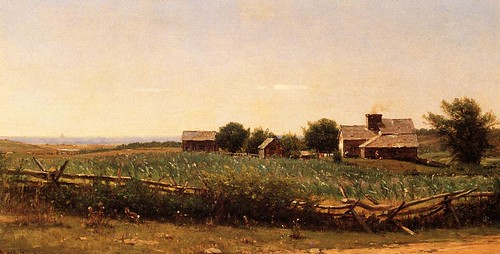
Artist: Jean-Baptiste Camille Corot (1796-1875)
Picture Source: Wikimedia
What do you think Corot might have been trying to communicate about man and nature in this picture, and how did he make use of horizontality to help him do so?
_____
JUST REMEMBER THAT A FLAT LINE SUGGESTS THAT "THERE'S NO LIFE HERE ... THERE'S NO THREAT ... IN FACT IT'S PRETTY DEAD HERE ... WE CAN TAKE OVER NOW."
To subscribe to the Thinking About Art Monthly Newsletter, see toward the bottom of the page.
June 20, 2010
The Stonecutter - Animated Film
THE STONECUTTER by Gerald McDermott
5 MINUTES
Click on arrow to begin - There is sound
The Stonecutter
‘Stonecutter’ (1960) 6m, dir. Gerald McDermott. McDermott made this, his first commercial film at the age of 19, an extremely complex animation short featuring approximately 2000 animation cels presented in six minutes. Influenced by Klee and Matisse, McDermott used silk-screen as well as traditional painting techniques in crafting ethnographic folk tale animation shorts. With films that are startling in intensity, and majestic in execution, McDermott is clearly one of the outstanding animators of his generation, despite having an output consisting solely of only five films, all of which are under 12 minutes in length. After retiring from film animation at the age of 32, McDermott began producing animated children’s books, eventually becoming one of the world’s best-known authors of books for young readers, winning numerous awards in the process.
Above Video and Text Source: archive.org.
To subscribe to the Thinking About Art Monthly Newsletter, look near bottom of the page.
June 14, 2010
The Horizontal Landscape and the Suggestion of Barrenness
Almost as soon as I'd finished my last post, on the horizontal format it occurred to me that there was something in that post that may have caused some confusion or wonder about whether or not I was thinking clearly, i.e., my insistence that flat land (or the illusion of it) - and I mean specifically flat land that appears to have little if anything growing naturally on it without a struggle, or a manmade landscape that has a similar profile - suggests barrenness, or a place where nothing can be grown...where life is nipped in the bud, so to speak.

Abandoned cotton farm - Texas, 1938
After I read again what I'd written (after the post had been published) I realized that someone might think that flat land might well suggest fertile ground rather than a barren place as it seems so perfect for farming, since many large and productive farms are indeed on flat land.

Crops growing in the Imperial Valley, California - 2009
I'm not an agricultural expert (not that you thought I was one), but after pondering this it occurred to me that what is now flat, or almost-flat, farmland has often been cleared of trees and/or tall grasses and other naturally-growing plants and leveled as much as possible in order to grow crops.
That is to say, before the farmers came along and began cultivating it (perhaps hundreds or even thousands of years ago) that land may never have looked absolutely flat and barren (at least during the time human eyes have been around to see it), because it wasn't...and so what you see now is not what you would have seen when it was in its natural state (when it may not have been "absolutely flat and barren").
In other cases farmers started growing crops on desert land that is naturally flat (except for usually waterless gulleys formed by occasional heavy rain showers, often coming down from nearby mountains), not because the soil is deep and rich (it isn't) and not because there is plenty of rainwater that falls consistently and will support the crops (there is not); they did it because the land was cheap, because it's easier to get around on and care for crops on a flat surface; and, most importantly, because water was available from elsewhere via irrigation canals and drip tubes, etc.

Flood Irrigation in desert - Yuma, Arizona - 2006
In other words, it seems to me that unless you're a rich agriculturalist or have never seen flat land that isn't under cultivation, an unrelievedly flat landscape (especially when mountains that drain moisture from the clouds are seen nearby) will still suggest barrenness...and if it does suggest fertility to some because of the association in their minds between flat terrain and successful farming, it would still suggest uniformity and homogeneity/lack of individuality, a certain dullness, and "no place to hide" (among other things - see the last post, on the horizontal format). This is especially true of large areas of land - what you might call "vast expanses" of land - which, if you wish to emphasize their vastness and flatness are usually best depicted in a horizontal format (i.e., on a canvas that is of a horizontal shape), though views from a high viewpoint can also convincingly emphasize the amplitude of a large area of land even in a square or even sometimes a vertical picture shape.
_____
I will write more about horizontality in pictures later this month or else in July.
To subscribe to the Thinking About Art Monthly Newsletter, see toward the bottom of the page.
May 10, 2010
The Horizontal Format - What to use it for and why
The Horizontal Format - What can it be used for and why?
I've written about the circular format (tondos, round artworks) and what kind of subjects and effects it's good for and why. Now I'd like to write about what the horizontal format is good for and why.
We have all heard that you should choose a horizontal composition if the subject itself is basically horizontal or if you want a feeling of serenity. But there are also other possible reasons for choosing a horizontal format. Here are some ideas that it may be useful to consider:
1) When there is a dominant horizontal axis, everything along that axis is perceived more or less "equal" in opportunity, strength, etc.
2) A horizontal format stresses the interaction (or the possibility of interaction) between things that are on the same horizontal level.
3) A horizontal orientation takes advantage of the tendency of people to read a picture from left to right.
4) The horizontal dimension can easily suggest the passage of time.
5) If you want to emphasize the uniquess or "aloneness" of something that is vertical/upright, it might be a good tactic to have a horizontal composition in which the one vertical item (or small cluster of them) is the only thing in a "sea of horizontality" that is not horizontal.
6) A horizontal picture of a human figure (and upright animals, also) emphasizes the groin rather than the head.
7) A hodgepodge of other ideas that horizontality can help get across.
I will explain all of these the best I can, and show some examples.
1) WHEN THERE IS A DOMINANT HORIZONTAL AXIS, EVERYTHING ALONG THAT AXIS IS PERCEIVED AS MORE OR LESS "EQUAL" IN OPPORTUNITY, STRENGTH, ETC. BECAUSE OF THEIR EQUAL SUSCEPTIBILITY TO THE PULL OF GRAVITY.
In a horizontal composition all components that are within the same horizontal "layer" are equally related to the bottom of the picture which we associate with the pull of gravity (assuming the picture is meant to represent life as it is lived here on earth where the effects of gravity as powerful and constant -- In many abstract paintings, for example, gravity as we experience it in our everyday lives is not represented in this way). Being equally subject to the gravitational pull from below they are intuitively perceived by the viewer to be coexisting in the same circumstances, meaning that whatever we find within the same layer in a horizontal composition (if no other factors in the composition nullify this perception) appears to be on equal footing, in the same hierarchical level, nothing within that layer apparently having any significant advantage over anything else within it (though something even poking a tiny bit above the general horizontal mass can give the impression of power over or even danger to the otherwise homogeneous mass they're in the midst of).

Marine, 1890
Maurice Galbraith Cullen (1866 - 1934)
Click on picture to see in larger size
In a vertical composition, on the other hand, what is "above" is perceived to have some kind of advantage over what is below; if there is a fight, for example, it's a good bet that we will get the feeling that the participant at the top of the picture is going to win as he/she/it has an unfair advantage since the participants, not being side-by-side (on a "level playing field"), are not portrayed as having equal powers or opportunities (the participant above seeming to be less influenced by the force of gravity, he/it appears obviously stronger, more alive, more resistant, more powerful; while the object below seems to us to be more subject to the pull of gravity and therefore is seen as weaker and vulnerable).
There may be other compositional factors at work which modify or even completely nullify this effect, of course (and this is true with regard to all of the possible effects of a horizontal composition described in this post), but we are talking here just about the effects of being on the same horizontal level, especially when the picture itself is in a horizontal format as this makes the left-right axis predominant and our eyes, while looking at the picture, move back and forth sideways more than up and down, thus enhancing the effect of uniformity and equality all across the horizontal plane.
2) A HORIZONTAL FORMAT STRESSES INTERACTION (OR THE POSSIBILITY OF INTERACTION) BETWEEN THINGS THAT ARE ON THE SAME LEVEL
The possibility of interaction between whatever is anywhere along the same level is suggested, most importantly along the main (left-right) axis in a horizontal composition.

Rehearsal of the Ballet, c. 1905-06
Everett Shinn (1876 - 1953)
Click on picture to see in larger size
Probably most humans spend most of the days of their lives living with, walking among, working with, driving on the same roads with, and/or otherwise interacting with (or attempting to avoid) people, animals, and objects sharing the same environment (I'm not including electronic communication; this is about the physical world).
This shared space in which there is the possibility of interaction is usually basically a horizontal one. There may be tall buildings, deep subterranean subways and malls, etc., but when these things empty out the people are back on the same horizontal surface which we all recognize as "ground" level. Above and below ground structures such as those just mentioned would contain their own "ground levels" but the main ground level, where at least most of them live, is "where sky meets earth." In any case (above, below, or at "sky meets earth" level) there is (or is the potential of) interaction between people/animals/things on the same plane, and this plane is emphasized in a horizontal composition.

The moonlight fight between Yoshitsune and Benkei on the Gojobashi, Kyoto, Japan
Utagawa Kuniyoshi (1798 - 1861)
Click on picture to see in larger size
In other words, putting aside the "lumpiness" of our physical environment, basically we live in a horizontal world in which most physical communication (or at least sharing of the same space with the possibility of communication) takes place, be it friendly or be it warlike. Naturally, in a horizontal composition this interaction (or failure to interact) is emphasized as not only does the horizontality of the long edges of the composition make us more aware of this horizontal band of interaction, but also we are able to see a wider view (left to right) and thus get a better idea of what various things or people or animals, etc. are likely to have some contact with each other (if only eye contact; that is communication, too) ... In a narrow composition we can only see what's "right in front of us" as if we have blinders on that prevent us from seeing what is further to the left and right. Also, more space along this horizontal line of interaction is available to the artist so that he or she can better show relationships (and, possibly, barriers) between whatever and/or whomever inhabits it.
Note: Contact (or the possibility of it) can be shown between things/people/animals that are not (in the picture) on the same level, of course, and often is, but there is more difficulty presumed in achieving that contact - or the contact is likely to be one-way rather than mutual - as non-horizontal contact has a hierarchical connotation. It's usually not "contact between equals." Due to the perceived sameness of susceptibility to the pull of gravity from below (as is mentioned in 1, above) there is a strong connotation of equality among those who are on the same level in the picture...They share the same circumstances and so they can, or at least there is a better possibility that they will (even if they are incompatible), at least be somewhat familiar with each other and understand each other better than those on distant rungs of the hierarchy ever will.
3) A HORIZONTAL ORIENTATION TAKES ADVANTAGE OF THE TENDENCY OF PEOPLE TO READ A PICTURE FROM LEFT TO RIGHT.
"As far as actual eye movements are concerned, scanning from left to right and vice versa occurs somewhat more readily than scanning up and down. In addition there is a well-known tendency, largely independent of actual eye movements, for viewers to perceive the area in the left corner of the visual field as the point of departure and the entire picture as organized from left to right." -- Rudolf Arnheim in The Power of the Center, page 37.

Abram Arkhipov - Led Proshel
Click on picture to see in larger size
4) THE HORIZONTAL FORMAT CAN EASILY SUGGEST THE PASSAGE OF TIME.
Below is my extremely simplified daily schedule, in horizontal timeline format:
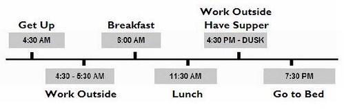
This goes with idea mentioned just above: A horizontal orientation takes advantage of the tendency of people to read a picture from left to right. Timelines have the earliest date at the left.
Because the right half of our brain is more observant and able when it comes to interpreting the meaning of what lies in our visual field -- and the right brain is more in control of what we see to the left (while the left brain is more in control of what we see to the right) -- what's at the left in our field of vision gets more of our attention and seems more important to us, and we identify with what's there and look from there (the left) to the right to see what "lies ahead," to the right (think of a horizontal timeline, which always shows earlier events to the left, later ones to the right).
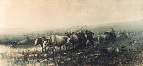
When we see a scene as beginning at the left the idea that there is a "beginning" implies that something comes afterwards rather than that the subject (for example as it would be in a round artwork with the subject in the middle) is unmovable -- going nowhere. So movement is suggested in the typical horizontal composition and that implies the time to make that movement; this effect is even stronger when the picture is decidedly horizontal. And so we are inclined to interpret a horizontal picture as if it were a scene unfolding from left to right. Of course things are sometimes seen to move in other directions, also (right to left, front to back, back to front), but because of the way we perceive a scene left to right movement seems more natural and easily achieved, so if the artist indicates movement that is NOT left to right the "speed" with which the perceived action unfolds is affected and also the time it seems to take is affected (we feel that time goes from left to right, too). For an example of how this affects our understanding of what is happening in a picture, when something is aimed from right to left the action unfolding in that direction seem slower, more plodding, more difficult - something we may want to imply, or may want to be careful not to imply.
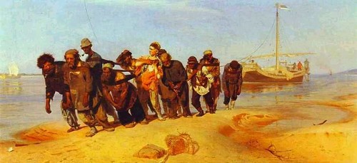
Barge Haulers on the Volga - 1870-73
Ilya Repin (1844 - 1930)
Nicolae Grigorescu (1838 - 1907) - Transport de Provizii - no date
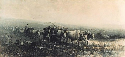
Nicolae Grigorescu (1838 - 1907) - Transport de Provizii - Picture reversed.
5) IF YOU WANT TO EMPHASIZE THE UNIQUENESS OR "ALONENESS" OF SOMETHING THAT IS VERTICAL/UPRIGHT, IT MIGHT BE A GOOD TACTIC TO HAVE A HORIZONTAL COMPOSITION IN WHICH THE ONE UPRIGHT ITEM (OR SMALL CLUSTER OF THEM) IS THE ONLY THING IN A "SEA OF HORIZONTALITY" THAT IS NOT HORIZONTAL.
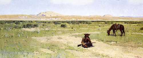
A Rest in the Desert, 1897 by Henry F. Farney (1847 - 1916) - Upright objects in a sea of horizontality
6) A HORIZONTAL HUMAN FIGURE EMPHASIZES THE GROIN RATHER THAN THE HEAD.
"Taken by itself, a human figure would be seen as dominated by the head, the home of the main sense organs and the seat of reasoning -- a version supported by the central vertical and the bilateral symmetry it controls. But no such symmetry exists visually around the central horizontal. The balancing center challenges the dominance of the head and proposes a structure organized around the pelvic area." -- Rudolf Arnheim in The Power of the Center, page 98.

Olympia, 1863 by Edouard Manet (1832 - 1883)
7) A HODGEPODGE OF OTHER IDEAS THAT HORIZONTALITY CAN HELP GET ACROSS.
A) Loneliness (This could be easily shown in a horizontal scene where something or someone can be compared with a great deal of space on both sides in the same "interactive" plane)
B) Abandonment (Can you imagine how this can be shown in a horizontal format? I can, but I'm sure that there are other ways and I wouldn't want to plant just that one idea in someone's brain. Contact me if you want to know my idea; I hope I can still think of it by then)
C) Vulnerability (Something that is horizontal is associated with weakness and vulnerability as things that are alive and well and strong are able resist the pull of gravity and stand up and defend themselves while things are are sick or weak have a difficult time becoming vertical on their own nor can they defend themselves well if at all)
D) Distance (time/space) (A long distance can be implied by the length of a horizontal line or plane in relation to a short height, especially if "obstacles" are placed along the path...this makes it seems as if the going will be very slow, taking a lot of time, and taking a lot of time implies a greater distance is having to be covered)
E) Isolation (Same comment as in A, above)
F) Disintegration. Although horizontal things can and do disintegrate, the effect is more noticeable in things that we recognize were upright to start with.
In nature most if not all things will eventually become horizontal in one way or another or a combination of ways. They may, for example, fall over or be knocked down (e.g., by an earthquake) or blown apart (e.g., by a volcano or explosives) or squashed by something heavy from above (a dislodged boulder, perhaps) or attacked and eaten away chemically and/or washed away by water, and eventually become horizontal or disappear altogether (unless before they have disintegrated completely they are lifted up by earth movements or some other force). The damage done to formerly vertical things does not in itself make them become horizontal. It's gravity that does that, pulling down the parts that become loosened.
A scene may be essentially horizontal even when it contains many upright things (such as buildings and walls) if everything is the same height or nearly so (e.g., flat roofs at the same level, no skyscrapers, no towers, no trees or telephone poles) . Even though erosion or other "damage" may not be at all responsible for this "flat all over" look, our intuitive interpretation of the large, unrelieved, horizontal expanse of such a landscape/cityscape/whatever it might be might well be that the place has undergone a vast amount of "erosion" or "disintegration." Intuitively (whether we know better or not) we perceive it as a sleepy and uninteresting place that looks like it has seen better days, and we expect the inhabitants to be lifeless and resigned to their plight rather than willing or able to do anything about it.
G) Barrenness (A horizontal composition can show emptiness not only in the foreground and background but also from side to side; emptiness implies barrenness; where things do not accumulate nothing is being produced; this is a close cousin of Disintegration, above, but it is not the same; barrenness would imply that nothing much was there in the first place and nothing at all is there now -- it is dead because that place does not support life -- while disintegration would imply that there was something thriving once but the place is dying now and whatever might remain is too weak to do anything about it.)
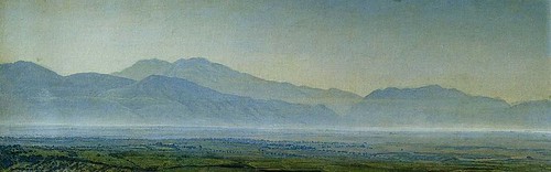
Alexandr Ivanov (1806 - 1858) - painted in 1838
H) Hopelessness (See Barrenness, just above and think about how whatever was in the middle of that barren scene would probably be pretty hopeless looking if they were in a horizontal position themselves.)
I) Weakness (See Vulnerability, above)
J) Death (See Vulnerability)
K) Inability to resist (See Vulnerability)
L) Progress (See the last paragraph in No. 4, above, and also think about how showing what's "behind" [usually to the left] in a horizontal scene shows what the person or object "down the road" to the right has passed through and left behind...this can be interpreted as progress if the setting and "props" are amenable to this analysis. If not considered "progress" in the positive sense, it will at least suggest movement in space and time...perhaps with things getting worse or not changing at all).
M) Confrontation (A collision between two obviously incompatible elements that are headed toward each other...or one is headed toward the other which may be stationary...in the same horizontal plane [a horizontal plane being the "interaction" plane...See 2, above] so that you can assume a confrontation is almost inevitable).
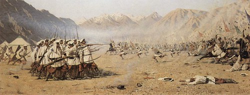
Vasily Vasilyevich Vereshchagin (1842 - 1904) - Plotzlicher Angriff - 1871
N) Ignorance of each other or inability to come into contact (You can show two elements in the same horizontal plane [the "interaction" plane] that seem to belong to or want to get in touch with each other yet they can't because of some kind of barrier(s) between them. These don't have to look like "real" barriers, e.g., high sturdy walls with gunmen at the top - just the "idea" of barriers can work, for example a busy street in between or a STOP sign or a fierce looking dog tied up and sitting on the sidewalk - can make it seem as though these things that want to be together will have a difficult time in accomplishing this aim).
0) Invisibility (See 5, above for how to make something stand out, and do the opposite...make the vertical object blend in by, among other things, making it appear as if it's part of the whole horizontal mass and is no different than anything else around it. You might be interested in reading an earlier post of mine, on camouflage, if you'd really like something to "be there" but not seen)
P) Equality or lack of individuality (The horizontal format would reinforce the idea of regimentation and homogeneity/equality for example in pictures of armies marching in lockstep or of breadlines)
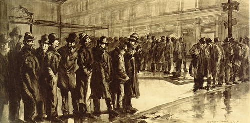
Everett Shinn (1876 - 1953) - Out of a Job - News of the Unemployed, 1908
This should give you a lot to think about. I think you'll agree that there's a whole lot more that a horizontal format can be useful for than just to give a feeling of serenity to the picture or provide a "fitting" frame for a horizontal subject.
I've written about the circular format (tondos, round artworks) and what kind of subjects and effects it's good for and why. Now I'd like to write about what the horizontal format is good for and why.
We have all heard that you should choose a horizontal composition if the subject itself is basically horizontal or if you want a feeling of serenity. But there are also other possible reasons for choosing a horizontal format. Here are some ideas that it may be useful to consider:
1) When there is a dominant horizontal axis, everything along that axis is perceived more or less "equal" in opportunity, strength, etc.
2) A horizontal format stresses the interaction (or the possibility of interaction) between things that are on the same horizontal level.
3) A horizontal orientation takes advantage of the tendency of people to read a picture from left to right.
4) The horizontal dimension can easily suggest the passage of time.
5) If you want to emphasize the uniquess or "aloneness" of something that is vertical/upright, it might be a good tactic to have a horizontal composition in which the one vertical item (or small cluster of them) is the only thing in a "sea of horizontality" that is not horizontal.
6) A horizontal picture of a human figure (and upright animals, also) emphasizes the groin rather than the head.
7) A hodgepodge of other ideas that horizontality can help get across.
I will explain all of these the best I can, and show some examples.
1) WHEN THERE IS A DOMINANT HORIZONTAL AXIS, EVERYTHING ALONG THAT AXIS IS PERCEIVED AS MORE OR LESS "EQUAL" IN OPPORTUNITY, STRENGTH, ETC. BECAUSE OF THEIR EQUAL SUSCEPTIBILITY TO THE PULL OF GRAVITY.
In a horizontal composition all components that are within the same horizontal "layer" are equally related to the bottom of the picture which we associate with the pull of gravity (assuming the picture is meant to represent life as it is lived here on earth where the effects of gravity as powerful and constant -- In many abstract paintings, for example, gravity as we experience it in our everyday lives is not represented in this way). Being equally subject to the gravitational pull from below they are intuitively perceived by the viewer to be coexisting in the same circumstances, meaning that whatever we find within the same layer in a horizontal composition (if no other factors in the composition nullify this perception) appears to be on equal footing, in the same hierarchical level, nothing within that layer apparently having any significant advantage over anything else within it (though something even poking a tiny bit above the general horizontal mass can give the impression of power over or even danger to the otherwise homogeneous mass they're in the midst of).
Marine, 1890
Maurice Galbraith Cullen (1866 - 1934)
Click on picture to see in larger size
| The "horizontal layer of interaction" in the above picture is right at the horizon, between sky and water. The boats, big and small, are in this layer. Although, recognizing the boats are only boats, after all, and not warships, and in fact the boat with the larger profile is actually a small sailboat, we do not assume any kind of confrontation or other physical contact has taken or is about to take place between them, still we get the "feeling" of dominance and danger from that sailboat, as it not only rises far above the other ships (as we see it, not presumably in real life) but also it looks like a knife slicing through the water, going at great speed from left to right, leaving the tiny specks (other boats, which are anchored to the left side of the picture...see 3, below) far behind. [An aside: This tells you that what we "know" -- in this case about the actual sizes and distances between things and probable intentions of the sailors handling their boats -- is not always the same as what we "see," and what we "see" (especially if unconsciously) strongly influences our perception of what we're looking at.] |
In a vertical composition, on the other hand, what is "above" is perceived to have some kind of advantage over what is below; if there is a fight, for example, it's a good bet that we will get the feeling that the participant at the top of the picture is going to win as he/she/it has an unfair advantage since the participants, not being side-by-side (on a "level playing field"), are not portrayed as having equal powers or opportunities (the participant above seeming to be less influenced by the force of gravity, he/it appears obviously stronger, more alive, more resistant, more powerful; while the object below seems to us to be more subject to the pull of gravity and therefore is seen as weaker and vulnerable).
There may be other compositional factors at work which modify or even completely nullify this effect, of course (and this is true with regard to all of the possible effects of a horizontal composition described in this post), but we are talking here just about the effects of being on the same horizontal level, especially when the picture itself is in a horizontal format as this makes the left-right axis predominant and our eyes, while looking at the picture, move back and forth sideways more than up and down, thus enhancing the effect of uniformity and equality all across the horizontal plane.
2) A HORIZONTAL FORMAT STRESSES INTERACTION (OR THE POSSIBILITY OF INTERACTION) BETWEEN THINGS THAT ARE ON THE SAME LEVEL
The possibility of interaction between whatever is anywhere along the same level is suggested, most importantly along the main (left-right) axis in a horizontal composition.
Rehearsal of the Ballet, c. 1905-06
Everett Shinn (1876 - 1953)
Click on picture to see in larger size
| Although the above horizontal composition isn't particularly wide in comparison to its height, it definitely stresses interaction on the same level. The dancers' heads are in line with those of the stage manager, the choreographer, or whoever those people to the left are; because they are at the same level (not to mention these people appear to be intensely interested in the dancers) they are obviously as important and necessary as those dancers in the production of the ballet (even though they are never seen by the audience). We can see the interaction taking place, actually: The men on the left are watching the dancers very closely; they appear to be inspecting and instructing them, and obviously the dancers would be responding or they would be out of a job. The musician is playing for the dancers; the dancers are dancing to the music. The scenery also seems to be included in among the "equals" and plays its own kind of role in the production. |
Probably most humans spend most of the days of their lives living with, walking among, working with, driving on the same roads with, and/or otherwise interacting with (or attempting to avoid) people, animals, and objects sharing the same environment (I'm not including electronic communication; this is about the physical world).
This shared space in which there is the possibility of interaction is usually basically a horizontal one. There may be tall buildings, deep subterranean subways and malls, etc., but when these things empty out the people are back on the same horizontal surface which we all recognize as "ground" level. Above and below ground structures such as those just mentioned would contain their own "ground levels" but the main ground level, where at least most of them live, is "where sky meets earth." In any case (above, below, or at "sky meets earth" level) there is (or is the potential of) interaction between people/animals/things on the same plane, and this plane is emphasized in a horizontal composition.
The moonlight fight between Yoshitsune and Benkei on the Gojobashi, Kyoto, Japan
Utagawa Kuniyoshi (1798 - 1861)
Click on picture to see in larger size
| An arching bridge, although not flat is just a "bump" in a horizonal strip in most cases. It is not necessary that the ground actually be perfectly flat for there to be the possibility of interaction between people/animals/objects that are contained within it. Neither is it necessary that the strip be very narrow as of course the scene may be viewed from above ground level, giving us a broader view. |
In other words, putting aside the "lumpiness" of our physical environment, basically we live in a horizontal world in which most physical communication (or at least sharing of the same space with the possibility of communication) takes place, be it friendly or be it warlike. Naturally, in a horizontal composition this interaction (or failure to interact) is emphasized as not only does the horizontality of the long edges of the composition make us more aware of this horizontal band of interaction, but also we are able to see a wider view (left to right) and thus get a better idea of what various things or people or animals, etc. are likely to have some contact with each other (if only eye contact; that is communication, too) ... In a narrow composition we can only see what's "right in front of us" as if we have blinders on that prevent us from seeing what is further to the left and right. Also, more space along this horizontal line of interaction is available to the artist so that he or she can better show relationships (and, possibly, barriers) between whatever and/or whomever inhabits it.
Note: Contact (or the possibility of it) can be shown between things/people/animals that are not (in the picture) on the same level, of course, and often is, but there is more difficulty presumed in achieving that contact - or the contact is likely to be one-way rather than mutual - as non-horizontal contact has a hierarchical connotation. It's usually not "contact between equals." Due to the perceived sameness of susceptibility to the pull of gravity from below (as is mentioned in 1, above) there is a strong connotation of equality among those who are on the same level in the picture...They share the same circumstances and so they can, or at least there is a better possibility that they will (even if they are incompatible), at least be somewhat familiar with each other and understand each other better than those on distant rungs of the hierarchy ever will.
3) A HORIZONTAL ORIENTATION TAKES ADVANTAGE OF THE TENDENCY OF PEOPLE TO READ A PICTURE FROM LEFT TO RIGHT.
"As far as actual eye movements are concerned, scanning from left to right and vice versa occurs somewhat more readily than scanning up and down. In addition there is a well-known tendency, largely independent of actual eye movements, for viewers to perceive the area in the left corner of the visual field as the point of departure and the entire picture as organized from left to right." -- Rudolf Arnheim in The Power of the Center, page 37.
Abram Arkhipov - Led Proshel
Click on picture to see in larger size
| Because of our tendency to read a picture from left to right, we are aware that the woman on the left is the "point of departure" in this composition and we tend to adopt her perceived attitude (waiting, but not expecting anything soon) and follow her glance, which here goes from (our) left to right, making us aware of the other people (all of them also apparently waiting for something) and then further right to the horizon where water meets sky. I have no idea what the title of this (in Russian) means or even if it's actually the title, but to me it looks like these people are obviously waiting for a boat (which is presumed to be beyond the horizon they are are oriented toward) with people aboard who mean a lot to them and about whom they are concerned. It is obvious that the boat would be traveling from right to left (as we view the scene) and this idea (right to left travel) makes it seem like it will probably take a long time getting there. And so this picture not only illustrates the idea of reading a picture from left to right but also how the idea of "time" can be easily be suggested in a horizontal format (see 4, just below). |
4) THE HORIZONTAL FORMAT CAN EASILY SUGGEST THE PASSAGE OF TIME.
Below is my extremely simplified daily schedule, in horizontal timeline format:
This goes with idea mentioned just above: A horizontal orientation takes advantage of the tendency of people to read a picture from left to right. Timelines have the earliest date at the left.
Because the right half of our brain is more observant and able when it comes to interpreting the meaning of what lies in our visual field -- and the right brain is more in control of what we see to the left (while the left brain is more in control of what we see to the right) -- what's at the left in our field of vision gets more of our attention and seems more important to us, and we identify with what's there and look from there (the left) to the right to see what "lies ahead," to the right (think of a horizontal timeline, which always shows earlier events to the left, later ones to the right).
When we see a scene as beginning at the left the idea that there is a "beginning" implies that something comes afterwards rather than that the subject (for example as it would be in a round artwork with the subject in the middle) is unmovable -- going nowhere. So movement is suggested in the typical horizontal composition and that implies the time to make that movement; this effect is even stronger when the picture is decidedly horizontal. And so we are inclined to interpret a horizontal picture as if it were a scene unfolding from left to right. Of course things are sometimes seen to move in other directions, also (right to left, front to back, back to front), but because of the way we perceive a scene left to right movement seems more natural and easily achieved, so if the artist indicates movement that is NOT left to right the "speed" with which the perceived action unfolds is affected and also the time it seems to take is affected (we feel that time goes from left to right, too). For an example of how this affects our understanding of what is happening in a picture, when something is aimed from right to left the action unfolding in that direction seem slower, more plodding, more difficult - something we may want to imply, or may want to be careful not to imply.
Barge Haulers on the Volga - 1870-73
Ilya Repin (1844 - 1930)
| The barge haulers are pulling toward our left and that makes their work seem all the more tortuous. If they were headed toward our right it wouldn't look quite so difficult. Because of the horizontal format, we are able to see where they came from and what they're hauling; besides that, the idea that that big heavy barge is also headed to the left makes it seem like an even more difficult load to pull. |
Nicolae Grigorescu (1838 - 1907) - Transport de Provizii - no date
| The above picture provides another illustration of how heading to the left makes movement seem slower and more arduous. Note how the same picture looks reversed, below. The oxen appear to be moving quickly in comparison with how plodding they look in the original picture where they're facing to the left. |
Nicolae Grigorescu (1838 - 1907) - Transport de Provizii - Picture reversed.
5) IF YOU WANT TO EMPHASIZE THE UNIQUENESS OR "ALONENESS" OF SOMETHING THAT IS VERTICAL/UPRIGHT, IT MIGHT BE A GOOD TACTIC TO HAVE A HORIZONTAL COMPOSITION IN WHICH THE ONE UPRIGHT ITEM (OR SMALL CLUSTER OF THEM) IS THE ONLY THING IN A "SEA OF HORIZONTALITY" THAT IS NOT HORIZONTAL.
A Rest in the Desert, 1897 by Henry F. Farney (1847 - 1916) - Upright objects in a sea of horizontality
6) A HORIZONTAL HUMAN FIGURE EMPHASIZES THE GROIN RATHER THAN THE HEAD.
"Taken by itself, a human figure would be seen as dominated by the head, the home of the main sense organs and the seat of reasoning -- a version supported by the central vertical and the bilateral symmetry it controls. But no such symmetry exists visually around the central horizontal. The balancing center challenges the dominance of the head and proposes a structure organized around the pelvic area." -- Rudolf Arnheim in The Power of the Center, page 98.
Olympia, 1863 by Edouard Manet (1832 - 1883)
7) A HODGEPODGE OF OTHER IDEAS THAT HORIZONTALITY CAN HELP GET ACROSS.
A) Loneliness (This could be easily shown in a horizontal scene where something or someone can be compared with a great deal of space on both sides in the same "interactive" plane)
B) Abandonment (Can you imagine how this can be shown in a horizontal format? I can, but I'm sure that there are other ways and I wouldn't want to plant just that one idea in someone's brain. Contact me if you want to know my idea; I hope I can still think of it by then)
C) Vulnerability (Something that is horizontal is associated with weakness and vulnerability as things that are alive and well and strong are able resist the pull of gravity and stand up and defend themselves while things are are sick or weak have a difficult time becoming vertical on their own nor can they defend themselves well if at all)
D) Distance (time/space) (A long distance can be implied by the length of a horizontal line or plane in relation to a short height, especially if "obstacles" are placed along the path...this makes it seems as if the going will be very slow, taking a lot of time, and taking a lot of time implies a greater distance is having to be covered)
E) Isolation (Same comment as in A, above)
F) Disintegration. Although horizontal things can and do disintegrate, the effect is more noticeable in things that we recognize were upright to start with.
In nature most if not all things will eventually become horizontal in one way or another or a combination of ways. They may, for example, fall over or be knocked down (e.g., by an earthquake) or blown apart (e.g., by a volcano or explosives) or squashed by something heavy from above (a dislodged boulder, perhaps) or attacked and eaten away chemically and/or washed away by water, and eventually become horizontal or disappear altogether (unless before they have disintegrated completely they are lifted up by earth movements or some other force). The damage done to formerly vertical things does not in itself make them become horizontal. It's gravity that does that, pulling down the parts that become loosened.
A scene may be essentially horizontal even when it contains many upright things (such as buildings and walls) if everything is the same height or nearly so (e.g., flat roofs at the same level, no skyscrapers, no towers, no trees or telephone poles) . Even though erosion or other "damage" may not be at all responsible for this "flat all over" look, our intuitive interpretation of the large, unrelieved, horizontal expanse of such a landscape/cityscape/whatever it might be might well be that the place has undergone a vast amount of "erosion" or "disintegration." Intuitively (whether we know better or not) we perceive it as a sleepy and uninteresting place that looks like it has seen better days, and we expect the inhabitants to be lifeless and resigned to their plight rather than willing or able to do anything about it.
G) Barrenness (A horizontal composition can show emptiness not only in the foreground and background but also from side to side; emptiness implies barrenness; where things do not accumulate nothing is being produced; this is a close cousin of Disintegration, above, but it is not the same; barrenness would imply that nothing much was there in the first place and nothing at all is there now -- it is dead because that place does not support life -- while disintegration would imply that there was something thriving once but the place is dying now and whatever might remain is too weak to do anything about it.)
Alexandr Ivanov (1806 - 1858) - painted in 1838
| The horizontal format makes this scene look all the more desolate and barren as we see not only depth but great width. Also, the flat ground looks all the flatter (and non-productive) because the painting is quite decidedly horizontal. |
H) Hopelessness (See Barrenness, just above and think about how whatever was in the middle of that barren scene would probably be pretty hopeless looking if they were in a horizontal position themselves.)
I) Weakness (See Vulnerability, above)
J) Death (See Vulnerability)
K) Inability to resist (See Vulnerability)
L) Progress (See the last paragraph in No. 4, above, and also think about how showing what's "behind" [usually to the left] in a horizontal scene shows what the person or object "down the road" to the right has passed through and left behind...this can be interpreted as progress if the setting and "props" are amenable to this analysis. If not considered "progress" in the positive sense, it will at least suggest movement in space and time...perhaps with things getting worse or not changing at all).
M) Confrontation (A collision between two obviously incompatible elements that are headed toward each other...or one is headed toward the other which may be stationary...in the same horizontal plane [a horizontal plane being the "interaction" plane...See 2, above] so that you can assume a confrontation is almost inevitable).
Vasily Vasilyevich Vereshchagin (1842 - 1904) - Plotzlicher Angriff - 1871
| Above is a very unsubtle example of confrontation on the same plane in a horizontal format. |
N) Ignorance of each other or inability to come into contact (You can show two elements in the same horizontal plane [the "interaction" plane] that seem to belong to or want to get in touch with each other yet they can't because of some kind of barrier(s) between them. These don't have to look like "real" barriers, e.g., high sturdy walls with gunmen at the top - just the "idea" of barriers can work, for example a busy street in between or a STOP sign or a fierce looking dog tied up and sitting on the sidewalk - can make it seem as though these things that want to be together will have a difficult time in accomplishing this aim).
0) Invisibility (See 5, above for how to make something stand out, and do the opposite...make the vertical object blend in by, among other things, making it appear as if it's part of the whole horizontal mass and is no different than anything else around it. You might be interested in reading an earlier post of mine, on camouflage, if you'd really like something to "be there" but not seen)
P) Equality or lack of individuality (The horizontal format would reinforce the idea of regimentation and homogeneity/equality for example in pictures of armies marching in lockstep or of breadlines)
Everett Shinn (1876 - 1953) - Out of a Job - News of the Unemployed, 1908
| These men are like dots in a line, their heads all on the same level. This is not about individual people who have gathered together for various reasons but about all of them being as one, in equal circumstances, in this case equally jobless and poor and seeking relief. It is very interesting how the opening in this line (probably for cars to pass through) enables us to see that the line is even longer than we might otherwise imagine if it only went from left to right, and yet the men further down the line, heading up another street, still appear at the same horizontal level that the men in the foreground inhabit. |
This should give you a lot to think about. I think you'll agree that there's a whole lot more that a horizontal format can be useful for than just to give a feeling of serenity to the picture or provide a "fitting" frame for a horizontal subject.
To subscribe to the Thinking About Art Monthly Newsletter, see toward the bottom of the page.
Subscribe to:
Posts (Atom)