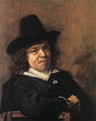
Here is the picture I am referring to:
Artist: Frans Hals (c. 1580-1666), Dutch painter
And these were my comments (my own "first impressions") on this subject, having not yet taken any time to try to analyze the picture: "A modest yet friendly man who would be nice to be stuck sitting next to while waiting for something. He looks like a good listener, and sympathetic and probably encouraging. It would probably be nice to have supper with him...and keep him for a friend."
I did not know anything about Frans Post when I saw this picture for the first time. And I still have not looked to find out anything about him or about other people's opinions and observations about the way the painting was composed and why it was composed that way. So, what follows are my own ideas based on my understanding of how these things work.
The main thing to get across here, as it helps so much in the interpretation of the personality of Mr. Post, is that where the subject is placed in relation to the center of the picture tells us a lot about it. (Of course there are also other factors that help us understand the subject, and I will point out a few of those shortly.)
It seems at first surprising to realize that so much of the subject's "personality" is evident when only a part of his face and one side of his collar are seen with any clarity. Everything else is in the dark.
How do we get such a strong idea of what he's like, then? It's not only the expression in his face, though that is part of it. What tells us even more is where his face is in the picture, and how it's tilted. And not just his face, but also his body.
Someone who was in dead center and straight upright, especially with head and body both facing directly toward the viewer, would seem (all other things being equal) perfectly composed, steady, like a rock, unchanging, hardly affected by outer events. You don't often see a portrait like that, as most people are not like that, though some are. Here is a good example of such a subject:
Source: Wikimedia (picture is in the public domain)
This is not an individual with a unique personality but the personification of compassion and mercy. We would expect someone like this to be serene, "like a rock, unchanging."
And here is another example:
Artist: John Singer Sargent
Source: The Athenaeum
The subject (or her head and neckscarf, anyway, which are all we can see) in the above picture is not in the center between top and bottom, but she is in the center between left and right, and her head and body are both facing directly toward the viewer. However, rather than giving the appearance of calmness and stability, as does the Senju Kannon, above, to me at least this woman looks like she's barely able to control strong emotion. She does not have "a thousand arms" reaching out in compassion, but instead seems to have all of her energy concentrated in her seemingly disembodied head. She projects that highly concentrated energy through her eyes, out of the darkness below her brows, causing her to look as if she's not at peace but, rather, stubborn, willful, and about to explode. She is quite literally "self-centered." She looks as if she would have only one position on things - her own, unchangeable, position. I would not want to be left alone with this person.
Frans Post, in Hals' painting, far from being in the center with face and body aimed directly toward the viewer, leans far to our left of the center of the picture. Recall:

He is also sitting behind the back of a chair, making him seem more "caged in," whereas the staring woman has nothing in front of her that protects us from her, should we need protection.
Mr. Post is a person, we understand, who is not afraid to look into our eyes (he has nothing to hide and seems open and honest). He, leaning comfortably against the back of the chair, has no fear of us, either, but, unlike the fearless Ms. Austin, he is not ready to pounce on us (physically or verbally). He doesn't seem to be leaning away from us, but, rather, is leaning a bit toward us. That, along with the focus (because of the light) on his facial expression, with its unforced friendly smile, is very endearing. He looks comfortable and content, and his body language seems to say "It's so good to see you. Please come and talk to me. Let's spend a while together."
I admit that it's true that in some portraits where the head is tilted back amost in the same way the subject does not look so friendly and welcoming as does Frans Post. For example, here is another portrait by Frans Hals in which the subject is placed in a similar pose:
Artist: Frans Hals
What are the differences between these pictures that account for how we interpret the two subjects so differently? For one thing, the man (no name is given) in this last picture does not look as relaxed as Mr. Post. He has a pleasant face with a sweet little smile (though it's almost sarcastic looking - try on that smile yourself and find out how it feels), but he looks very stiff, which in my opinion has a lot to do with the diagonal row of buttons or decoration down the front of his jacket, which makes his head look like a piece of candy on the end of a lollipop stick. He does not look "relaxed," but simply leaning away from us as if he didn't want us to get too close. Also, he is not looking at us. He is looking at someone (or something) behind us and to our right, as if he couldn't care less about us but was only interested in whatever he's looking toward. His gaze also has the effect of straightening him up, which is one of the reasons he looks so tense. The overall effect is to make him look like a very alert, superficially accommodating person who, however, is impatient, fidgety, and not very thoughtful.
Furthermore, his clothing does not blend in so well with the background as does Mr. Post's. It is much more noticeable because it is well-lit and lit from the side so that the folds and creases are very noticeable, making his clothing appear to be aggressively confronting us. Also, we are able to see that the fabric looks as stiff as the row of buttons, and that his right arm is thrust forward toward us, almost into "our" space; this seems "unfriendly," as if he's trying to put up a threatening barrier between himself and the viewer.
In other words, he does not look comfortable and he does not look welcoming. The message I get is: "I'd like to get out of this chair and this situation ASAP, and, by the way, I do wish you'd stop pestering me. I have better things to do."
There are more portraits by Hals where he has his subject in this same basic position, and it would be fun to compare more of them, but those will have to wait for other posts.

0 comments:
Post a Comment