The Horizontal Format - What can it be used for and why?
I've written about the circular format (tondos, round artworks) and what kind of subjects and effects it's good for and why. Now I'd like to write about what the horizontal format is good for and why.
We have all heard that you should choose a horizontal composition if the subject itself is basically horizontal or if you want a feeling of serenity. But there are also other possible reasons for choosing a horizontal format. Here are some ideas that it may be useful to consider:
1) When there is a dominant horizontal axis, everything along that axis is perceived more or less "equal" in opportunity, strength, etc.
2) A horizontal format stresses the interaction (or the possibility of interaction) between things that are on the same horizontal level.
3) A horizontal orientation takes advantage of the tendency of people to read a picture from left to right.
4) The horizontal dimension can easily suggest the passage of time.
5) If you want to emphasize the uniquess or "aloneness" of something that is vertical/upright, it might be a good tactic to have a horizontal composition in which the one vertical item (or small cluster of them) is the only thing in a "sea of horizontality" that is not horizontal.
6) A horizontal picture of a human figure (and upright animals, also) emphasizes the groin rather than the head.
7) A hodgepodge of other ideas that horizontality can help get across.
I will explain all of these the best I can, and show some examples.
1) WHEN THERE IS A DOMINANT HORIZONTAL AXIS, EVERYTHING ALONG THAT AXIS IS PERCEIVED AS MORE OR LESS "EQUAL" IN OPPORTUNITY, STRENGTH, ETC. BECAUSE OF THEIR EQUAL SUSCEPTIBILITY TO THE PULL OF GRAVITY.
In a horizontal composition all components that are within the same horizontal "layer" are equally related to the bottom of the picture which we associate with the pull of gravity (assuming the picture is meant to represent life as it is lived here on earth where the effects of gravity as powerful and constant -- In many abstract paintings, for example, gravity as we experience it in our everyday lives is not represented in this way). Being equally subject to the gravitational pull from below they are intuitively perceived by the viewer to be coexisting in the same circumstances, meaning that whatever we find within the same layer in a horizontal composition (if no other factors in the composition nullify this perception) appears to be on equal footing, in the same hierarchical level, nothing within that layer apparently having any significant advantage over anything else within it (though something even poking a tiny bit above the general horizontal mass can give the impression of power over or even danger to the otherwise homogeneous mass they're in the midst of).

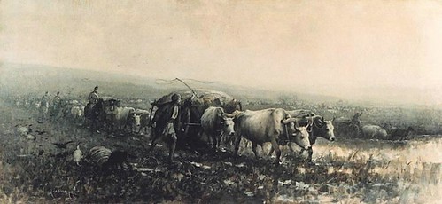
Marine, 1890
Maurice Galbraith Cullen (1866 - 1934)
Click on picture to see in larger size
In a vertical composition, on the other hand, what is "above" is perceived to have some kind of advantage over what is below; if there is a fight, for example, it's a good bet that we will get the feeling that the participant at the top of the picture is going to win as he/she/it has an unfair advantage since the participants, not being side-by-side (on a "level playing field"), are not portrayed as having equal powers or opportunities (the participant above seeming to be less influenced by the force of gravity, he/it appears obviously stronger, more alive, more resistant, more powerful; while the object below seems to us to be more subject to the pull of gravity and therefore is seen as weaker and vulnerable).
There may be other compositional factors at work which modify or even completely nullify this effect, of course (and this is true with regard to all of the possible effects of a horizontal composition described in this post), but we are talking here just about the effects of being on the same horizontal level, especially when the picture itself is in a horizontal format as this makes the left-right axis predominant and our eyes, while looking at the picture, move back and forth sideways more than up and down, thus enhancing the effect of uniformity and equality all across the horizontal plane.
2) A HORIZONTAL FORMAT STRESSES INTERACTION (OR THE POSSIBILITY OF INTERACTION) BETWEEN THINGS THAT ARE ON THE SAME LEVEL
The possibility of interaction between whatever is anywhere along the same level is suggested, most importantly along the main (left-right) axis in a horizontal composition.

Rehearsal of the Ballet, c. 1905-06
Everett Shinn (1876 - 1953)
Click on picture to see in larger size
Probably most humans spend most of the days of their lives living with, walking among, working with, driving on the same roads with, and/or otherwise interacting with (or attempting to avoid) people, animals, and objects sharing the same environment (I'm not including electronic communication; this is about the physical world).
This shared space in which there is the possibility of interaction is usually basically a horizontal one. There may be tall buildings, deep subterranean subways and malls, etc., but when these things empty out the people are back on the same horizontal surface which we all recognize as "ground" level. Above and below ground structures such as those just mentioned would contain their own "ground levels" but the main ground level, where at least most of them live, is "where sky meets earth." In any case (above, below, or at "sky meets earth" level) there is (or is the potential of) interaction between people/animals/things on the same plane, and this plane is emphasized in a horizontal composition.

The moonlight fight between Yoshitsune and Benkei on the Gojobashi, Kyoto, Japan
Utagawa Kuniyoshi (1798 - 1861)
Click on picture to see in larger size
In other words, putting aside the "lumpiness" of our physical environment, basically we live in a horizontal world in which most physical communication (or at least sharing of the same space with the possibility of communication) takes place, be it friendly or be it warlike. Naturally, in a horizontal composition this interaction (or failure to interact) is emphasized as not only does the horizontality of the long edges of the composition make us more aware of this horizontal band of interaction, but also we are able to see a wider view (left to right) and thus get a better idea of what various things or people or animals, etc. are likely to have some contact with each other (if only eye contact; that is communication, too) ... In a narrow composition we can only see what's "right in front of us" as if we have blinders on that prevent us from seeing what is further to the left and right. Also, more space along this horizontal line of interaction is available to the artist so that he or she can better show relationships (and, possibly, barriers) between whatever and/or whomever inhabits it.
Note: Contact (or the possibility of it) can be shown between things/people/animals that are not (in the picture) on the same level, of course, and often is, but there is more difficulty presumed in achieving that contact - or the contact is likely to be one-way rather than mutual - as non-horizontal contact has a hierarchical connotation. It's usually not "contact between equals." Due to the perceived sameness of susceptibility to the pull of gravity from below (as is mentioned in 1, above) there is a strong connotation of equality among those who are on the same level in the picture...They share the same circumstances and so they can, or at least there is a better possibility that they will (even if they are incompatible), at least be somewhat familiar with each other and understand each other better than those on distant rungs of the hierarchy ever will.
3) A HORIZONTAL ORIENTATION TAKES ADVANTAGE OF THE TENDENCY OF PEOPLE TO READ A PICTURE FROM LEFT TO RIGHT.
"As far as actual eye movements are concerned, scanning from left to right and vice versa occurs somewhat more readily than scanning up and down. In addition there is a well-known tendency, largely independent of actual eye movements, for viewers to perceive the area in the left corner of the visual field as the point of departure and the entire picture as organized from left to right." -- Rudolf Arnheim in The Power of the Center, page 37.

Abram Arkhipov - Led Proshel
Click on picture to see in larger size
4) THE HORIZONTAL FORMAT CAN EASILY SUGGEST THE PASSAGE OF TIME.
Below is my extremely simplified daily schedule, in horizontal timeline format:
This goes with idea mentioned just above: A horizontal orientation takes advantage of the tendency of people to read a picture from left to right. Timelines have the earliest date at the left.
Because the right half of our brain is more observant and able when it comes to interpreting the meaning of what lies in our visual field -- and the right brain is more in control of what we see to the left (while the left brain is more in control of what we see to the right) -- what's at the left in our field of vision gets more of our attention and seems more important to us, and we identify with what's there and look from there (the left) to the right to see what "lies ahead," to the right (think of a horizontal timeline, which always shows earlier events to the left, later ones to the right).
When we see a scene as beginning at the left the idea that there is a "beginning" implies that something comes afterwards rather than that the subject (for example as it would be in a round artwork with the subject in the middle) is unmovable -- going nowhere. So movement is suggested in the typical horizontal composition and that implies the time to make that movement; this effect is even stronger when the picture is decidedly horizontal. And so we are inclined to interpret a horizontal picture as if it were a scene unfolding from left to right. Of course things are sometimes seen to move in other directions, also (right to left, front to back, back to front), but because of the way we perceive a scene left to right movement seems more natural and easily achieved, so if the artist indicates movement that is NOT left to right the "speed" with which the perceived action unfolds is affected and also the time it seems to take is affected (we feel that time goes from left to right, too). For an example of how this affects our understanding of what is happening in a picture, when something is aimed from right to left the action unfolding in that direction seem slower, more plodding, more difficult - something we may want to imply, or may want to be careful not to imply.
Barge Haulers on the Volga - 1870-73
Ilya Repin (1844 - 1930)
Nicolae Grigorescu (1838 - 1907) - Transport de Provizii - no date
Nicolae Grigorescu (1838 - 1907) - Transport de Provizii - Picture reversed.
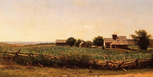
5) IF YOU WANT TO EMPHASIZE THE UNIQUENESS OR "ALONENESS" OF SOMETHING THAT IS VERTICAL/UPRIGHT, IT MIGHT BE A GOOD TACTIC TO HAVE A HORIZONTAL COMPOSITION IN WHICH THE ONE UPRIGHT ITEM (OR SMALL CLUSTER OF THEM) IS THE ONLY THING IN A "SEA OF HORIZONTALITY" THAT IS NOT HORIZONTAL.
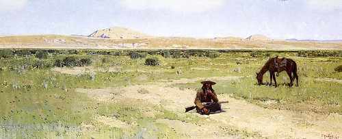
A Rest in the Desert, 1897 by Henry F. Farney (1847 - 1916) - Upright objects in a sea of horizontality
6) A HORIZONTAL HUMAN FIGURE EMPHASIZES THE GROIN RATHER THAN THE HEAD.
"Taken by itself, a human figure would be seen as dominated by the head, the home of the main sense organs and the seat of reasoning -- a version supported by the central vertical and the bilateral symmetry it controls. But no such symmetry exists visually around the central horizontal. The balancing center challenges the dominance of the head and proposes a structure organized around the pelvic area." -- Rudolf Arnheim in The Power of the Center, page 98.

Olympia, 1863 by Edouard Manet (1832 - 1883)
7) A HODGEPODGE OF OTHER IDEAS THAT HORIZONTALITY CAN HELP GET ACROSS.
A) Loneliness (This could be easily shown in a horizontal scene where something or someone can be compared with a great deal of space on both sides in the same "interactive" plane)
B) Abandonment (Can you imagine how this can be shown in a horizontal format? I can, but I'm sure that there are other ways and I wouldn't want to plant just that one idea in someone's brain. Contact me if you want to know my idea; I hope I can still think of it by then)
C) Vulnerability (Something that is horizontal is associated with weakness and vulnerability as things that are alive and well and strong are able resist the pull of gravity and stand up and defend themselves while things are are sick or weak have a difficult time becoming vertical on their own nor can they defend themselves well if at all)
D) Distance (time/space) (A long distance can be implied by the length of a horizontal line or plane in relation to a short height, especially if "obstacles" are placed along the path...this makes it seems as if the going will be very slow, taking a lot of time, and taking a lot of time implies a greater distance is having to be covered)
E) Isolation (Same comment as in A, above)
F) Disintegration. Although horizontal things can and do disintegrate, the effect is more noticeable in things that we recognize were upright to start with.
In nature most if not all things will eventually become horizontal in one way or another or a combination of ways. They may, for example, fall over or be knocked down (e.g., by an earthquake) or blown apart (e.g., by a volcano or explosives) or squashed by something heavy from above (a dislodged boulder, perhaps) or attacked and eaten away chemically and/or washed away by water, and eventually become horizontal or disappear altogether (unless before they have disintegrated completely they are lifted up by earth movements or some other force). The damage done to formerly vertical things does not in itself make them become horizontal. It's gravity that does that, pulling down the parts that become loosened.
A scene may be essentially horizontal even when it contains many upright things (such as buildings and walls) if everything is the same height or nearly so (e.g., flat roofs at the same level, no skyscrapers, no towers, no trees or telephone poles) . Even though erosion or other "damage" may not be at all responsible for this "flat all over" look, our intuitive interpretation of the large, unrelieved, horizontal expanse of such a landscape/cityscape/whatever it might be might well be that the place has undergone a vast amount of "erosion" or "disintegration." Intuitively (whether we know better or not) we perceive it as a sleepy and uninteresting place that looks like it has seen better days, and we expect the inhabitants to be lifeless and resigned to their plight rather than willing or able to do anything about it.
G) Barrenness (A horizontal composition can show emptiness not only in the foreground and background but also from side to side; emptiness implies barrenness; where things do not accumulate nothing is being produced; this is a close cousin of Disintegration, above, but it is not the same; barrenness would imply that nothing much was there in the first place and nothing at all is there now -- it is dead because that place does not support life -- while disintegration would imply that there was something thriving once but the place is dying now and whatever might remain is too weak to do anything about it.)
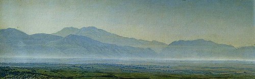
Alexandr Ivanov (1806 - 1858) - painted in 1838
H) Hopelessness (See Barrenness, just above and think about how whatever was in the middle of that barren scene would probably be pretty hopeless looking if they were in a horizontal position themselves.)
I) Weakness (See Vulnerability, above)
J) Death (See Vulnerability)
K) Inability to resist (See Vulnerability)
L) Progress (See the last paragraph in No. 4, above, and also think about how showing what's "behind" [usually to the left] in a horizontal scene shows what the person or object "down the road" to the right has passed through and left behind...this can be interpreted as progress if the setting and "props" are amenable to this analysis. If not considered "progress" in the positive sense, it will at least suggest movement in space and time...perhaps with things getting worse or not changing at all).
M) Confrontation (A collision between two obviously incompatible elements that are headed toward each other...or one is headed toward the other which may be stationary...in the same horizontal plane [a horizontal plane being the "interaction" plane...See 2, above] so that you can assume a confrontation is almost inevitable).
Vasily Vasilyevich Vereshchagin (1842 - 1904) - Plotzlicher Angriff - 1871
N) Ignorance of each other or inability to come into contact (You can show two elements in the same horizontal plane [the "interaction" plane] that seem to belong to or want to get in touch with each other yet they can't because of some kind of barrier(s) between them. These don't have to look like "real" barriers, e.g., high sturdy walls with gunmen at the top - just the "idea" of barriers can work, for example a busy street in between or a STOP sign or a fierce looking dog tied up and sitting on the sidewalk - can make it seem as though these things that want to be together will have a difficult time in accomplishing this aim).
0) Invisibility (See 5, above for how to make something stand out, and do the opposite...make the vertical object blend in by, among other things, making it appear as if it's part of the whole horizontal mass and is no different than anything else around it. You might be interested in reading an earlier post of mine, on camouflage, if you'd really like something to "be there" but not seen)
P) Equality or lack of individuality (The horizontal format would reinforce the idea of regimentation and homogeneity/equality for example in pictures of armies marching in lockstep or of breadlines)
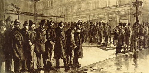
Everett Shinn (1876 - 1953) - Out of a Job - News of the Unemployed, 1908
This should give you a lot to think about. I think you'll agree that there's a whole lot more that a horizontal format can be useful for than just to give a feeling of serenity to the picture or provide a "fitting" frame for a horizontal subject.
I've written about the circular format (tondos, round artworks) and what kind of subjects and effects it's good for and why. Now I'd like to write about what the horizontal format is good for and why.
We have all heard that you should choose a horizontal composition if the subject itself is basically horizontal or if you want a feeling of serenity. But there are also other possible reasons for choosing a horizontal format. Here are some ideas that it may be useful to consider:
1) When there is a dominant horizontal axis, everything along that axis is perceived more or less "equal" in opportunity, strength, etc.
2) A horizontal format stresses the interaction (or the possibility of interaction) between things that are on the same horizontal level.
3) A horizontal orientation takes advantage of the tendency of people to read a picture from left to right.
4) The horizontal dimension can easily suggest the passage of time.
5) If you want to emphasize the uniquess or "aloneness" of something that is vertical/upright, it might be a good tactic to have a horizontal composition in which the one vertical item (or small cluster of them) is the only thing in a "sea of horizontality" that is not horizontal.
6) A horizontal picture of a human figure (and upright animals, also) emphasizes the groin rather than the head.
7) A hodgepodge of other ideas that horizontality can help get across.
I will explain all of these the best I can, and show some examples.
1) WHEN THERE IS A DOMINANT HORIZONTAL AXIS, EVERYTHING ALONG THAT AXIS IS PERCEIVED AS MORE OR LESS "EQUAL" IN OPPORTUNITY, STRENGTH, ETC. BECAUSE OF THEIR EQUAL SUSCEPTIBILITY TO THE PULL OF GRAVITY.
In a horizontal composition all components that are within the same horizontal "layer" are equally related to the bottom of the picture which we associate with the pull of gravity (assuming the picture is meant to represent life as it is lived here on earth where the effects of gravity as powerful and constant -- In many abstract paintings, for example, gravity as we experience it in our everyday lives is not represented in this way). Being equally subject to the gravitational pull from below they are intuitively perceived by the viewer to be coexisting in the same circumstances, meaning that whatever we find within the same layer in a horizontal composition (if no other factors in the composition nullify this perception) appears to be on equal footing, in the same hierarchical level, nothing within that layer apparently having any significant advantage over anything else within it (though something even poking a tiny bit above the general horizontal mass can give the impression of power over or even danger to the otherwise homogeneous mass they're in the midst of).
Marine, 1890
Maurice Galbraith Cullen (1866 - 1934)
Click on picture to see in larger size
| The "horizontal layer of interaction" in the above picture is right at the horizon, between sky and water. The boats, big and small, are in this layer. Although, recognizing the boats are only boats, after all, and not warships, and in fact the boat with the larger profile is actually a small sailboat, we do not assume any kind of confrontation or other physical contact has taken or is about to take place between them, still we get the "feeling" of dominance and danger from that sailboat, as it not only rises far above the other ships (as we see it, not presumably in real life) but also it looks like a knife slicing through the water, going at great speed from left to right, leaving the tiny specks (other boats, which are anchored to the left side of the picture...see 3, below) far behind. [An aside: This tells you that what we "know" -- in this case about the actual sizes and distances between things and probable intentions of the sailors handling their boats -- is not always the same as what we "see," and what we "see" (especially if unconsciously) strongly influences our perception of what we're looking at.] |
In a vertical composition, on the other hand, what is "above" is perceived to have some kind of advantage over what is below; if there is a fight, for example, it's a good bet that we will get the feeling that the participant at the top of the picture is going to win as he/she/it has an unfair advantage since the participants, not being side-by-side (on a "level playing field"), are not portrayed as having equal powers or opportunities (the participant above seeming to be less influenced by the force of gravity, he/it appears obviously stronger, more alive, more resistant, more powerful; while the object below seems to us to be more subject to the pull of gravity and therefore is seen as weaker and vulnerable).
There may be other compositional factors at work which modify or even completely nullify this effect, of course (and this is true with regard to all of the possible effects of a horizontal composition described in this post), but we are talking here just about the effects of being on the same horizontal level, especially when the picture itself is in a horizontal format as this makes the left-right axis predominant and our eyes, while looking at the picture, move back and forth sideways more than up and down, thus enhancing the effect of uniformity and equality all across the horizontal plane.
2) A HORIZONTAL FORMAT STRESSES INTERACTION (OR THE POSSIBILITY OF INTERACTION) BETWEEN THINGS THAT ARE ON THE SAME LEVEL
The possibility of interaction between whatever is anywhere along the same level is suggested, most importantly along the main (left-right) axis in a horizontal composition.
Rehearsal of the Ballet, c. 1905-06
Everett Shinn (1876 - 1953)
Click on picture to see in larger size
| Although the above horizontal composition isn't particularly wide in comparison to its height, it definitely stresses interaction on the same level. The dancers' heads are in line with those of the stage manager, the choreographer, or whoever those people to the left are; because they are at the same level (not to mention these people appear to be intensely interested in the dancers) they are obviously as important and necessary as those dancers in the production of the ballet (even though they are never seen by the audience). We can see the interaction taking place, actually: The men on the left are watching the dancers very closely; they appear to be inspecting and instructing them, and obviously the dancers would be responding or they would be out of a job. The musician is playing for the dancers; the dancers are dancing to the music. The scenery also seems to be included in among the "equals" and plays its own kind of role in the production. |
Probably most humans spend most of the days of their lives living with, walking among, working with, driving on the same roads with, and/or otherwise interacting with (or attempting to avoid) people, animals, and objects sharing the same environment (I'm not including electronic communication; this is about the physical world).
This shared space in which there is the possibility of interaction is usually basically a horizontal one. There may be tall buildings, deep subterranean subways and malls, etc., but when these things empty out the people are back on the same horizontal surface which we all recognize as "ground" level. Above and below ground structures such as those just mentioned would contain their own "ground levels" but the main ground level, where at least most of them live, is "where sky meets earth." In any case (above, below, or at "sky meets earth" level) there is (or is the potential of) interaction between people/animals/things on the same plane, and this plane is emphasized in a horizontal composition.
The moonlight fight between Yoshitsune and Benkei on the Gojobashi, Kyoto, Japan
Utagawa Kuniyoshi (1798 - 1861)
Click on picture to see in larger size
| An arching bridge, although not flat is just a "bump" in a horizonal strip in most cases. It is not necessary that the ground actually be perfectly flat for there to be the possibility of interaction between people/animals/objects that are contained within it. Neither is it necessary that the strip be very narrow as of course the scene may be viewed from above ground level, giving us a broader view. |
In other words, putting aside the "lumpiness" of our physical environment, basically we live in a horizontal world in which most physical communication (or at least sharing of the same space with the possibility of communication) takes place, be it friendly or be it warlike. Naturally, in a horizontal composition this interaction (or failure to interact) is emphasized as not only does the horizontality of the long edges of the composition make us more aware of this horizontal band of interaction, but also we are able to see a wider view (left to right) and thus get a better idea of what various things or people or animals, etc. are likely to have some contact with each other (if only eye contact; that is communication, too) ... In a narrow composition we can only see what's "right in front of us" as if we have blinders on that prevent us from seeing what is further to the left and right. Also, more space along this horizontal line of interaction is available to the artist so that he or she can better show relationships (and, possibly, barriers) between whatever and/or whomever inhabits it.
Note: Contact (or the possibility of it) can be shown between things/people/animals that are not (in the picture) on the same level, of course, and often is, but there is more difficulty presumed in achieving that contact - or the contact is likely to be one-way rather than mutual - as non-horizontal contact has a hierarchical connotation. It's usually not "contact between equals." Due to the perceived sameness of susceptibility to the pull of gravity from below (as is mentioned in 1, above) there is a strong connotation of equality among those who are on the same level in the picture...They share the same circumstances and so they can, or at least there is a better possibility that they will (even if they are incompatible), at least be somewhat familiar with each other and understand each other better than those on distant rungs of the hierarchy ever will.
3) A HORIZONTAL ORIENTATION TAKES ADVANTAGE OF THE TENDENCY OF PEOPLE TO READ A PICTURE FROM LEFT TO RIGHT.
"As far as actual eye movements are concerned, scanning from left to right and vice versa occurs somewhat more readily than scanning up and down. In addition there is a well-known tendency, largely independent of actual eye movements, for viewers to perceive the area in the left corner of the visual field as the point of departure and the entire picture as organized from left to right." -- Rudolf Arnheim in The Power of the Center, page 37.
Abram Arkhipov - Led Proshel
Click on picture to see in larger size
| Because of our tendency to read a picture from left to right, we are aware that the woman on the left is the "point of departure" in this composition and we tend to adopt her perceived attitude (waiting, but not expecting anything soon) and follow her glance, which here goes from (our) left to right, making us aware of the other people (all of them also apparently waiting for something) and then further right to the horizon where water meets sky. I have no idea what the title of this (in Russian) means or even if it's actually the title, but to me it looks like these people are obviously waiting for a boat (which is presumed to be beyond the horizon they are are oriented toward) with people aboard who mean a lot to them and about whom they are concerned. It is obvious that the boat would be traveling from right to left (as we view the scene) and this idea (right to left travel) makes it seem like it will probably take a long time getting there. And so this picture not only illustrates the idea of reading a picture from left to right but also how the idea of "time" can be easily be suggested in a horizontal format (see 4, just below). |
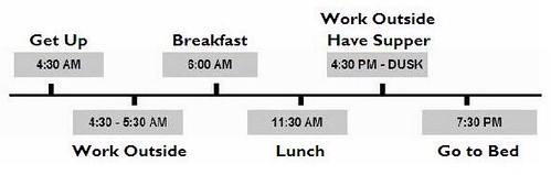
4) THE HORIZONTAL FORMAT CAN EASILY SUGGEST THE PASSAGE OF TIME.
Below is my extremely simplified daily schedule, in horizontal timeline format:
This goes with idea mentioned just above: A horizontal orientation takes advantage of the tendency of people to read a picture from left to right. Timelines have the earliest date at the left.
Because the right half of our brain is more observant and able when it comes to interpreting the meaning of what lies in our visual field -- and the right brain is more in control of what we see to the left (while the left brain is more in control of what we see to the right) -- what's at the left in our field of vision gets more of our attention and seems more important to us, and we identify with what's there and look from there (the left) to the right to see what "lies ahead," to the right (think of a horizontal timeline, which always shows earlier events to the left, later ones to the right).
When we see a scene as beginning at the left the idea that there is a "beginning" implies that something comes afterwards rather than that the subject (for example as it would be in a round artwork with the subject in the middle) is unmovable -- going nowhere. So movement is suggested in the typical horizontal composition and that implies the time to make that movement; this effect is even stronger when the picture is decidedly horizontal. And so we are inclined to interpret a horizontal picture as if it were a scene unfolding from left to right. Of course things are sometimes seen to move in other directions, also (right to left, front to back, back to front), but because of the way we perceive a scene left to right movement seems more natural and easily achieved, so if the artist indicates movement that is NOT left to right the "speed" with which the perceived action unfolds is affected and also the time it seems to take is affected (we feel that time goes from left to right, too). For an example of how this affects our understanding of what is happening in a picture, when something is aimed from right to left the action unfolding in that direction seem slower, more plodding, more difficult - something we may want to imply, or may want to be careful not to imply.
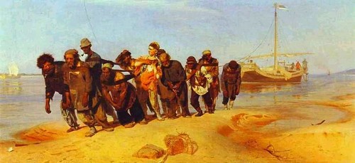
Barge Haulers on the Volga - 1870-73
Ilya Repin (1844 - 1930)
| The barge haulers are pulling toward our left and that makes their work seem all the more tortuous. If they were headed toward our right it wouldn't look quite so difficult. Because of the horizontal format, we are able to see where they came from and what they're hauling; besides that, the idea that that big heavy barge is also headed to the left makes it seem like an even more difficult load to pull. |
Nicolae Grigorescu (1838 - 1907) - Transport de Provizii - no date
| The above picture provides another illustration of how heading to the left makes movement seem slower and more arduous. Note how the same picture looks reversed, below. The oxen appear to be moving quickly in comparison with how plodding they look in the original picture where they're facing to the left. |
Nicolae Grigorescu (1838 - 1907) - Transport de Provizii - Picture reversed.
5) IF YOU WANT TO EMPHASIZE THE UNIQUENESS OR "ALONENESS" OF SOMETHING THAT IS VERTICAL/UPRIGHT, IT MIGHT BE A GOOD TACTIC TO HAVE A HORIZONTAL COMPOSITION IN WHICH THE ONE UPRIGHT ITEM (OR SMALL CLUSTER OF THEM) IS THE ONLY THING IN A "SEA OF HORIZONTALITY" THAT IS NOT HORIZONTAL.
A Rest in the Desert, 1897 by Henry F. Farney (1847 - 1916) - Upright objects in a sea of horizontality
6) A HORIZONTAL HUMAN FIGURE EMPHASIZES THE GROIN RATHER THAN THE HEAD.
"Taken by itself, a human figure would be seen as dominated by the head, the home of the main sense organs and the seat of reasoning -- a version supported by the central vertical and the bilateral symmetry it controls. But no such symmetry exists visually around the central horizontal. The balancing center challenges the dominance of the head and proposes a structure organized around the pelvic area." -- Rudolf Arnheim in The Power of the Center, page 98.
Olympia, 1863 by Edouard Manet (1832 - 1883)
7) A HODGEPODGE OF OTHER IDEAS THAT HORIZONTALITY CAN HELP GET ACROSS.
A) Loneliness (This could be easily shown in a horizontal scene where something or someone can be compared with a great deal of space on both sides in the same "interactive" plane)
B) Abandonment (Can you imagine how this can be shown in a horizontal format? I can, but I'm sure that there are other ways and I wouldn't want to plant just that one idea in someone's brain. Contact me if you want to know my idea; I hope I can still think of it by then)
C) Vulnerability (Something that is horizontal is associated with weakness and vulnerability as things that are alive and well and strong are able resist the pull of gravity and stand up and defend themselves while things are are sick or weak have a difficult time becoming vertical on their own nor can they defend themselves well if at all)
D) Distance (time/space) (A long distance can be implied by the length of a horizontal line or plane in relation to a short height, especially if "obstacles" are placed along the path...this makes it seems as if the going will be very slow, taking a lot of time, and taking a lot of time implies a greater distance is having to be covered)
E) Isolation (Same comment as in A, above)
F) Disintegration. Although horizontal things can and do disintegrate, the effect is more noticeable in things that we recognize were upright to start with.
In nature most if not all things will eventually become horizontal in one way or another or a combination of ways. They may, for example, fall over or be knocked down (e.g., by an earthquake) or blown apart (e.g., by a volcano or explosives) or squashed by something heavy from above (a dislodged boulder, perhaps) or attacked and eaten away chemically and/or washed away by water, and eventually become horizontal or disappear altogether (unless before they have disintegrated completely they are lifted up by earth movements or some other force). The damage done to formerly vertical things does not in itself make them become horizontal. It's gravity that does that, pulling down the parts that become loosened.
A scene may be essentially horizontal even when it contains many upright things (such as buildings and walls) if everything is the same height or nearly so (e.g., flat roofs at the same level, no skyscrapers, no towers, no trees or telephone poles) . Even though erosion or other "damage" may not be at all responsible for this "flat all over" look, our intuitive interpretation of the large, unrelieved, horizontal expanse of such a landscape/cityscape/whatever it might be might well be that the place has undergone a vast amount of "erosion" or "disintegration." Intuitively (whether we know better or not) we perceive it as a sleepy and uninteresting place that looks like it has seen better days, and we expect the inhabitants to be lifeless and resigned to their plight rather than willing or able to do anything about it.
G) Barrenness (A horizontal composition can show emptiness not only in the foreground and background but also from side to side; emptiness implies barrenness; where things do not accumulate nothing is being produced; this is a close cousin of Disintegration, above, but it is not the same; barrenness would imply that nothing much was there in the first place and nothing at all is there now -- it is dead because that place does not support life -- while disintegration would imply that there was something thriving once but the place is dying now and whatever might remain is too weak to do anything about it.)
Alexandr Ivanov (1806 - 1858) - painted in 1838
| The horizontal format makes this scene look all the more desolate and barren as we see not only depth but great width. Also, the flat ground looks all the flatter (and non-productive) because the painting is quite decidedly horizontal. |
H) Hopelessness (See Barrenness, just above and think about how whatever was in the middle of that barren scene would probably be pretty hopeless looking if they were in a horizontal position themselves.)
I) Weakness (See Vulnerability, above)
J) Death (See Vulnerability)
K) Inability to resist (See Vulnerability)
L) Progress (See the last paragraph in No. 4, above, and also think about how showing what's "behind" [usually to the left] in a horizontal scene shows what the person or object "down the road" to the right has passed through and left behind...this can be interpreted as progress if the setting and "props" are amenable to this analysis. If not considered "progress" in the positive sense, it will at least suggest movement in space and time...perhaps with things getting worse or not changing at all).
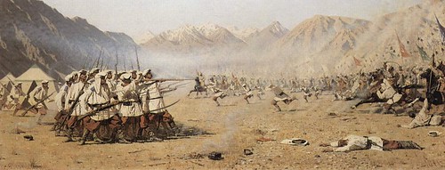
M) Confrontation (A collision between two obviously incompatible elements that are headed toward each other...or one is headed toward the other which may be stationary...in the same horizontal plane [a horizontal plane being the "interaction" plane...See 2, above] so that you can assume a confrontation is almost inevitable).
Vasily Vasilyevich Vereshchagin (1842 - 1904) - Plotzlicher Angriff - 1871
| Above is a very unsubtle example of confrontation on the same plane in a horizontal format. |
N) Ignorance of each other or inability to come into contact (You can show two elements in the same horizontal plane [the "interaction" plane] that seem to belong to or want to get in touch with each other yet they can't because of some kind of barrier(s) between them. These don't have to look like "real" barriers, e.g., high sturdy walls with gunmen at the top - just the "idea" of barriers can work, for example a busy street in between or a STOP sign or a fierce looking dog tied up and sitting on the sidewalk - can make it seem as though these things that want to be together will have a difficult time in accomplishing this aim).
0) Invisibility (See 5, above for how to make something stand out, and do the opposite...make the vertical object blend in by, among other things, making it appear as if it's part of the whole horizontal mass and is no different than anything else around it. You might be interested in reading an earlier post of mine, on camouflage, if you'd really like something to "be there" but not seen)
P) Equality or lack of individuality (The horizontal format would reinforce the idea of regimentation and homogeneity/equality for example in pictures of armies marching in lockstep or of breadlines)
Everett Shinn (1876 - 1953) - Out of a Job - News of the Unemployed, 1908
| These men are like dots in a line, their heads all on the same level. This is not about individual people who have gathered together for various reasons but about all of them being as one, in equal circumstances, in this case equally jobless and poor and seeking relief. It is very interesting how the opening in this line (probably for cars to pass through) enables us to see that the line is even longer than we might otherwise imagine if it only went from left to right, and yet the men further down the line, heading up another street, still appear at the same horizontal level that the men in the foreground inhabit. |
This should give you a lot to think about. I think you'll agree that there's a whole lot more that a horizontal format can be useful for than just to give a feeling of serenity to the picture or provide a "fitting" frame for a horizontal subject.
9 comments:
Hi, well be sensible, well-all described
When I can figure out how to get rid of the above comment, I will. It is simply an ad for Cialis (i.e., comment spam) that someone has added. - Jean
Although facinating, all of that analysis is too left hand side of the brain for me.When doing art I prefer intuition,just doing what feels or looks right.Perhaps a few thumbnails if I'm stuck!
In other areas of life I use the intelect intensivly but in art I feel,that's whatit is for me,many see it differently, I know.Perhaps I'm on the wrong site, thinking about art!!
Can’t help to leave a comment here; you really are intelligent. Thanks for sharing this wonderful write – up. I’m having a wonderful time reading them.
www.n8fan.net
Thanks for all your efforts...
Lovely Blog with the best information. Thanks for updating this
thierry mysius paintings
fine art consultancy phoenix
russian artwork
angelo vadala
amazing traditional art paintings
dmitri annenkov paintings
anastasiya matveeva paintings
contemporary oil paintings
angelo vadala paintings
best art consultancy phoenix
I Always love to dear about 80's post and thats the one i am loving it and its nicely written. i also suggest you kindly read that too Painters in Diamond bar
Good
Diamond painting art is an emerging form of art that has recently become popular with hobbyists and experienced painters alike.
Post a Comment