Part 1 - Spring (painted in 1889)
I would very much like to show the painting I'm going to write about here, but since it's apparently under copyright in Norway until 2014 (though it is already in the public domain here in the U.S.), I'm going to have to add a link to it instead. The painting was made by painter and printmaker Edvard Munch (Norwegian, 1863-1944). It was painted in a realist style as Munch, although he had been experimenting with it hadn't yet fully developed his mature symbolist/expressionist style (and, besides, he hoped by means of this picture to get a scholarship to study in France and a less conservative style would probably have not have helped) -- yet it was of a subject that he depicted many times, mostly in an "unrealistic" manner.
Munch's pictures on this subject do not all show the same scene (though he did repeat each scene several times, in variations); nevertheless, they all show a room with people in it in which there is a sick and dying - or just-deceased - person included. That person is sometimes his mother and sometimes his sister, both of whom died long before he began making these pictures of them -- his mother when Munch was five years old and his sister when he was fourteen (she was fifteen). The other people in the room, in the pictures, are grieving family members.
The particular picture I'm going to begin with is called Spring. It's a very large painting, approximately 5-1/2 feet tall by 8-1/2 feet wide. It was painted in 1889 when Munch was 25 years old. Please click here to see it on the CGFA site.
I wish I could show it on here. The picture is horizontal and quite wide, with a woman and an older girl on the left side; both of them sitting in chairs which are turned toward the right side of the picture, but they are not looking in that direction; the girl is facing the front of the picture and is staring toward the floor, and the mother is looking at the girl. The girl, Munch's sister, is obviously very ill. She is sitting up in a chair with a pillow behind her head, looking weak and resigned. Her mother is very close by, very tense, and entirely focused upon her daughter. Both of them are dressed in black. On the right side, facing the two women and toward which their chairs are turned, is an open window with billowing translucent white curtains through which you can see brightly lit yellow-green new spring growth beyond the house, and on the sunny windowsill are pots of flowering plants. The right side, in other words, reflects the title of the painting: Spring. The left side looks like the dead of winter in comparison, dark and practically lifeless although the light from the window touches both faces and the mother's hands. Neither the young woman nor her mother pay any attention to the lovely scene at the window and beyond, though, nor do they seem enlivened by the fresh air. In contrast to the light, airy, sunny scene at the right side of the picture, the left side is all grays, faded pink, dark blood red (mainly the large cabinet behind the girl) and touches of white...and stillness.
Without making the picture appear to break into halves, Munch has contrasted the right side with the left side in several ways to create tension and poignancy. As already mentioned there is the contrast of the lightness and the spring-warmth of the colors on the right with the dark somber grays and blood colors of the left. Then there is the presence, on the right, of things that tell of new life (warm sunshine, pots on the windowsill, open window, flowers, the yellow of new spring growth outside the window) that contrast with an almost-bare table, the girl and the woman in plain black dresses, the invalid's stiff square pillow, deep shadows, etc. A trickle of light from outside reaches into the left side of the picture as if deep into a cave, but one feels that the air does not reach that far and the atmosphere seems stifling on that side of the room.
There is also the bulge of the curtains on the right that suggests movement, while on the left the verticals (and horizontal of the top of the cabinet) against the wall and the almost solid mass of darkness that weighs down the two figures suggests something entrenched, locked in place, that cannot be moved. Also, the lively diagonal where the dark floor meets the white window wall, which makes us feel we could easily step into that part of the room contrasts with the very bottom-heavy, solidly structured (he had the Cartesian grid in mind) "wouldn't move in an earthquake" composition of the grouping on the left side -- There is no diagonal to lead us in, and no room to walk in, in that area; it seems filled with a dark impenetrable mass.
I find this painting very moving because of these contrasts. Spring, of course, symbolizes "renewed life" and "optimism." But obviously for the people in the room it is completely unnoticed because it doesn't apply to their lives. One might think at first glance that the open space in the room between the left and right side would have allowed at least a little spring/hope to reach the subjects of this composition, but at closer look even the viewer loses hope, seeing that in nearly the exact center of the picture (between "hope" and "reality") the girl's limp ashen-gray hands hold a bloody handkerchief, giving away the state of her health. (She had tuberculosis.)
Her mother's hands, in contrast, are ruddy and active (she seems to be knitting). Also, they are lit by the sunlight that reaches across the room.
The daughter's face is as pale as her hands; her mother's face is pink.
In fact, Munch's mother died long before her daughter (her oldest child) died, but Munch has put them together here. I understand that he used his mother's sister as a model for his mother, and one of his younger sisters as a model for his sister who died.
His mother's younger sister -- the model for the mother in this picture -- did in fact take Munch's mother's place in the household after she died. She had already been helping out when her sister died, and kept up the role full-time from then on. She apparently didn't marry Edvard's father, but ran the household and acted as substitute mother to the five children.
In a future post (or two posts) I'll write about more of Munch's death-themed pictures.
_____
"In pictorial space, things are made to coexist for a more important reason than that they occurred together in a story or setting. They are united by the picture's theme, and it is that theme that authorizes the story to serve as subject matter. I am saying, to use another example, that in paintings of the Annunciation, the angel Gabriel and Mary appear in the same room not because such an event did in fact occur; rather, the scene 'was made to take place' because the Virgin Birth had to be announced." -- Rudolf Arnheim (in his book Parables of Sun Light, 1982, p. 295)
_____
NOTES:
1) Here is a long and thorough biography of Edvard Munch, by Marit Lande, on the Munch Museum site.
2) Size of the painting (Spring): 169 x 263.5 cm (5.54 ft. x 8.64 ft.)
November 16, 2009
Edvard Munch and the Motif of Death - Part 1
October 27, 2009
Composition - Relating to the Outside Edges
Lessons from Edvard Munch's The Murderer in the Lane.
The outside edges of a painting play a major role in determining what your picture is about.
We can't just start painting without considering how the edges affect the subject we are trying to portray. What is inside the picture must be related to the outside perimeter of whatever we're painting or drawing on from the very beginning ... as well as to the center of the picture (but of course we only know where that center is when we know where the edges are).
Usually, when we are not just practicing we paint (or draw, etc.) in order to present a subject in such a way that other viewers might see it as we do and respond to it as we wish them to.
I think that all artists have these object in mind, though some who may be earnestly trying to get their message across may not realize how they are sabotaging their own efforts by ignoring the edges of their pictures, not taking them into account at all except as places where they must stop painting because they've run out of room.
Before we even choose the size and shape of the surface upon which we'll be painting, we must have in mind exactly what we're trying to say with our picture. What is it that has impressed us with regard to the subject that we want to impress upon others? Once we have that in mind, we can think about how we will accomplish this.
There are many things to think about when composing a picture, but one of the most important and probably the first to be considered is where the main subject will be placed and how large or small it will be, etc. in relation to the center and to the edges of the picture (as well as to everything else that's going to be in the picture). If you just paint whatever is "out there" that you are looking at (or what you're thinking about) until you get to the edges of your canvas, the intent of the picture will probably be unclear, to say the least. In fact my personal opinion is that it's not "art" unless you have planned for it (whether consciously or intuitively) to say what you want it to say.
If you have nothing to say, except perhaps that the subject of your painting is beautiful or interesting (though you can't think of exactly why and otherwise it has no particular meaning to you), you might as well just take snapshots or make sketches. You can always use the photos or studies later, after you've thought about what you want to say about this subject.
Why must we worry about the edges? Why can't we just put our main subject in the middle of the picture and paint outward from there until we reach the edges of the canvas? Because, as Rudolf Arnheim points out in his book The Power of the Center, "the nature of an object can be defined only in relation to the context in which it is considered." That context includes the surface you're painting or drawing on, right out to its outer limits.
"[T]he character, function, and weight of each object changes with the particular context in which we see it," writes Arnheim. Further, he says: "A frame of a particular size and shape defines the location of the things within its space and determines the distances between them." He is not talking here about the kind of frame you put a picture in and attach to a wall, but about the outside edges of the picture, or the "boundaries" of the picture, and how everything in the painting relates to those edges.
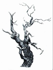
I'll give an example. If your subject was a very distressed murderer leaving the scene of the crime in great haste, would you put him in the middle of the picture? Perhaps. It depends on what else you do in the picture (with colors, values, rhythm, shapes, etc.) and what else you want to say about him. But take a look at the picture painted in 1919 by Edvard Munch (1863-1944), called The Murderer on the Lane.
Here you can see how large the painting is, as this page shows a recent photo of the original painting in a gallery with people looking at it -- Scroll down to the bottom picture on the page to see it.
In the painting we see just the head of someone hurrying down a dirt lane lined with frightening-looking trees, away from a dead body. His or her simple, almost cartoon-like face shows concentration and anxiety.
Assuming the head you see (a man's? a woman's?) at the bottom of the picture is that of the murderer (not a horrified passerby), you may wonder why (let's call this person "he") isn't somewhere near the middle of the picture rather than just barely seen at the bottom edge - After all, isn't the murderer the subject? I don't think Munch would put a murderer in the most "stable" part of the picture (the center), or anywhere near it. Whatever is in the center would look like it's not going anywhere soon, if at all; it would be as if planted there with no intention of movng away. The killer is crazy -- quite unstable -- and he's leaving the murder scene (and leaving it rather empty, except for that dead body), hurtling himself toward me (the viewer), in fact, and so near the bottom edge (with most of him out of sight) that his advance toward me seems unstoppable; he is "falling" right out of the picture, pulled by gravity, so to speak...as we associate the pull of gravity with the bottom of a picture (and the effect is even stronger if a significant amount of ground shows, as it does here).
In fact, if the murderer was in the center and also much larger in relation to the size of the painting, he might look like he was paralyzed, hardly able to move, the more so the bigger he was in relation to the outside of the picture. If his head filled the whole canvas so that it reached the edges it might look as if he were going to explode...but that is not the same as looking as if he were intent on getting the heck out of that place (and in fact there would be no space left in the picture in which the scene he was leaving could be depicted).
If he were situated very near or even touching the top edge of the picture rather than at the bottom he would probably not seem threatening to us at all. That edge would "hold him" up and away from us (like a helium balloon stuck to the ceiling), especially if it were toward the right side of the picture (the left side is where action usually begins, and it unfolds -- or appears that it will unfold -- toward the right, suggesting that whatever is happening will be completed by the time it reaches the far right side...unless it seems to be crashing down toward the foreground, perhaps, as in this painting).
Of course there are other things you can do with a picture to indicate the state of mind of someone, or the trajectory of his path, the likely escape route, or etc., but these are some of the ways in which the edges work ... you can modify or cancel the effects with other things you do, but let us see how the edges can work for us; it is useful to know these things if only to make sure we are not inadvertently saying something we don't want to say by where we're placing things in a picture.
In this painting the artist has made the murderer's head small in relation to the whole picture, and left plenty of room behind him so that we can see what he is fleeing from, and he has placed his head right at the bottom edge, almost out of the picture.
One reason that having the subject at the bottom edge of the picture is very effective is because, as mentioned, he seems to be uncontrollably leaving the scene. It's also effective because it's such an odd place to find the subject that it makes it very conspicuous...especially since it's only a head, with no body in sight. It's scary, and riveting.
The very dominant, large thick tree just to the left of the center of the picture is in a place and of a size such that it balances (visual weight-wise) the murderer's head that's just to the right of (and below) the center. (And the tree also looks something like a person, with a face on the thick branch at the right -- a witness to the murder, watching the murderer as he rushes away -- maybe it even represents the murderer in the act, with its branches upraised like arms perhaps wielding the knife.) There are other tree witnesses further up the lane. These trees not only play roles in the drama as witnesses, but they are lifting themselves and their branches up to the very top edge of the picture (and beyond), balancing the murderer who is running out of the picture at the bottom edge, so that the picture is not bottom-heavy, and so we look upward to the rest of the picture as there is so much in it that we need to see besides the murderer's head.
The picture shows the lane behind the murderer, where the dastardly deed was done (with the dead body still there to prove it), and although we see that the lane is not on a hill, there is still a "hill-like" effect that we feel since it starts at the horizon and comes toward the foreground (and continues beyond it out of the picture in our minds) ... Although we realize this is flat land being portrayed, we can't help but get a feeling that things are starting "high" (because the end of the path is up high in the picture) and coming "down" (to the bottom of the canvas) toward us. Also, we have a view of the murderer from slightly above his head, looking down on him, which increases the feeling that he is going downhill. What is in the foreground near the bottom edges of the picture is strongly affected by gravity in our "unconscious" minds if not in reality. An artist like Munch knows these things if only intuitively. And so the lane delivers (dumps?) the murderer into our laps.
The relatively calm (but not silent) area at the left side of the picture balances all the action on the right.
Note that the horizon (where all looks peaceful and humdrum) as well as the four edges of the picture (and the vertical trees - and there's even a square in the sky that appears to be the moon...what else could it be) are based on the Cartesian grid - These horizontal and vertical lines -- as I say, including those of the outside edges of the picture -- stabilize the picture and serve as contrast with and intensifiers of all that is bizarre and unnerving in the painting; they also determine for us what is up and what is down...We must know this in order to "feel" the gravitational pull at the bottom [this is something that we perceive below the level of consciousness] that is ridding the scene of the murderer.
All of the eerie, nervous lines and the sickening colors and so on in the picture that cause anxiety in us are more effective because of this contrast, i.e. chaos and anxiety contrasted with seeming permanence and stability of vertical and (especially) calm, non-threatening horizontal lines.
I have hardly begun to touch on the ways considering the edges (and center) of the picture can make our pictures more effective, but it's a beginning, and certainly enough for one post.
_____
NOTES:
1) The Power of the Center: A Study of Composition in the Visual Arts is a book by Rudolf Arnheim published by the University of California Press.
2) The Murderer in the Lane is also called The Murderer on the Lane and Murderer in the Avenue.
LINK:
The Artchive - Commentary on and Pictures by Edvard Munch. There is very interesting commentary here on Munch.