If what you're looking for isn't here, type keywords in SEARCH box (right side of this page)

OR look through list of topics in this blog OR look a bit lower for posts in order by date.


June 3, 2016


THE PURPOSE OF ART


HISTORY OF IDEAS - ART
The School of Life 
(founded by Alain de Botton)
7 min., 45 sec.


January 17, 2016


What makes a photographer when everyone is taking pictures?
PBS News
3 minutes, 2 seconds


April 8, 2014

WHAT'S THE DIFFERENCE BETWEEN ART AND CRAFT?
Laura Morelli
5 Minutes, 30 Seconds
_____

(Below)
BOOKS MENTIONED IN THIS VIDEO - FREE TO READ OR DOWNLOAD FROM GUTENBERG.ORG

Lives of the Most Eminent Painters Sculptors & Architects
Volumes 1 through 10
by Giorgio Vasari
_____

The Stones of Venice, Volume 1 of 3
John Ruskin
_____

The Stones of Venice, Volume 2 of 3
John Ruskin
_____

The Stones of Venice, Volume3 of 3
John Ruskin
_____

April 5, 2014

Gary Ratushniak on the Art of Linocut
15 Minutes, 52 Seconds

Recreation of a Van Gogh self-portrait as a photograph

"This image is a digital recreation of the artist's most iconic self-portraits using photography and digital retouching. The video is a comparison of a painting and my image." - Tadao Cern


January 14, 2013

VAN GOGH SELF-PORTRAIT AS A PHOTOGRAPH

Recreation of a Van Gogh self-portrait as a photograph

"This image is a digital recreation of the artist's most iconic self-portraits using photography and digital retouching. The video is a comparison of a painting and my image." - Tadao Cern

Be sure to open up the video to full size to see details better.

September 30, 2012

Why Beauty Matters - Roger Scruton

Why Beauty Matters - BBC - Roger Scruton (2009)
Time: 58 minutes, 59 seconds

Here are philosopher Roger Scruton's ideas about what art is and what it's for. Artists have stopped making art that's beautiful, he says, and replaced it with "art" that's shocking, that has nothing to do with "beauty" and is even purposely ugly in some cases.

Quotations from this video:

"The masters of the past recognized that we have spiritual needs as well as animal appetites."

"[T]hinkers of the Enlightenment saw art and beauty as ways in which we save ourselves from meaningless routines and rise to a higher level."

"But art turned its back on beauty. It became a slave to the consumer culture, feeding our pleasures and addictions, and wallowing in self disgust."

Have in mind that this video is about an hour long!

August 26, 2012

Robert Hughes - American Visions on Video

ROBERT HUGHES - AMERICAN VISIONS

(In 8 episodes - Links to all are below)

EPISODE 1: THE REPUBLIC OF VIRTUE
First broadcast 3 November, 1996

The first Part of the First Episode of American Visions is shown in the video just below.  There is also a text link to this first video, and links to all other Parts of the First through the Last Episodes of "American Visions."  Each video is close to eleven minutes long.  If you intend to watch the whole series via these links, you could copy this entire post and paste it into an email that you send to yourself, so that whenever it's convenient for you, you can watch the next video in the series by clicking on a link in your email rather than having to get online, find your way to this post, and start all over again.   At the bottom of this post there is a video interview with Robert Hughes (who died this month: August, 2012), as well as links to a biography/obituary and to the book American Visions by Robert Hughes.


THE REPUBLIC OF VIRTUE - PART 1 of 5 (If the above video is working and you have viewed that video, you can skip to the next link)
10 minutes, 47 seconds

THE REPUBLIC OF VIRTUE - PART 2 of 5
10 Minutes, 53 Seconds

THE REPUBLIC OF VIRTUE - PART 3 of 5
10 Minutes, 58 Seconds

THE REPUBLIC OF VIRTUE - PART 4 of 5
10 Minutes, 58 Seconds

THE REPUBLIC OF VIRTUE - PART 5 of 5
10 Minutes, 59 Seconds
_____

EPISODE 2: THE PROMISED LAND
First broadcast 10 November, 1996

THE PROMISED LAND - PART 1 of 5
10 Minutes, 58 Seconds

THE PROMISED LAND - PART 2 of 5
10 Minutes, 58 Seconds

THE PROMISED LAND - PART 3 of 5
10 Minutes, 58 Seconds

THE PROMISED LAND - PART 4 of 5
10 Minutes, 42 Seconds

THE PROMISED LAND - PART 5 of 5
10 Minutes, 59 Seconds
(This looks like it ends at around 6 minutes, 40 seconds, and then it starts in again with what seems to be a "preview of episodes to come" - I would skip that part and go on to Episode 3.)
 _____

EPISODE 3: THE WILDERNESS AND THE WEST
First broadcast 17 November, 1996

THE WILDERNESS AND THE WEST - PART 1 of 5
10 Minutes, 49 Seconds
(Be forewarned: This is the part that is so disturbing because of the cringe-inducing scene showing American "eco-extremists" wailing on and on. However, aside from this one scene, this, to me, it's fine.)

THE WILDERNESS AND THE WEST - PART 2 of 5
10 Minutes, 55 Seconds

THE WILDERNESS AND THE WEST - PART 3 of 5
10 Minutes, 59 Seconds

THE WILDERNESS AND THE WEST - PART 4 of 5
10 Minutes, 31 Seconds

THE WILDERNESS AND THE WEST - PART 5 of 5
10 Minutes, 58 Seconds
_____

EPISODE 4: THE GILDED CAGE
First broadcast 24 November, 1996

THE GILDED CAGE - PART 1 of 5
10 Minutes, 58 Seconds

THE GILDED CAGE - PART 2 of 5
10 Minutes, 41 Seconds

THE GILDED CAGE - PART 3 of 5
10 Minutes, 12 Seconds

THE GILDED CAGE - PART 4 of 5
10 Minutes, 48 Seconds

THE GILDED CAGE - PART 5 of 5
10 Minutes, 59 Seconds
_____

EPISODE 5: THE WAVE FROM THE ATLANTIC
First broadcast 8 December, 1996

THE WAVE FROM THE ATLANTIC - PART 1 of 5
10 Minutes, 49 Seconds

THE WAVE FROM THE ATLANTIC - PART 2 of 5
10 Minutes, 57 Seconds

THE WAVE FROM THE ATLANTIC - PART 3 of 5
10 Minutes, 58 Seconds

THE WAVE FROM THE ATLANTIC - PART 4 of 5
10 Minutes, 57 Seconds

THE WAVE FROM THE ATLANTIC - PART 5 of 5
10 Minutes, 59 Seconds
_____

EPISODE 6: STREAMLINES AND BREADLINES
First broadcast 15 December, 1996

STREAMLINES AND BREADLINES - PART 1 of 5
10 Minutes, 54 Seconds

STREAMLINES AND BREADLINES - PART 2 of 5
10 Minutes, 59 Seconds

STREAMLINES AND BREADLINES - PART 3 of 5
10 Minutes, 51 Seconds

STREAMLINE AND BREADLINES - PART 4 of 5
10 Minutes, 59 Seconds

STREAMLINES AND BREADLINES - PART 5 of 5
10 Minutes, 58 Seconds
_____

EPISODE 7: THE EMPIRE OF SIGNS
First broadcast 22 December, 1996

THE EMPIRE OF SIGNS - PART 1 of 5
10 Minutes, 47 Seconds

THE EMPIRE OF SIGNS - PART 2 of 5
10 Minutes, 52 Seconds

THE EMPIRE OF SIGNS - PART 3 of 5
10 Minutes, 58 Seconds

THE EMPIRE OF SIGNS - PART 4 of 5
10 Minutes, 58 Seconds

THE EMPIRE OF SIGNS - PART 5 of 5
10 Minutes, 58 Seconds
_____

EPISODE 8 - THE AGE OF ANXIETY
First broadcast 29 December, 1996

THE AGE OF ANXIETY - PART 1 of 5
10 Minutes, 51 Seconds

THE AGE OF ANXIETY - PART 2 of 5
10 Minutes, 30 Seconds

THE AGE OF ANXIETY - PART 3 of 5
10 Minutes, 58 Seconds

THE AGE OF ANXIETY - PART 4 of 5
10 Minutes, 58 Seconds

THE AGE OF ANXIETY - PART 5 of 5
10 Minutes, 59 Seconds _____
_____

In another post: Remembering Robert Hughes
_____

By/With/About Robert Hughes

At Amazon.com, the book: American Visions: The Epic History of Art in America, by Robert Hughes
___

60  Minutes Overtime (December 28, 1997)

The black sheep from Down Under (video below)

 
___

  And in the Taipei Times, this biography/obituary of August 12, 2012


_____

August 18, 2012

Robert Hughes

REMEMBERING ROBERT HUGHES (July 28, 1938 - August 6, 2012)
Art Critic and Historian, Time Magazine art critic for 30 years
Time: 2 minutes, 10 seconds


Another post: Robert Hughes - American Visions - Videos

April 22, 2012

Away from the Daily Grind - Part 4

This is the fourth in a series of posts with videos of artists painting (or drawing) "Away from the Daily Grind." I hope you enjoy being out with them as they're doing what you're probably wishing you were doing right now. (Me, too.)

(Links to earlier posts in this series are below the videos.)

____________


BELOW - AN ARTIST IN THE U.K.
WATERCOLOUR SKETCHBOOK WITH BRIAN RYDER
2 minutes, 22 seconds

This short video gives the feeling of being at seaside on a brisk cool day. (Yes, there's a train at seaside...Also, boats.) The artist talks about his watercolor sketchbook and says that sketching on location before painting is a good idea for watercolor artists because when you're using simple means you tend to get down just "the essential bits," or, in other words, the essence of the subject. There are a couple of other sketching tips. I get the feeling there's a longer video of this somewhere.

_____________


BELOW - AN ARTIST IN MILWAUKEE, WISCONSIN
RIVER FRONT PLEIN AIR OIL PAINTING
2 minutes, 40 seconds

Artist Fred Bell braves quite a unique painting spot under a bridge in the city where space is rather cramped and there are very few other people around (and those who are in the area are sometimes rather suspicious-looking characters). It's quite interesting to to me to see somewhere that's so different than the usual kind of painting/drawing spot. Thanks for taking us with you, Mr. Bell.


____________


BELOW - ANOTHER ARTIST IN WISCONSIN
CAVE POINT EN PLEIN AIR ("FINDING THE MOTIF") - ARTIST: BRAD TEARE
2 minutes, 39 seconds

The artist points out that it's critical to do a sketch of the motif you've chosen before starting the painting because the shadows will change dramatically. He says that he uses the sketch "to maintain that basic design that attracted me to the motif." What a beautiful place to paint.

____________


BELOW - AN ARTIST IN THE ARCTIC
CORY TREPANIER'S "INTO THE ARCTIC #65" - FORT CONGER (Canada)
4 minutes, 54 seconds

And now for something entirely different -- This artist finds himself in a very rugged place in the Canadian Arctic, where there are ruins of wood houses abandoned by 19th-Century explorers of the area. He hitched a plane ride to this place and has just a couple of hours in which to choose a subject and make a picture before the plane takes off again. Even in that short a time, however, the tide comes in and his painting gear is stranded.


____________


BELOW - AN ARTIST IN BELGIUM
THE PASSIONATE PAINTER IN ANTWERP: ALVARO CASTAGNET
3 minutes, 2 seconds

"Alvaro Castagnet is a highly respected watercolour artist with an international reputation. His paintings capture the essence of his subjects with passion, boldness and elegance. In this film he travels to Antwerp and selects a range of subjects which include street views, a café interior, inside the railway station and one of the oldest bars in Antwerp painted at night."

____________


Earlier posts in this series:

PART ONE INCLUDES

- Ed Cooper - Painting Landscapes Outdoors

- Painting in a Florida Swamp

- Drawing with Indian Ink in Open Air (Barcelona, Spain)

- A Passion for Paint: Herman Pekel (Australia)

- Sketching at Erawan Waterfalls, Thailand


PART 2 INCLUDES

- Painting in the Grand Canyon, Arizona

- Sketching Taormina, Sicily

- South African Landscape Painter Niel Jonker

- Plein Air Painting on Moonstone Beach, California

- Open Air Painting in the Peak District National Park (U.K.)

- Painting a Fish Farm Bridge (Hong Kong)


PART THREE INCLUDES

- Seattle Sketcher

- An Artist Painting in Silver Creek, Idaho

- Peter Pettegrew (in "the Florida wilderness")

- Summer Light in Watercolor (Australia)

- On the Streets of New York


March 31, 2012

Painting Away from the Daily Grind - Part 3

In January and February I posted several videos of artists painting outdoors ("away from the daily grind"):
Painting Away from the Daily Grind - Part 1
Painting Away from the Daily Grind - Part 2

In this post there are five more videos of artists painting outdoors, including an artist who sketches in Seattle, Washington, another artist painting in Florida (there's a video on a Florida artist in the first of these posts), another artist in Australia (there was also an Australian artist in the first post), an artist on the streets of New York City, and one in Silver Creek, Idaho. There will be more posts with videos of artists working outdoors soon.
I hope you enjoy going outside with them.
____________

BELOW - AN ARTIST IN SEATTLE, WASHINGTON

SEATTLE SKETCHER
2 minutes, 47 seconds


Gabriel Campanario is a journalist and illustrator at the Seattle Times. A native of Spain, he has been in Seattle just a few years. He feels he is getting to know the city better by sketching it, as he doesn't even notice some things until he's assigned a subject he may have passed many times but hasn't really "seen." And he's doing the same for others, showing them what they may have not seen or known about even if they are natives of the city. He really likes the idea of being able to share his discoveries through his sketches. He also gets to meet a lot of people while out on the streets.

____________

BELOW - AN ARTIST PAINTING IN SILVER CREEK, IDAHO

PLEIN AIR PAINTING DEMONSTRATION - GREGG RUSSELL
3 minutes, 24 seconds


Nice music, at least to my taste. No voice. The entire time the camera is on the artist's shoulder and arm and hand and on his canvas, along with the actual scene he's painting in the background. The video is either speeded-up or else he's very fast. :-) We can see just how he approaches his painting, and what he's looking at as he does so. He ends up with a very nice painting, but for me, at least, it's enough of an inspiration just to hear the music.
____________

BELOW - ANOTHER ARTIST PAINTING IN FLORIDA

PLEIN AIR PAINTING DEMO BY PETER PETTEGREW ("In the Florida wilderness")
6 minutes, 49 seconds


At the Lake Woodruff National Wildlife Refuge in northeast Florida, the artist stops his car to capture the look of a sunrise from the back of his car, then goes on to find just the right scene to paint (using his sunrise sketch as the background). He says that the trick to painting on-site is to get the things that are changing (the sky, usually), and give them top priority. He also says that painting is the best way to describe not only a place but the time of day or an experience.

____________

BELOW - AN ARTIST IN AUSTRALIA

SUMMER LIGHT IN WATERCOLOUR: ROSS PATERSON
2 minutes, 32 seconds


Is Australia really as unpopulated and pleasant and rural as it looks in the videos I've seen of Australian artists painting outdoors? Or is what we see in the videos just a small part of it! It makes me wish I lived there. Though I'm not sure I'd like to be outside with all those flies.
____________

BELOW

ON THE STREETS OF NEW YORK (SKETCHING IN NEW YORK CITY)
2 minutes, 11 seconds


This one makes me think of the Seattle Sketcher (first video, above). I love hearing the sounds of the city as well as seeing what this artist is seeing and capturing. It really looks like an enjoyable way to spend a day away from the daily grind.

____________

There will be some really interesting videos coming up in the next part of this series of artists painting outdoors "away from the dialy grind." Also, if you haven't seen the earlier posts, here are links:
Painting Away from the Daily Grind - Part 1
Painting Away from the Daily Grind - Part 2

February 20, 2012

Away from the Daily Grind - Part 2

(Here is Part 1 of this series)

In January I put five videos of artists painting outdoors ("away from the daily grind") into one post. In today's post there are six videos. There will be more posts with more videos coming up.

There's a seemingly endless supply of videos of artists working outdoors, and I have hunted down and watched several dozens of them, looking for the ones that I like best for one or more reasons. Some are done as trailers for DVDs that are for sale -- That's okay with me, as long as they are interesting and show one person painting or drawing alone. Many show a group of "plein air" painters out together, usually with a teacher, and I leave those out (I believe there might be one or two exceptions to this, but no more, among all the videos that I will eventually show on these posts). I'm sure that painting in a group is a useful and enjoyable experience for those artists, but I'm most interested in one person (sometimes with a companion who holds the camera, but most often taking care of the camera themselves) trudging by themselves to some place that intrigues them enough to make them go to all the trouble.

It doesn't matter to me that these individuals often produce very "unprofessional" camerawork, or that they don't come across as experienced speakers (sometimes laughably not. :-). Those things aren't important. What's important is that they're out there away from their ordinary living conditions (and sometimes they are in very uncomfortable or even dangerous conditions), working on their own to wrestle a drawing or painting out of something they're experiencing at that moment, using the equipment that they have chosen themselves, and that they can carry under the circumstances.

Okay, here are six videos, showing artists outdoors at the Grand Canyon in Arizona, in Sicily (Italy), in South Africa, at a beach in California, in the Peak District (U.K.), and in Hong Kong. I hope you enjoy going outside with them.


____________

BELOW
This one is not for people who are afraid of heights

GRAND CANYON MASTERPIECE, LOVE OF AN ARTIST, AMERY BOHLING
4 minutes, 5 seconds

Hiking along a narrow trail at the edge(falling away at both sides) of the Grand Canyon to get to the place she thinks will be perfect for capturing the mules coming up the trail, she says near the beginning: "My main goal is not falling, and keeping this pack on...It's a little heavy." Even before that my heart skipped a beat when I saw her view of the edge of the canyon (as I am afraid of being in high places...even just a few feet off the ground). She was not only carrying her easel and other supplies on her back, but at the same time carrying (and aiming) the camera. This video definitely takes my mind off my own problems, but the truth is that it scares me half to death (which is a new problem). I wouldn't do this much for my art as I don't want to die, especially in such a horrible way as falling off the edge of a cliff. (One has to be alive in order to draw and paint, right?) This is definitely making art "away from the daily grind," but it makes the daily grind seem to me - at least while watching this - not so bad after all!


____________

SKETCHING TAORMINA, SICILY - Artist: Rob Carey (Jan. 5, 2012)
3 minutes, 7 seconds

This artist knows right away after looking at all that is there in front of him what will make an interesting, charming composition, and he goes right to work, sticks with it, and finishes it up while he has the opportunity.


____________

BELOW
SOUTH AFRICAN LANDSCAPE PAINTER NIEL JONKER
3 minutes, 22 seconds

This artist lives in a little village near the location where he's painting (at the ocean's edge), having moved there "because it wasn't on the map." So he had already escaped "the daily grind" to some degree even before trekking out to his painting sites. I see he has a very small canvas, no doubt not only because it doesn't take nearly as long to apply the paint (light changes fast as clouds move about in fast-changing weather conditions and only the essence of the scene can be captured when time is limited) but also because a small picture can be easily made secure in the wind.


____________

BELOW
PLEIN AIR PAINTING ON MOONSTONE BEACH, CALIFORNIA Artist Karen Winters
1 minute, 42 seconds

This artist was at an artist's "paint out" in San Luis Obispo, when a storm started moving in, apparently putting an end to the "paint out," so she took the opportunity to paint at a nearby beach. Although the incoming storm brought strong winds, she was able to wedge her easel into some rocks to keep it secure. Realizing the clouds were changing fast, she painted those first.


____________

BELOW

OPEN AIR PAINTING IN THE PEAK DISTRICT NATIONAL PARK (U.K.) with American Timothy Haglund
3 minutes, 34 seconds

While Timothy Haglund's wife was stationed near the Peak District National Park (U.K.) for seven months as a visiting professor, Haglund painted in the Park three or four times a week no matter what the weather (freezing temperatures, high winds, frost on the ground, etc.), taking about three hours to do a painting.


____________

BELOW - AN ARTIST IN HONGKONG
PAINTING A FISH FARM BRIDGE by Hongkong Artist Kwong Ko Wah
3 minutes, 31 seconds

And now for something that seems completely different than what you see in the first five videos, above....Yet, as is the case with the others, it's an artist, painting alone, from life, in his own way, a subject that, one assumes, appeals to him and that he himself has chosen.


____________


There will be more posts with videos of individual artists working "away from the daily grind" all over the world. The last post with these videos are from the U.S. (two of them), Spain, Australia, and Thailand.

January 25, 2012

Stieglitz, Modern Art, and New York City

ALFRED STIEGLITZ, MODERN ART, AND NEW YORK CITY - Early 20th Century

BELOW

STIEGLITZ AND THE NEW YORK ART SCENE (1905-46)
1 hour, 9 minutes, 31 seconds


This video, produced by The Metropolitan Museum of Art, contains two (illustrated) lectures given the same day at the Metropolitan Museum of Art in the fall of 2011. Note that it takes over an hour to watch this entire video!

The first lecture is called "Alfred Stieglitz: His Time, Influence, and Vision," and the speaker is Lisa M. Messinger, associate curator, Dept. of 19th-Century Modern and Contemporary Art.

The second lecture is called "Extreme Modernity: The Avant-Garde Looks at New York, 1910-40."  The speaker is Jessica Murphy, research associate in the Dept. of 19th-Century, Modern and Contemporary Art.

These lectures are related to the exhibition (which ended January 2nd, 2012) at the Met Museum called Stieglitz and His Artists: Matisse to O'Keeffe - on The Metropolitan Museum of Art."

There were three short films shown after these lectures. The films are not included in this video, but you can see them on YouTube videos (below, on this page).

In the first lecture we learn about Stieglitz's promotion in America of modern artists, including Matisse, Picasso, Toulouse-Lautrec, Georgia O'Keeffe (who would become his wife), John Marin, Arthur Dove, and Charles Demuth, among others.

In the second lecture we are shown what New York City was like in the early 1900s, and what it was becoming and how the artists Stieglitz promoted...especially John Marin and Arthur Dove, Charles Demuth and Georgia O'Keeffe...represented it.

We think of Georgia O'Keeffe mainly as a painter of New Mexico landscapes and of flowers, but when she still lived with Stieglitz in New York City in the 1920s she painted in NYC, and some of those paintings are shown in the video.  Also, look at this website for paintings by O'Keeffe of New York skyscrapers (and one of the East River).
BELOW: THE THREE SHORT FILMS THAT WERE SHOWN BETWEEN AND AFTER THE LECTURES YOU'LL SEE ON THE ABOVE VIDEO:

MANHATTA (1921)
7 minutes, 23 seconds


This film was created by painter Charles Sheeler and photographer Paul Strand. It is based on their photographs of New York City.

___

MANHATTAN MEDLEY (1931)
10 minutes, 30 seconds


This film looks at a day in the life of Manhattan in 1931.

___

CONEY ISLAND AT NIGHT (1905)

3 minutes, 18 seconds


____________

See earlier post on photographer Alfred Stieglitz

January 22, 2012

Painting Away from the Daily Grind - Vicariously

Drawing and Painting Away from the Daily Grind - Vicariously

Do you have a hard time actually getting around to drawing or painting even though that's what you want to do more than anything else? One thing after another comes up that you "must do" first, right? And then there's just no time. In my case, even on those rare occasions when I'm able to begin, I'm seldom able to finish the projects I was so anxious to work on. It can get really depressing.

Recently I've been under lots of pressure, having many things that really are urgent and much more important than drawing that I must concern myself with, but I found one way to feel a little less depressed about this situation, if only for a few minutes at a time. It's a kind of daydreaming, actually, but it seems relatively "real" and is very refreshing. I've been watching videos of artists drawing and painting away from home, in the city or way out in the country...really getting away from the daily grind. I vicariously join up with these individuals and see the world through their eyes for a while. They are doing what I wish I was doing, and I'm doing it with them. And when they do a good job, I feel I've done it. :-) Best of all, though, I'm away from the usual grind, outdoors, trying to bat away hungry mosquitoes or keep from freezing to death or from falling over the side of a cliff -- annoying or miserable or frightening things that do a really good job of keeping my mind off very worrisome problems that aren't so simple. And sometimes the artist is having no problems at all, just having a wonderful time. That's good, too! Besides, it's really interesting to see how others draw and paint, especially in such challenging conditions.

I've gathered several of these videos that I particularly liked for one or more reasons (some may make you wonder about me!). The artists are from all over the world. I'm going to put them together into several posts. I hope you'll enjoy some of these, too.

Below are five videos - Come back for more posts with more videos of more artists, painting and drawing outside all around the world - Next ones coming up soon.

BELOW

ED COOPER - PAINTING LANDSCAPES OUTDOORS
2 minutes, 16 seconds


I don't know where this video was made. It seems he paints in many places. Here he's on a grassy bank under shady trees, looking out at the water, with another grassy bank and trees beyond. There are foothills, and mountains in the distance. A lovely peaceful-looking place. Here is Ed Cooper's website.

____________


BELOW

PAINTING IN A FLORIDA SWAMP
7 minutes, 37 seconds


I'm not sure I really, really want to go along with this fellow. I don't like a lot of heat, especially humid heat, and I don't like the idea of being covered with mosquito bites, stepping on snakes, having my legs cut up by sharp-edged undergrowth, or having slithery creepy-crawlers climbing up my legs. But it does take one's mind of their own troubles. You have to admire this guy.

____________


BELOW - AN ARTIST DRAWING IN BARCELONA, SPAIN

DRAWING WITH INDIAN INK IN OPEN AIR
8 minutes, 27 seconds


"Spanish artist drawing in the open air with a wooden stalk, Indian ink and water, on paper. The subject is the main door of a noble farm in Montmeló (Barcelona, Spain)."

Wait 'till you see what a beautiful job he does.

I love the sounds in this video: Lots of birds chirping along with very light traffic. What a pleasant place it must be to sit and draw. It reminds me of when I lived with a couple of different families over several months in Morelia, Mexico while I attended language school. I used to think back then how much I'd love to come back some day and draw and paint there.

____________


BELOW - AN ARTIST IN AUSTRALIA

A PASSION FOR PAINT: HERMAN PEKEL (a"trailer" for a DVD)

Several subjects in and near Melbourne, Australia
2 minutes, 58 seconds


This is a trailer for a DVD, but it's fun to watch, and even more fun to listen to. It's "art instruction," but it's not at all tedious. He is obviously having fun when he goes out to paint, and that's the best part to me.

_____________


BELOW - AN ARTIST IN THAILAND

SKETCHING AT ERAWAN WATERFALLS, THAILAND - KHWAN BARTON,  ARTIST
2 minutes, 26 seconds


And finally, here is an artist who really gets close to her subjects, in a location that seems idyllic...She doesn't mention mosquitoes or snakes, anyway. But really, it's a beautiful, peaceful place and she blends right in with it - and she does make some very nice drawings under somewhat distracting conditions.

____________


More artists working outdoors in many different places, in more posts (coming up soon).

December 21, 2011

Vivian Maier - Street Photographer

"Vivian Maier (February 1, 1926 – April 21, 2009) was an American amateur street photographer who was born in New York but grew up in France, and after returning to the U.S., worked for about forty years as a nanny in Chicago. During those years she took about 100,000 photographs, primarily of people and cityscapes most often in Chicago, although she traveled and photographed worldwide." (Quote from Wikipedia article on Vivian Maier)

Below
VIVIAN MAIER
9 minutes, 33 seconds


_____________

VIVIAN MAIER SLIDESHOWS ON VIDEO

VIVIAN MAIER - STREET PHOTOGRAPHY - Part 1
9 minutes, 56 seconds
VIVIAN MAIER - STREET PHOTOGRAPHY - Part 2
10 minutes, 17 seconds
Below
VIVIAN MAIER - STREET PHOTOGRAPHY - Part 3
6 minutes, 5 seconds
The woman shown below, before the video starts, is not Vivian Maier. She is one of Maier's subjects.

 
Many of Maier's Chicago pictures remind me of some of Bruegel's paintings where there are many, many people packed into the overall scene and much going on -- one to a few people in clusters acting out their own tiny dramas and paying no attention to the others all around, yet all of them fitting equally well into the larger setting.


Netherlandish Provers, 1559, by Pieter Bruegel, the Elder

I feel intrusive when I'm looking at Maier's photographs. I feel that I was right with her as she butted in on other people's private moments. Many street photographs look artful but not intrusive ... They look too carefully composed and they just don't seem to relate to human life in any meaningful way; they may be a "slice of life" but it's not a slice that matters. Many street photographs are neither artful nor intrusive. Many look as if they were not taken by a human being...Somehow they seem to have taken with an invisible camera. Vivian Meiers' photographs look both artful and intrusive -- artful not meaning that her photos look carefully thought out ahead by an "artist," but that she knew exactly when and where to point that camera to best capture the essence of what she was observing; plus the subjects do look in many cases as if they were intruded upon (and sometimes they knew it, and she apparently didn't care that they knew it).

Most of her photographs that I have seen were taken in downtown Chicago, the streets of which seem to have been filled with an unending supply of human interest vignettes that Maier, with camera in hand, must have been constantly on the lookout for. Obviously she was fascinated by human life. She had a sense of humor and a sense of the absurd. She was sympathetic to some, and simply fascinated by others -- by what they were doing, how they presented themselves (wittingly and/or unwittingly) in public and how they related to others (including to her) and to their surroundings.

She knew instinctively what looks odd together, such as the woman holding a doll, the man in a suit, sleeping in his car, his hat hanging on the gearshift, the old gentleman sleeping on his back on the steps of a doorway, his hat to the side (an especially odd sight since we cannot see the man's head). In another picture a well-dressed man's head is missing due to a balloon being held in front of it by a baby he's tending, and in another picture a man, smoking a cigarette, is looking in a window (we see this from inside the room) at second- or third-story level (must be a window washer), and then there's the man with a long beard and dressed as if on safari waiting to cross a street. And lots more.

One reason her photographs, at least the ones I've seen, are so powerful (I think) is that she caught people "living their lives," not posing. Even when someone stops what they're doing to look at the camera because she called their attention for that purpose, as Maier apparently did now and then, it's only for a brief second of their lives and they do not get "out of character" while watching her watching them. So although they're looking right at the photographer the result is not a "posed" picture, but rather a revealing look at the subject's immediate and natural reaction to the situation they suddenly encounter (i.e., they are being photographed), their facial expressions reflecting their own personalities and concerns.

I think we're very lucky that the man who bought Maier's pictures at that auction realized how extraordinary her photos were and has devoted himself to scanning and preserving and sharing them.

November 22, 2011

A Painting of Frans Post by Frans Hals

In my last post, about painting "civilized" people (i.e., people in good control of their body language), one of the pictures I commented on was a portrait of Frans Post painted by Frans Hals in about 1655. As I wrote in that post, the comments I made on each of several pictures, including this one, were my first impressions of the personality and character of the people portrayed. Some pictures tell me a lot more than others about the people in them, and this was the one that told me the most.

Here is the picture I am referring to:

Frans Post
Artist: Frans Hals (c. 1580-1666), Dutch painter

And these were my comments (my own "first impressions") on this subject, having not yet taken any time to try to analyze the picture: "A modest yet friendly man who would be nice to be stuck sitting next to while waiting for something. He looks like a good listener, and sympathetic and probably encouraging. It would probably be nice to have supper with him...and keep him for a friend."

I did not know anything about Frans Post when I saw this picture for the first time.  And I still have not looked to find out anything about him or about other people's opinions and observations about the way the painting was composed and why it was composed that way. So, what follows are my own ideas based on my understanding of how these things work.

The main thing to get across here, as it helps so much in the interpretation of the personality of Mr. Post, is that where the subject is placed in relation to the center of the picture tells us a lot about it. (Of course there are also other factors that help us understand the subject, and I will point out a few of those shortly.)
It seems at first surprising to realize that so much of the subject's "personality" is evident when only a part of his face and one side of his collar are seen with any clarity. Everything else is in the dark.

How do we get such a strong idea of what he's like, then? It's not only the expression in his face, though that is part of it. What tells us even more is where his face is in the picture, and how it's tilted. And not just his face, but also his body.

Someone who was in dead center and straight upright, especially with head and body both facing directly toward the viewer, would seem (all other things being equal) perfectly composed, steady, like a rock, unchanging, hardly affected by outer events. You don't often see a portrait like that, as most people are not like that, though some are. Here is a good example of such a subject:

Senju Kannon - 12th Century - Japan -Scroll
Senju Kannon ("Thousand-armed Bodhisattva of Compassion"), 12th Century - Hanging scroll, color on silk, Tokyo National Museum
Source: Wikimedia (picture is in the public domain)

This is not an individual with a unique personality but the personification of compassion and mercy. We would expect someone like this to be serene, "like a rock, unchanging."

And here is another example:

Mary Turner Austin - 1880, by John Singer Sargent
Mary Turner Austin, 1880
Artist: John Singer Sargent
Source: The Athenaeum

The subject (or her head and neckscarf, anyway, which are all we can see) in the above picture is not in the center between top and bottom, but she is in the center between left and right, and her head and body are both facing directly toward the viewer. However, rather than giving the appearance of calmness and stability, as does the Senju Kannon, above, to me at least this woman looks like she's barely able to control strong emotion. She does not have "a thousand arms" reaching out in compassion, but instead seems to have all of her energy concentrated in her seemingly disembodied head. She projects that highly concentrated energy through her eyes, out of the darkness below her brows, causing her to look as if she's not at peace but, rather, stubborn, willful, and about to explode. She is quite literally "self-centered." She looks as if she would have only one position on things - her own, unchangeable, position. I would not want to be left alone with this person.

Frans Post, in Hals' painting, far from being in the center with face and body aimed directly toward the viewer, leans far to our left of the center of the picture. Recall:

Frans Post c.1655 - Artist: Frans Hals

He is also sitting behind the back of a chair, making him seem more "caged in," whereas the staring woman has nothing in front of her that protects us from her, should we need protection.

Mr. Post is a person, we understand, who is not afraid to look into our eyes (he has nothing to hide and seems open and honest). He, leaning comfortably against the back of the chair, has no fear of us, either, but, unlike the fearless Ms. Austin, he is not ready to pounce on us (physically or verbally). He doesn't seem to be leaning away from us, but, rather, is leaning a bit toward us. That, along with the focus (because of the light) on his facial expression, with its unforced friendly smile, is very endearing. He looks comfortable and content, and his body language seems to say "It's so good to see you. Please come and talk to me. Let's spend a while together."

I admit that it's true that in some portraits where the head is tilted back amost in the same way the subject does not look so friendly and welcoming as does Frans Post. For example, here is another portrait by Frans Hals in which the subject is placed in a similar pose:

Portrait of a Man - 1635, by Frans Hals
Portrait of a Man - 1635
Artist: Frans Hals

What are the differences between these pictures that account for how we interpret the two subjects so differently? For one thing, the man (no name is given) in this last picture does not look as relaxed as Mr. Post. He has a pleasant face with a sweet little smile (though it's almost sarcastic looking - try on that smile yourself and find out how it feels), but he looks very stiff, which in my opinion has a lot to do with the diagonal row of buttons or decoration down the front of his jacket, which makes his head look like a piece of candy on the end of a lollipop stick. He does not look "relaxed," but simply leaning away from us as if he didn't want us to get too close. Also, he is not looking at us. He is looking at someone (or something) behind us and to our right, as if he couldn't care less about us but was only interested in whatever he's looking toward. His gaze also has the effect of straightening him up, which is one of the reasons he looks so tense. The overall effect is to make him look like a very alert, superficially accommodating person who, however, is impatient, fidgety, and not very thoughtful.

Furthermore, his clothing does not blend in so well with the background as does Mr. Post's. It is much more noticeable because it is well-lit and lit from the side so that the folds and creases are very noticeable, making his clothing appear to be aggressively confronting us. Also, we are able to see that the fabric looks as stiff as the row of buttons, and that his right arm is thrust forward toward us, almost into "our" space; this seems "unfriendly," as if he's trying to put up a threatening barrier between himself and the viewer.
In other words, he does not look comfortable and he does not look welcoming. The message I get is: "I'd like to get out of this chair and this situation ASAP, and, by the way, I do wish you'd stop pestering me. I have better things to do."

There are more portraits by Hals where he has his subject in this same basic position, and it would be fun to compare more of them, but those will have to wait for other posts.

October 30, 2011

The Difficulty of Portraying Civilized People

... or GET UNDER THE MASK - OR WORK AROUND IT

A CIVILIZED PERSON LOOKING QUITE BORING. (BELOW)

Mr. Morley - before 1802 - artist George Romney

ABOVE: Mr. Morley, before 1802 (Wikimedia)
artist: George Romney (1734-1802), English painter

ANOTHER CIVILIZED PERSON JUST A TAD LESS BORING LOOKING (BELOW)

Nikolay Karamzin, 1818 - artist Vasily Tropinin

ABOVE: Nikolay Karamzin,1818 (Wikimedia)
artist: Vasily Tropinin (1776-1857), Russian painter

RENOIR NOT "GESTURING" BUT SITTING IN AN ODD PLACE, WHICH IS ALSO EXPRESSIVE. HE LOOKS SELF-CONFIDENT, AND COMFORTABLE IN CASUAL CIRCUMSTANCES. HE ALSO LOOKS ALERT, AND "RECEPTIVE" (NOT OVER-ASSERTIVE, JUST PAYING ATTENTION) (BELOW)

Renoir, 1867 - artist Frederic Bazille

ABOVE: Renoir, 1867 (The Athenaeum)
artist: Frederic Bazille (1841-1870), French painter

A WOMAN WITH PLENTY OF SELF-ESTEEM YET WHO WISHES TO BE ALONE. BUT WILLING TO FACE WHAT SHE MUST FACE...SIGH (BELOW)

Eleanora Duse c. 1893 - artist John Singer Sargent

ABOVE: Eleanora Duse, c. 1893 (Wikimedia)
artist: John Singer Sargent (1856-1925), American

A CHEERY, INTELLIGENT AND KIND BUT HONEST WOMAN I'D LIKE TO BE BEST FRIENDS WITH. SHE'S NOT LOUD AND AGGRESSIVE, BUT SHE GETS ALONG FINE WITH PEOPLE - YET SHE'S COMFORTABLE BEING ALONE. (BELOW)

Lucie in 1915 - artist Robert Henri

ABOVE: Lucie (Wikimedia)
artist: Robert Henri (1865-1929), American

A MODEST YET FRIENDLY MAN WHO WOULD BE NICE TO BE SITTING NEXT TO WHILE WAITING FOR SOMETHING. HE LOOKS LIKE A GOOD LISTENER, AND SYMPATHETIC AND PROBABLY ENCOURAGING. IT WOULD PROBABLY BE NICE TO HAVE SUPPER WITH HIM...AND KEEP HIM FOR A FRIEND. (BELOW)


ABOVE: Frans Post
artist: Frans Hals (c. 1580-1666), Dutch painter

A WOMAN WHO EVIDENTLY DID NOT WANT HER PICTURE PAINTED - SHE WANTS TO BE LEFT WITH HER OWN PRIVATE THOUGHTS. SHE LOOKS NOT SHY SO MUCH AS EMBARRASSED AND UNCOMFORTABLE BEING IN THE SPOTLIGHT. AND SHE IS NOT IN FULL CONTROL OF HER EMOTIONS. SHE MAY BE QUITE AN INTERESTING PERSON, AND PROBABLY IS, BUT THE PICTURE DOESN'T SAY "WHY" SHE MIGHT BE INTERESTING, ONLY THAT SHE'S VERY UNCOMFORTABLE, LIKE A FISH OUT OF WATER.(BELOW)

Katharine Pratt in1890 - artist John Singer Sargent

ABOVE: Katherine Pratt
artist: John Singer Sargent

JUST A PERSON - A GENERIC WOMAN - NOT INTERESTING (BELOW)

Jane Needham- no date - artist Mary Beale

Jane Needham
artist: Mary Beale (1646-1692), English painter

(Comments above the pictures are my first reactions to the subjects, the point being that some pictures tell me a lot more than others about the people in them.)

THE MASKS "CIVILIZED PEOPLE" WEAR

Most everyone who has reached the self-conscious age (what is it now, about eight years old? It used to be about age thirteen) has a "mask" that they wear while around other people (often they wear slightly different masks for different occasions...in many cases even in their own homes, and occasionally when alone). This "mask" (or "persona") is "how they wish to appear to others." The mask often consists solely of self-control, but sometimes it includes dress, hairstyle, makeup, and other accessories, even the milieu in which they allow themselves to be seen.

Some people don't have a mask, because they are quite unself-conscious or they just don't care what others think of them or whether they're upsetting people. But most of us with self-awareness try to control to some degree our facial expressions, language, and gestures so that we don't appear like five-year-olds or savages and make everyone wish we would just go away.

We are born with no mask at all, of course, as is so easily seen in babies, who let loose with every possible expression and gesture without any restraint during every waking moment ... and sometimes while sleeping. Of course there are some adults who seldom even try to hold back their emotions and in any case are unable to...jumping with joy at the slightest delight, crying easily, hitting or slapping people they feel offended by, stomping their feet when angry, and so on, but these people, who embarrass most of the rest of us, are few and far between. Generally, when we paint a portrait, the subject is a person who is not so unrestrained at least most of the time - they are "civilized" people, after all - and showing them with contorted faces and unconstrained body language would not portray them as they usually are (physically, at least), and there would be no point in making the portrait in that case.

Yet we don't want to simply show the mask...the mask, after all, is what covers up important things that we don't want people to know about us -- our attitudes and feelings toward life that may be in conflict with how we attempt to appear. The mask is important, as it is something the person has chosen, but what's underneath the mask is also important. In other words, we want to show both the inside and the outside of a person. Otherwise the person will look very, very boring, as uncomplex people are.

THE CHALLENGE OF MAKING A TRUTHFUL PICTURE OF SOMEONE WHO IS WEARING A MASK

In "civilized" societies we are taught from childhood to control our gestures and the looks on our faces (and our language) in order to cover up actions and reactions that come naturally to us. We are especially made to control ourselves when we are in public. And so we begin to acquire our mask very early in life, though it isn't until we are really self-aware (as mentioned above) that the mask starts to set. Once set, we may still experience strong feelings inside, but perhaps not as strongly after we become accustomed to not displaying them outwardly. In any case, painting portraits of individuals is often a difficult challenge because we are not able to use dramatic gestures and facial expressions to make clear the personality of a person, but must rely on less obvious clues to show what a person is typically like as far as their relationship with the outside world ... or, in fact, with the inside world -- with themselves and their own private thoughts.

And so we must figure out how to portray people's attitudes, and how they meet life's challenges -- or, in other words, we have to show their true "character" -- without relying mainly - or only - on facial expression and bodily gestures. Unless, of course, we want to portray someone who is very physically expressive, and this kind of person is probably fun to paint, and easier to paint (or draw), because their bodies are so helpful in revealing what kind of people they are. These subjects include babies and young children, as well as some adults.

Those who want more of a challenge, however, will choose a subject who is at least somewhat reserved in demeanor when it comes to their public persona, but who has a strong personality nonetheless. The challenge is to show the personality and character of that person even though he or she is sitting or standing still and not contorting his or her face like an old-time stage actor. (Painting or drawing people with very lackluster personalities with the intention of trying to show their personality is impossible because there is no personality; if you want to use them as subjects that are meant to look like they have no "life force" within them, that's a different story.)

THERE ARE MANY, MANY PORTRAITS OF BORING-LOOKING PEOPLE

I look at pictures of paintings and drawings just about every single day, sometimes dozens and dozens of them at one sitting, and I have seen many, many portraits that are quite "boring" even though done by very well thought of artists ... sometimes even well thought of by myself. They are often very fine pictures in a way, but they are - again - boring. The pictures themselves may be very interesting and well-done but the subjects look like there was no reason to paint them because they look painfully dull. I'm sure they were painted for the sitter or his or her family and represent the way the sitter wished to appear to others or the family wanted them to appear to others, and this is only natural (I would be the same way, hoping the artist would show me as I think of myself as being). Perhaps the artists hardly know their sitters in many cases, and don't have much to go on besides the demands and/or expectations of the person who is paying for the portrait.

So many of these portraits look the same -- and the person portrayed is just not interesting. You hope and wonder if they have a life (or a "personality"), because it sure doesn't look like it in the picture. They look like they might as well be invisible.

SO WHAT CAN BE DONE, THEN?

Assuming the artist wants to show a person's unique "self," i.e., to make a picture of an individual person rather than a generic one, it seems obvious that they absolutely must get to know the subject as well as they possibly can, or at least find out what the sitter wishes to project. But how do they show what someone is "really like" if they're sitting or standing in a typical pose that shows nothing other than that the sitter has learned to look composed, pleasant, and "natural" according to the style of the day? Or else they are wearing the type of clothing the artist has chosen, posing against a background the artist has put them in, and assuming a pose the artist - or photographer - has coached them into -- the clothing type, background, and pose being chosen by him or her from a limited amount of "standard" choices. (And by the way, how many studio portrait photographs have you seen that look like this? Tell me, are they not truly boring, too?)

What has to be done is this: The entire picture must be composed in such a way that it will help us understand the personality and character of the subject. Copying the person's exterior appearance is not nearly enough and often the exterior appearance may tell you very little about that person; in fact it isn't important or even desirable that you get every detail of what you see in front of you - as it would be seen in a detailed photograph. Only what contributes to your idea of what this person is like should be there, or should be emphasized, not every single thing that your eyes see in front of them.

The human being (perhaps I should say "the body") in front of the artist is not the only thing he or she must be concerned with. The body should be in a context. The entire picture contributes to our idea of what the person is like, and this is where "composition" comes in. In fact, it occurs to me that a good (and interesting) exercise might be to use a painting of a person that someone else has done, getting the physical "likeness" as it is in that picture (same basic facial expression and pose, etc.), and try to change the person's perceived personality and character by how you re-compose the picture around these basic facts.

HOW DO YOU DO THIS?

How do you do this? Some examples: change colors and/or darkness and lightness and intensity of colors, change dark/light contrasts, change the size and/or placement of the subject and other objects in relation to the outside edges of the picture, change values, change the direction of the light, change what is emphasized, change the style of the chair, add appropriate (to your idea) objects and remove inappropriate ones. And, also, you can and even should use a certain amount of bodily gesture, just so it's subtle, and very natural to the person and helps us to understand what he or she is like. There is much more you can do - you will think of things as you go along. It would be important to always keep in mind exactly what you want to say about the subject so that you don't just do whatever might be "fun" or "interesting" to do and end up with a different personality than you intended. The result might be exciting to look at, but if it wasn't an exercise and were a real portrait of someone you were painting then you would not have done them justice. The idea isn't to have fun (though you might have fun anyway; I would hope so) but to do the person justice.
_____

NOTES:

1) If you try the above-suggested exercise, maybe you could leave a comment in which you add a URL that would lead us to the "before" and "after" pictures. I would love to see them and probably others would, too.
2) I will write more on portraits.

September 26, 2011

Making a Giant Look Immense and Powerful

What makes The Colossus look so gigantic?
_____

GIANT, noun: (in folklore) a being with human form but superhuman size, strength, etc.
Dictionary.com


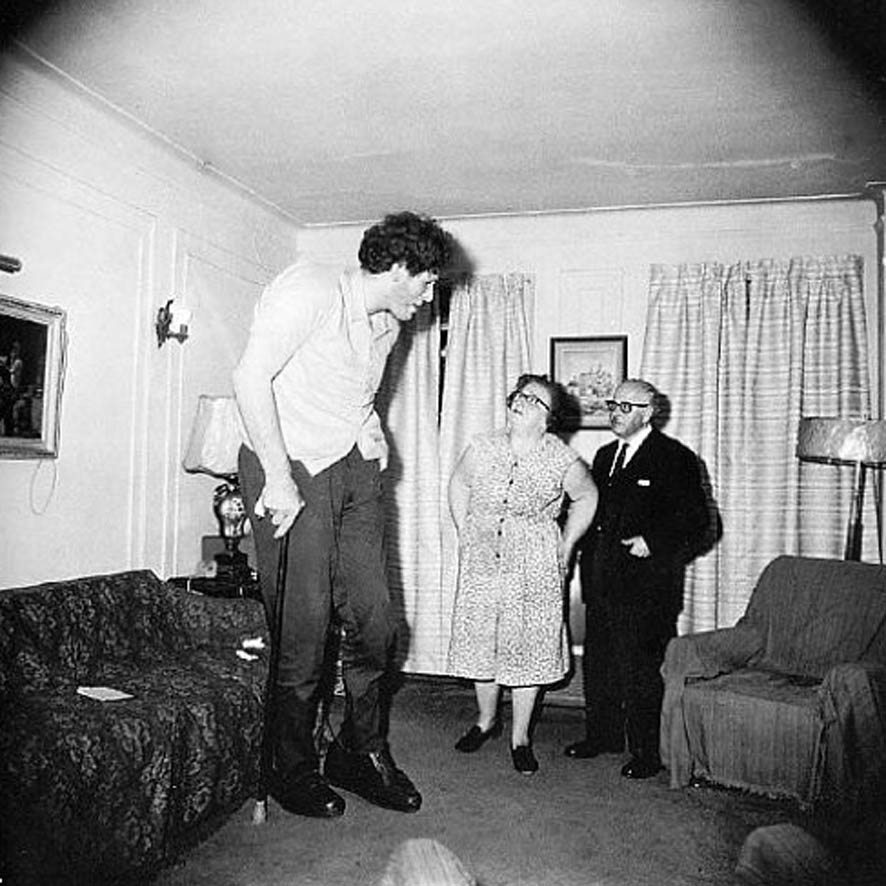
There are very tall people among us now, and no doubt there always have been. Here are photos of just a few of them:

Zhan Shi Chai (1840s-1893), Chinese, Eddie Carmel (1936-1972), Israeli-American, Ralph Madsen (1897-1948), American, and Sultan Kosen (1982-still living), Turkish.

These unfortunate people have often ended up being exhibited as freaks in circuses, and as there are few other job openings for them or anyplace where they "fit in," they usually grudgingly accept their fate and allow themselves to be exhibited. Their abnormal size is usually a result of a tumor on their pituitary gland (which regulates growth). Rather than being super-healthy, their condition often causes them to die young. These people are startlingly tall compared to the rest of us, but of course none of them have been "giants" of the kind that we know about from legends and fairy tales. They are not the type to cause an earthquake when they walk or eat a pile of whole roast oxen for dinner.

The giants of mythology and stories and movies and so on are always huge beyond a size that humans have ever grown to, and are extremely strong and powerful and often looking for a fight with gods, or with other giants, or else they're looking for a meal. No matter if they might be supposedly "friendly," such a giant would be frightening, as even the most careful and courteous giant might inadvertently step or sit down on people or animals or houses, etc., or knock over a building. He (sometimes she) would also use up the resources of the local "little people" in a hurry.

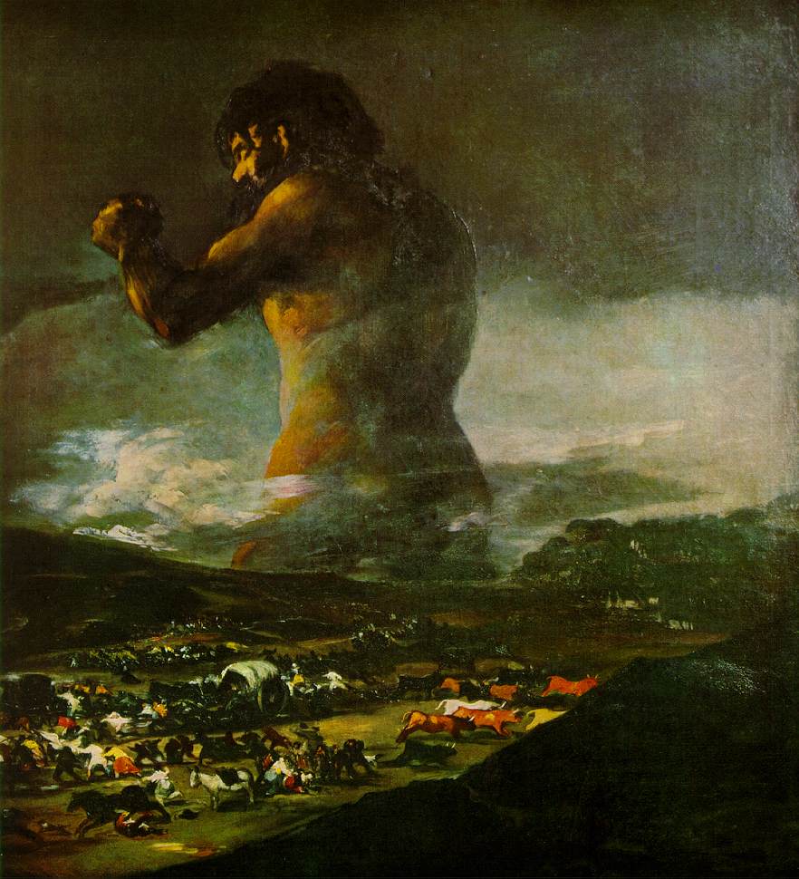
Though it's obvious that giants of this type have never actually existed in real life, they've been invented by writers, artists, and storytellers as metaphors to fill different needs. For instance, it is likely that the giant ("Colossus") in the painting shown below is meant to represent the Spanish people resisting Napoleon's invasion.


The Colossus - Click to see in larger size

The Colossus - 1808-10
A clearer reproduction
Artist: This painting was formerly attributed to Francisco de Goya, but some experts now believe it is by Asensio Julia (1760-1832) (Here is a much better article on Julia, but in Spanish), a pupil and friend of Goya (Spanish - 1746-1828)
Picture, from Wikimedia, is in the public domain

To me this giant looks definitely of gargantuan size and strength, in addition to appearing somber, serious, and powerful. One would think mountains would crumble as he walked by.

What are some of the things the artist has done that make this giant seem so gargantuan and powerful? It's not just the size he has made the figures in the foreground, which are tiny in relation to the giant. If we are able to see this picture more clearly and in a larger size, we'll see there are people and animals in the foreground fleeing the area, but I didn't even notice them when I first looked at this dark reproduction of the picture, and wasn't aware of them until I read about them later; they just looked like specks of debris to me. When I saw another reproduction, I could see them, but even when I didn't know they were there the giant looked extremely gigantic. In fact, it seems to me that you could remove the bottom third or so of the picture, leaving out all the comparatively tiny humans and animals, and he would still look of monstrous size.

And what if we leave the bottom of the picture intact - Why is it that we don't see the Colossus as a man of normal size and the fleeing people and animals as being very tiny?

There are several things I can think of that the artist has done to make the Colossus look so gigantic and powerful. Here is what I've been able to come up with so far:

Borrowing the immensity of the sky

- There is the fact that he blends in with the black sky, making him "as big as the sky," since in many places you can't really see where he ends and the sky begins. I think that is one of the most effective methods the artist has used to imply monstrous size. What is bigger than the sky?

Making the giant appear to be rooted in the earth

- Although he seems to be part of the sky - or the sky seems to be part of him, at the same time he seems to be "rooted" in the earth (his body from the thighs down is either in a very deep valley or at the bottom of the ocean...neither one of which seems likely...or he is supposed to be buried from feet to thighs in the earth, not immobilized, but in order to appear figuratively deeply of this place and not about to be unsettled by mere interlopers), and this secure attachment to the ground gives him a look of great stability, adding to the impression of power and invulnerability.

Comparing his height with the height of the clouds

- He rises above the clouds...that alone makes him seem huge.

Contrasting his size with that of the clouds

- There is also, of course, the contrast in size between the clouds and the giant.

Contrasting his size with that of figures in the foreground.

- Mentioned above.

Having his eyes closed to show control of a huge reservoir of emotional energy

- The giant appears to have closed eyes. To me at least the closed eyes add to the feeling of power and strength contained within his massive and stable body. The closed eyes remind me of closed vents on a steaming pressure cooker. They show that he's holding back extremely strong emotions in order to keep them under control, presumably in order to make the best use of them, though he could explode with fury and action at any second.


The Colossus - Click to see in larger size

Making him appear reddish
- One thing that helps make him look powerful is the lighting, which presumably is caused by a setting sun, making him reddish, and therefore hot looking, which causes him to appear very "alive" and possibly angry or otherwise possessed by a powerful emotion about to erupt.

Illuminating the giant from a low angle

- The light shining on the giant is coming from a low angle, illuminating him as a just-setting sun would throw dramatic reddish light on a monstrous thundercloud to the east. Lighting him from "below" helps make him seem even taller.

Positioning his body so that he looks even bigger

- His raised arm and fist make him look bigger -- It gives him more bulk; and although his back is in blackness, much of its outline is clearly defined by the lighted clouds beyond it, so that we are aware of the thickness of the middle of his body -- If the background behind his back had also been black, he would not have looked so big and powerful. He would have look very tall, but "flimsy," not thick and strong.

Positioning him so that he appears to be rising

- Also, the raised arm, capped by a huge fist aimed upwards, along with the nearby head of the giant (which so strongly pulls our attention so near the top of the picture), makes it seem as if he's rising (and, as Arnheim [see Note 3, below] points out, what is rising is what we are alarmed by -- what is drooping or lying flat does not scream out "danger" to us; it calms us down as it is non-threatening). A rising giant (and/or the rising arm and fist of a giant) is definitely alarming.

Using a strong diagonal to show action

- The raised arm is the only really noticeable diagonal in the composition. We all know that a diagonal that is not supporting something signals "action," though that action could be "rising" or it could be "falling." The arm does look like it's rising, rather than falling, as the fist seems to "pull it up." Action, especially "rising" action, implies energy and power.

The Colossus - Click to see in larger size

Providing a viewpoint that makes the giant look huge

- Another thing that adds to the impression of hugeness is how the giant appears from our viewpoint. Even though he is a great distance away, we are looking "up" at the giant from approximately the level of his thighs, knowing that the rest of his lower body is far below our eye level. Just imagine how it would affect us if we saw such a thing from this viewpoint in real life.

Putting him in the upper part of the picture

- There is also the fact that objects that are higher up in a picture seem heavier than they would if they were lower in the picture. The giant is the only thing in the upper part of the picture, other than the clouds (which are "floating"). His raised arm and fist plus the thickness and three-quarter view of his body give him great width in this part of the picture. If his arm had been at his side and the hugeness of his back not defined by the light-colored clouds behind it, he would have looked tall but not massive. But he does have a raised arm and fist and etc. Not only that, but as mentioned, just because these things are so high up in the picture it makes him seem even heavier, and stronger. (If a person can easily hold up that much weight - the weight of his monstrous body - we can assume he is very strong).

Putting him in the distance

-- Oddly enough, something else that makes him look huge is putting him at such a distance from the foreground. How do we know that the giant is far in the distance? One way we can tell is that the mountains are in front of him (i.e., between the giant and the viewer) -- We may not assume that those dark shapes are mountains but even then we know that the entire foreground, whatever it is, is between him and us, cutting him off at the upper thighs, thereby, to our eyes, pushing him back behind something, which of course indicates that he is in the distance.

-- Another thing that implies distance is the dramatic difference in lighting between the foreground and background. Where the giant is, in the distance, the evening sunlight is still trickling through, but in the foreground you can hardly see what is going on; it is as if it's already nighttime there. Such a difference in lighting indicates a difference in depth. Knowing he's at a great distance, the fact that he still looks enormous is rather stunning.

The Colossus - Click to see in larger size

Putting him in the vertical center

- He is basically, as far as the legs and main trunk of his body is concerned, in the vertical center of the picture (though turned toward the left). Being in this position stabilizes him and makes him seem invulnerable.

Having him turn toward the left
- The fact that he is turning toward the left might show an attempt to push back at something that is coming at him from that direction. Action in a picture generally is imagined to begin at the left side and in this case the giant stops it and keeps it from going further. (Due to the fact that his base is firmly "planted" along the central vertical of the picture, the giant does not seem to have come from elsewhere, but to be defending himself from his home base, there in the center of the picture.) Having him turned toward the intrusion shows that he is quite aware of the danger and is able and prepared to do something about it ("the sleeping giant" has been awakened and he is furious).

Including fleeing people and animals

- Although these are hard to make out (at least in the copies of the painting I've seen), when you do notice them, they appear to be moving at top speed away from the giant, indicating, I would guess, one of three things:1) The giant is scaring them; 2) They know that something horrific is about to happen involving that giant and whatever he is facing; or 3) They are trying to escape whatever the giant is confronting, leaving him to take care of the problem. In any of these cases the giant, be he friend or foe, is having a terrific impact on these people and their animals.

Selecting a suitable format

- The picture is in the shape of a vertical rectangle, though not far from being a square. That is, it's "squat." This format reinforces the stocky, sturdy, powerful look of the giant.
_____

Although I have not seen the original painting, and I have probably not even seen a good reproduction (the picture shown here is the only one I've studied; I chose it because it was explicity said to be in the public domain), the ways in which it appears to me that this picture makes the giant look tremendously huge and powerful are still valid. My point is to reveal ways in which to make something look immense and fightfully strong and energetic. Certainly techniques such as these have been, and are, used not only in stories and drawings, paintings, photographs, etc., but also in other art "products"...from architecture to advertising...to make something - anything - appear to have similar qualities.
_____

NOTES:

1) The thoughts presented above on how the artist has made the giant appear to be so huge and powerful are my own, based on what I have read and understand; I am not pretending to be an expert, but I am very interested in composition and study the subject constantly.

2) I'm aware that The Colossus is now considered by some (most importantly, the Museo del Prado) to be the work of Goya's apprentice, Asensio Julia, yet it is very much in the spirit of what Goya himself would have done and some experts still believe it was painted by him. It doesn't matter here (in this post) who the artist was, as we're talking about how the composition makes the giant look gigantic, but it's interesting.

Here are some articles on this subject that you might want to read:
Wikipedia article on The Colossus (El Coloso), in English

Wikipedia article on El Coloso (The Colossus), in Spanish - This one is much longer and more interesting than the one in English.

"Does it matter who painted The Colossus - Goya or his apprentice?", Article in The Guardian (U.K.),

January 27, 2009, by Adrian Searle

Museo Nacional del Prado on the attribution of El Coloso
This is in Spanish, though Google will translate it. It's a long, very detailed, illustrated explanation of why they consider that El Coloso was not painted by Goya.


3) Rudolf Arnheim

Books by Arnheim consulted for this post:
--- The Power of the Center
--- Visual Thinking
--- Art and Visual Perception
To subscribe to the Thinking About Art Monthly Newsletter, see toward the bottom of the page.

August 18, 2011

Andre Kertesz

ANDRÉ KERTÉSZ, PHOTOGRAPHER
(Born in Hungary in 1894; died in New York City in 1985)

Photographers Robert Doisneau at left, André Kertész at right, during a talk in Arles, France, in 1975 - Photo provided through Creative Commons License 3.0 by Wolfgang H. Wogerer, Wien

AN INTERVIEW WITH ANDRÉ KERTÉSZA IN FOUR VIDEOS - Watch Them Below

There are many of Kertész's photographs shown in these videos. Don't be put off by the first video because of his difficult-to-understand English. It is definitely worth the trouble of trying to pick up what one can (and the interviewer, as well as the photos shown, do help). You will be glad you were patient when you get to the second and third videos, especially. The second and third time I went back through the interview, I understood what he was saying better and better, and of course I was able to see the photographs again and again.

After Kertész moved to the United States, to New York City, in 1936, his work, in the style he had always worked in, was rejected by magazines here (though his pictures had been published in European magazines) because it was too "human," too "sentimental" and "tells too many stories." Yes, he said, they were right, as that is what his photographs are about, those are the kinds of pictures he took. He said that they wanted photographs that were mechanically perfect, that were "documents," but his were, instead, sensitive and human, and "real."
___

"He left behind him a successful career and many close friends.  New York was a disaster.  His kind of photography was not understood, and magazines would not print his tender and sober images." (From second video, see below)
___

Nevertheless, he did some magazine work here in the U.S., though not able to fully exercise his unique creativity in the assignments he was given (for example he worked for House and Garden from 1945 to 1962), and he was very disappointed, but he stayed.  After he left House and Garden he was finally able to take the kinds of pictures he wanted to again.  Now he is recognized as the fine photographer that he was.

Note that you can watch these videos in a much larger size in the Thinking About Art Library.

André Kertész - Part 1
Master Photographers BBC series (1983)
9 minutes, 55 seconds

When first video finishes, scroll down to the next video


WHEN THIS VIDEO FINISHES, SCROLL DOWN BELOW TO THE NEXT ONE
__________

André Kertész - Part 2
Master Photographers BBC series
10 minutes, 20 seconds


WHEN THIS VIDEO FINISHES, SCROLL DOWN BELOW TO THE NEXT ONE
___________

André Kertész - Part 3
Master Photographers BBC series
7 minutes, 33 seconds


WHEN THIS VIDEO FINISHES, SCROLL DOWN BELOW TO THE NEXT ONE
__________

André Kertész - Part 4
Master Photographers BBC series
3 minutes, 53 seconds


__________

Here is another interview with Kertész, which you can read rather than listening to. It appears to be a transcription of a filmed interview. This is quite different than the interview in the videos, above. Almost every bit of this is regarding his experiences with photography from childhood until before he came to the U.S.


An excellent NY Times article on André Kertész (2005)


"Everything is a subject. Every subject has a rhythm. To feel it is the raison d'être. The photograph is a fixed moment of such a raison d'être, which lives on in itself." - André Kertész
To subscribe to the free Thinking About Art Monthly Newsletter, see below on this (or any) page.